Sun Symbols, Society, Ancient History, and Barack Obama...
Comments
-
even though I believe Dunk is 100% correct....I'm failing to see the conspiracy presented in all that information. sun and eyes are suppose to be doing what to me exactly? I really dont get it. driftin, it would help if you can sum it up in like a paragraph.0
-
DriftingByTheStorm wrote:
so a company that sells gas and has the name "SHELL" should turn their logo in to a SUN?
Oh i know, i know, the sun is energy!
Yep. And 8 out of 10 hotels should have suns for logos, because people only go to hotels in the sun!
Yep! And Walmart should have a sun in their logo because ...
yep!
And a bunch of MASSIVE banks should have a sun in their logo because ...
yep!
And the fact that all these things are so circular just goes to show the massive commanality of human experience.
Yep.
SO WHAT?!!!?!?!?!?! a sun is sun like a sun. right? or am I missing something. seeing a sun on everything really is making me into an obedient drone? 0
0 -
Where does Hamburglar fit in all of this? :?0
-
DriftingByTheStorm wrote:so a company that sells gas and has the name "SHELL" should turn their logo in to a SUN??
It's a stylized shell... not a sun :roll:
Real shell....
Logo shell.... 0
0 -
redrock wrote:DriftingByTheStorm wrote:so a company that sells gas and has the name "SHELL" should turn their logo in to a SUN??
It's a stylized shell... not a sun :roll:
I see you've fallen under the spell of corporate obedience. they want you to think its a shell. its a trap!0 -
jlew24asu wrote:DriftingByTheStorm wrote:
so a company that sells gas and has the name "SHELL" should turn their logo in to a SUN?
Oh i know, i know, the sun is energy!
Yep. And 8 out of 10 hotels should have suns for logos, because people only go to hotels in the sun!
Yep! And Walmart should have a sun in their logo because ...
yep!
And a bunch of MASSIVE banks should have a sun in their logo because ...
yep!
And the fact that all these things are so circular just goes to show the massive commanality of human experience.
Yep.
SO WHAT?!!!?!?!?!?! a sun is sun like a sun. right? or am I missing something. seeing a sun on everything really is making me into an obedient drone?
well,
one assumption would be that secret symbology is used amongst and between participants of the ruling elite in order to more easily communicate ownership. another would be this whole business of an occult elite that belives in the magical properterties of certain symbols that somehow gives them power.
If i had to go with just one theory, i would go with the first though.
The use of symbols that are familiar to eachother allows members to support, buy stock in, and generally promote the business interests of the firms which are "of the brotherhood", so to speak.
Of course, i'm sure it will take all of 5 minutes for someone to tell me that this is a hairbrained way to run a secret group, and SURELY there are easier ways to communicate this stuff.
But like i said, if i had to guess, thats what i would go with, right now.
??? i dunno ???
Dunkman, you are probably right about SOME of these logos.
But you will never convince me that TIme Warner and AOL, who MERGED together, BOTH are sporting DIRECT SYMBOLS OF THE SUN in their logos. I don't mean JUST eyes. Youve got TimeWarner that is CLEARLY the EYE OF RA. See that little curl hanging down and to the right? Thats not JUST an eye. And the AOL logo is an EYE in a Pyramid. What, are you going to tell me it represents an iCam or something?If I was to smile and I held out my hand
If I opened it now would you not understand?0 -
DriftingByTheStorm wrote:The use of symbols that are familiar to eachother allows members to support, buy stock in, and generally promote the business interests of the firms which are "of the brotherhood", so to speak.?
I think you may be on to something there.... the sun again.....
Whilst I get your drift and all this symbolism is very interesting indeed, one needs to look into this objectively and not try to read something esoteric, mysterious or even devious into everything.
Sure all the symbols such as the sun, eye, circle, etc. are very important in a lot of ancient cultures/cults/religions, etc. their 'meaning' was perceived very differently then because of the beliefs in those times.
What comes out nowadays in various books (The Da Vinci Code being one of them), is very far fetched.0 -
DriftingByTheStorm wrote:well,
one assumption would be that secret symbology is used amongst and between participants of the ruling elite in order to more easily communicate ownership. another would be this whole business of an occult elite that belives in the magical properterties of certain symbols that somehow gives them power.
If i had to go with just one theory, i would go with the first though.
The use of symbols that are familiar to eachother allows members to support, buy stock in, and generally promote the business interests of the firms which are "of the brotherhood", so to speak.
again SO WHAT? beyond the so what factor however, I will say you're really stretched deep with this crap.0 -
I think its very easy to read too much into all this conspiracy lark. There may have been some truth at an ancient level and if there was I'm sure it was very localised, as in contained within one or two societies or organisations, it was probably not as global as you may think.
Nowadays, because the world is so globally interconnected there isn't so much of a need to have secret symbols to spell things out to others. Everything is stolen anyway and used by whoever, so if one company uses the eye and another a pyramid and another a sun doesn't mean that they are communicating secret signals to each other. They probably just copied each other's ideas!
Remember everything has to go through marketing and PR departments too - believe me PR people aren't going to want to get their brand entangled with giving out secret messages etc. The potential for PR disaster would be too huge for them to even consider it!"We have to change the concept of patriotism to one of “matriotism” — love of humanity that transcends war. A matriarch would never send her own children off to wars that kill other people’s children." Cindy Sheehan
---
London, Brixton, 14 July 1993
London, Wembley, 1996
London, Wembley, 18 June 2007
London, O2, 18 August 2009
London, Hammersmith Apollo (Ed solo), 31 July 2012
Milton Keynes Bowl, 11 July 2014London, Hammersmith Apollo (Ed solo), 06 June 2017London, O2, 18 June 2018London, O2, 17 July 2018Amsterdam, Afas Live (Ed solo), 09 June 2019Amsterdam, Afas Live (Ed solo), 10 June 20190 -
easy........when viewed from above, his sombreo resembles the sun and the obivious 666 is on his forehead.Byrnzie wrote:Where does Hamburglar fit in all of this? :?
this topic makes me smile.live and let live...unless it violates the pearligious doctrine.0 -
DriftingByTheStorm wrote:Dunkman, you are probably right about SOME of these logos.
But you will never convince me that TIme Warner and AOL, who MERGED together, BOTH are sporting DIRECT SYMBOLS OF THE SUN in their logos. I don't mean JUST eyes. Youve got TimeWarner that is CLEARLY the EYE OF RA. See that little curl hanging down and to the right? Thats not JUST an eye. And the AOL logo is an EYE in a Pyramid. What, are you going to tell me it represents an iCam or something?
i'm not going to tell you fucking anything .. thats where we differ")
i'll look at the evidence you have given and then i'll offer mine...
you answered someones question as to WHY? why have the sun? whats the point of it with thisone assumption would be that secret symbology is used amongst and between participants of the ruling elite in order to more easily communicate ownership.
but i can understand that if the design brief from these big companies was "hey designer dude... make us a new logo could you? yeah, we're a bank from Iceland, but put a big fucking sun in there could you as we are part of a secret elite organisation that controls the capitalist world"
but the design brief is normally something like
"hey guys, i'm just a pathetic accountant... come up with something cool and we'll pay you a few thousand to talk shit about how it represents revitalisation, growth, energy, life"
as for Time Warner and AOL... i'll look into it... but your original post had something like 70 logos on it... now you just want to concentrate on 2? did the other 68 not fit the theory? oh scary... 40000 morbidly obese christians wearing fanny packs invading europe is probably the least scariest thing since I watched an edited version of The Care Bears movie in an extremely brightly lit cinema.0 -
While I was reading this post, my (almost) 3 yr old was sitting across the room, unable to see my computer screen and drawing a huge SUN on her Doodle Pro. I don't know what that means, but it certainly did tickle me. 0
-
it means...............he watches too much tv or computer.Brain of J.Lo wrote:While I was reading this post, my (almost) 3 yr old was sitting across the room, unable to see my computer screen and drawing a huge SUN on her Doodle Pro. I don't know what that means, but it certainly did tickle me. live and let live...unless it violates the pearligious doctrine.0 -
They get you early, is whatBrain of J.Lo wrote:While I was reading this post, my (almost) 3 yr old was sitting across the room, unable to see my computer screen and drawing a huge SUN on her Doodle Pro. I don't know what that means, but it certainly did tickle me. .
Generally, linking ancient history, mythology and all that with modern times, places and people are in the extreme far-fetched. Just because we now can read books about it from the shelf next to billionaire biographies, doesn't mean they are in any way connected, although our minds work in such ways that we always look for connecting stuff we see. A circle, the sun and whatever, has been the basis of religions, and humans have since time immemorial liked such symbols. Circles, triangles, stars, half moons abound throughout human history. That doesnt imply conspiracy and control, it implies people thinking similarly and perhaps in archetypes a la Jung.
Repeating basic geometric shapes in logos is far easier and less messily explained by graphic designers nowadays liking clean and basic logos. It's in the times to be minimalistic, and logos based on basic geometric shapes like circles and triangles are in vogue. Simple, inobtrusive logos that can be slapped on anything are better than ornamental, complicated ones. And the more the company can be associated with a basic geometric shape, so much the better. That means we may think of the company when we encounter that shape elsewhere. Circles can signify all sorts of things: Coins (which may make it a fave in banking etc), the Sun, continuity, eternity, bottle caps and so on.
Basically, what dunkman said.
Peace
Dan"YOU [humans] NEED TO BELIEVE IN THINGS THAT AREN'T TRUE. HOW ELSE CAN THEY BECOME?" - Death
"Every judgment teeters on the brink of error. To claim absolute knowledge is to become monstrous. Knowledge is an unending adventure at the edge of uncertainty." - Frank Herbert, Dune, 19650 -
0
-
time warner logo creator... here;s an interview with him.
DESIGNER AT CHERMAYEFF & GEISMAR
What determines the choice of colors when you design a corporate logo?
Well, most corporations tend to prefer blue to any other color. It doesn’t have any negative connotation. It evokes the sky, etc. Blue is safe.
Blue doesn’t have to be the color of the whole logo, of course. We designed MOBIL that has a red “O” in it, but it’s an accent within a blue logo. The same holds true for many others that are basically a blue scale with maybe a red accent.
Red is usually perceived, at least on the corporate level, perhaps as too aggressive. I don’t think that we have at this point to overcome the political stigma that red is communism. That used to be in the olden days, I don’t think that’s the case anymore.
When you are commissioned to design a logo, how much freedom do you have to decide what the colors are going to be?
We always make recommendations, and try to be reasonable about it but a lot of our work has to do with mergers or companies upgrading what they had in the past. Often a corporation associates with a color and feels strongly about it, you can try to maybe swing away from this with a hue which may be more memorable or has more distinction to it, but often it is very much influenced by the past.
Color is never brought up as the original question. It always comes along with the symbol or the logotype.
When you get into the range of symbols even more so, it has to do with what the company is about. In NBC’s case, the revelation was that ABC was perceived as black and white, CBS did not have much color to it and NBC had this great advantage in having a symbol [the peacock] that stood for color. That peacock was a symbol for color television, it was not the symbol for NBC. They just adopted it as a pet. It used to say: “Brought to you in living color” and then the peacock came on the screen to announce that the program was changing from black and white to color. And then NBC adopted it because it has a great deal to do which what they’re about, which is color television.
In another case, if you do, let’s say, a symbol for Central Park, you have a good chance of making that green, simply because it implies a relief from all the city grey. It obviously has to do with what it’s about.
What are your limitations when reworking or updating a corporate logo?
Well if it is a reworking of something or a merging of an old company with another old company of course you try to see what their past has been, because you try to have some continuation. It’s often very helpful to tie in, especially if there is equity in the perception or equity in the visual heritage companies bring with them. You try to, at least, tie something over.
TIME WARNER is perhaps an extreme example, both companies’ identities were given up in order to attain a new one. It was the only way to do so because both had a very strong product identification. For TIME, nobody knows really what TIME INC. looks like, but they know the product, they know what TIME magazine looks like, and LIFE, PEOPLE magazine, FORTUNE, TIME LIFE books and what have you. For WARNER the “W” in a sort of TV shape was not quite as well known as for instance the WARNER BROS. shield, which was a division of WARNER COMMUNICATION, so the corporate heritage was not that strong. Nevertheless, even though it’s a completely new symbol, that signifies an eye and an ear, in the end it goes back to blue because that is what they are used to, both of them.oh scary... 40000 morbidly obese christians wearing fanny packs invading europe is probably the least scariest thing since I watched an edited version of The Care Bears movie in an extremely brightly lit cinema.0 -
and another interview with him
Designer Steff Geissbuhler commented on his design shortly after its release: "Warner is primarily entertainment, Time is essentially journalism. So a common denominator needed to be much broader: looking and listening, reading and hearing, receiving and sending....I believe the time has come to bring back more symbolic marks when possible and appropriate, because we've been oversaturated with abstractions and letterforms....Of course, all this has to be reviewed in a year or two, and then we'll see if we were right."
In 1993, Time Warner replaced the evocative eye/ear symbol with a neutral typographic treatment of the company's name; Chermayeff & Geismar's unusual symbol proved too strong a statement for Time Warner, a vast conglomerate that encompasses numerous separate brand identities having their own distinctive visual marks. The hieroglyph is now used only to identify Time Warner Cable.
interesting in that Time Warner gave up the logo feeling it to strong?... wouldnt their elitist buddies be upset about that... not sure if they were still part of the gang?
again.. please read how it was the design of a Swiss logo designer and not the design brief of a megalomaniac conglomerate...
up next ... AOL debunkedoh scary... 40000 morbidly obese christians wearing fanny packs invading europe is probably the least scariest thing since I watched an edited version of The Care Bears movie in an extremely brightly lit cinema.0 -
LOL0
-
Largest HMO, and 5th largest Private Company In America:

This is ACN, or American Communications Network,
it is the largest provider of direct-sales telecommunications services in the world:
Both companies being private,
you can't get ownership information.
Sweet.
Here is The Information Awareness Office,
a subgroup of The Defense Advanced Research Projects Agency (DARPA),
itself an agency of the United States Department of Defense:
Here is CAT or Caterpillar Inc. ,
the worlds largest construction equipment manufacturer, 50 on Fortune 500 List, $30 Billion in Assets
yellow pyramid (spelling it out for the obtuse):
INSIDE OF A MASONIC LODGE:
larger photo for the blind
Extremely old "Master Mason" Apron presented to high level Freemasons: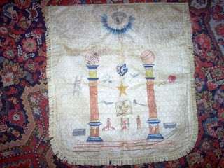
Here is a special "payment" coin for "Mark Masons":
source page
Masonic Lodge Sign Displaying the Cross Of Lorraine, for those doubting the Exxon logo connection:
Also note the SKULL & BONES, another very important symbol of high level masonry.
Another Masonic Master Mason's Apron, PYRAMID WITH SUN RAYS, CIRCLE AND DOT:
Another Apron, EYE IN PYRAMID:
Sun with Black Sun in the Center of a Zodiac inside a Masonic Lodge,
Remember the Sun and Zodiac on Bracken House?
From a Masonic Degree Chart, RISING SUN OVER PYRAMID in the center:
And finally, for today, the symbol of the 33rd Degree of Freemasonry: If I was to smile and I held out my hand
If I opened it now would you not understand?0 -
you just dont give up do ya0


Categories
- All Categories
- 149K Pearl Jam's Music and Activism
- 110.2K The Porch
- 282 Vitalogy
- 35.1K Given To Fly (live)
- 3.5K Words and Music...Communication
- 39.3K Flea Market
- 39.3K Lost Dogs
- 58.7K Not Pearl Jam's Music
- 10.6K Musicians and Gearheads
- 29.1K Other Music
- 17.8K Poetry, Prose, Music & Art
- 1.1K The Art Wall
- 56.8K Non-Pearl Jam Discussion
- 22.2K A Moving Train
- 31.7K All Encompassing Trip
- 2.9K Technical Stuff and Help