framed poster thread
Comments
-
hey i just got the same poster --- a mazing! my friend picked it up for me so its out of 250 and not doodled. How are you going to frame it since the one fish extends to the edge of the pagederbydave wrote:Just arrived today...but had to share!!
This EMEK / Coachella '13 poster MAY be the BEST one in my collection:
I got #97 of 100:
Signed & Doodled (LOVE the singing fish doodle) :
The detail is just AMAZING!!!

Bonus Handbill:
This one will be off to the Framing Center REALLY SOON!!!
:ugeek:0 -
I had the same issue with the PJ20 / Klausen poster and my framers did the matte fitting so it covered about a 1/8" of the poster.mydogmookieblaylock wrote:hey i just got the same poster --- a mazing! my friend picked it up for me so its out of 250 and not doodled. How are you going to frame it since the one fish extends to the edge of the page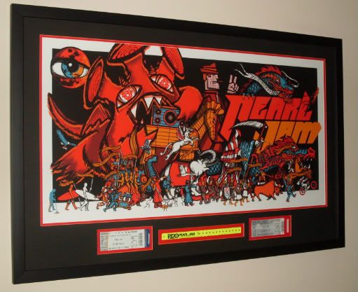
I'm not concerned with covering a tiny bit of the print to make sure the matte looks okay!!!
This poster is impressive...the only other Emek I have is the 2012 Bon Iver from Santa Barbara.
Another GREAT poster: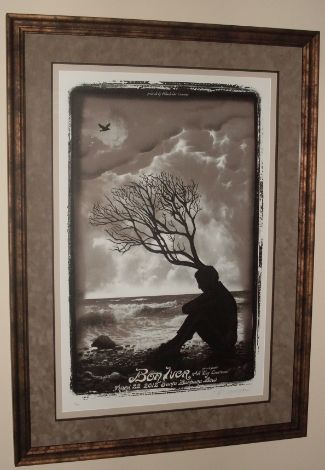
:ugeek:'96: Seattle: Key Arena
'98: Seattle: Memorial Stadium 1 & 2
'00: Columbus: Polaris
'03: Columbus: Germain
'10: Columbus: Nationwide Arena
'11: East Troy: Alpine Valley - PJ20 1 & 2 + EV Detroit
'12: Missoula + EV Jacksonville 1 & 2
'13: Chicago / Pittsburgh / Buffalo / Seattle
'14: Cincinnati / St. Louis / Tulsa / Lincoln / Memphis / Detroit / Moline
'15: New York City - Global Citizen Festival
'16: Greenville / Hampton / Raleigh / Columbia / Lexington / Ottawa / Toronto 1 & 2 / Wrigley 1 & 2
'17: Brooklyn - Rock & Roll Hall of Fame Induction Ceremony
'18: London 1 & 2 / Seattle 1 & 2 / Missoula / Wrigley 1
'22: Nashville / St. Louis0 -
elwayvedder wrote:one of my favourites and I believe it is so underrated. I posted this a few pages back but never heard from anyone- any chance of this thing looking different under a black light? Just curious. Wish I had one to try it out!
You mean like UV Light?"Life comes from within your heart and desire"0 -
Mango wrote:elwayvedder wrote:one of my favourites and I believe it is so underrated. I posted this a few pages back but never heard from anyone- any chance of this thing looking different under a black light? Just curious. Wish I had one to try it out!
You mean like UV Light?
YEP!0 -
I'll be honest chief, I aint gonna bother testing this out but if I do come across a UV light lying around the place I'll get on it
 "Life comes from within your heart and desire"0
 -
Just got back my Klausen print from Ed's Vegas Night 2 2012 show. Epic night where he played Black with Boom on the pump organ. Just had to be there witness what happened that night.
Anyway, not the best picture quality but I'm very pleased with how this one turned out. Next - I am FINALLY getting my Bristow 2010 poster framed. Bristow, VA - 5.13.10
East Troy, WI - 9.3.11
East Troy, WI - 9.4.11
Atlanta, GA - 9.22.12
Las Vegas, NV - 10.31.12 (EV)
Las Vegas, NV - 11.1.12 (EV)
Chicago, IL - 7.19.13
Dallas, TX - 11.15.13
Oklahoma City, OK - 11.16.13
Seattle, WA - 12.6.13
Lincoln, NE - 10.9.14
Moline, IL - 10.17.14
St. Paul, MN - 10.19.14
Milwaukee, WI - 10.20.14
New York, NY - 5.1.16
New York, NY - 5.2.16
Boston, MA - 8.5.16
Boston, MA - 8.7.16
Chicago, IL - 8.20.160 -
After the decision that we didn’t care if our house turned into a Pearl Jam poster shrine, and who cares what other people think when they come over, Stephen and I did a bunch of framing this past weekend. We re-matted/made adjustments to 4 frames, framed up 4 new ones in black wood with matting and another few in black metal no-mat frames.
We recently purchased a couple of picture ledges to create an 8 foot long display ledge in our living room (they aren’t up yet- we are painting the area first). I know i have seen someone else around here do this too. We are psyched. This set up will allow us to change out the displayed posters fairly easily without making new holes in the walls, and we think it looks nice and clean too") . With so many of our posters being 18x24, and so many in black frames, we figure it will be easy to change the poster inside OR swap out the entire frame, depending on what we want to display. I ordered 4 new frames from a different frame shop than I normally use (way cheaper with the added bonus of being MUCH easier to open up) so that will make this even more convenient.
. With so many of our posters being 18x24, and so many in black frames, we figure it will be easy to change the poster inside OR swap out the entire frame, depending on what we want to display. I ordered 4 new frames from a different frame shop than I normally use (way cheaper with the added bonus of being MUCH easier to open up) so that will make this even more convenient.
However, one of the best things we did was use archival mounting strips for framing our matted prints: (http://www.amazon.com/gp/product/B000KN ... UTF8&psc=1). I don't know about anyone else, but we have a perpetual issue with prints sliding down in their frames. After ruling out the framing being done too “loosely”, we assumed it was due to humidity or temperature changes (which can be quite drastic living on the top floor where all the heat rises to). These strips are perfect. They DO NOT adhere at all to the print itself, only to the mat. They are heavy duty-ish adhesive strips with a hard plastic tab at the top. To use, you position your print on the mat per the usual and then stick the strip to the back of the mat right below the edge of the print; allowing the plastic tab to create a “pocket” for the print to sit in. These things eliminate our frustrations with the slipping completely. The ones I linked to above are pretty big, you can cut them in half (or maybe even thirds?) I placed them on all 4 sides of each print but you can probably get away with doing just the bottom and sides. I highly recommend these for anyone with slippage problems and who, like us, refuses to put tape on their prints. I can not even express how happy these things have made me
Anyhow, we will post up some pics of all the framing we did this weekend to share with you all once we get around to taking the photos. Our place is in a bit of an uproar with super spring cleaning, painting, and with Stephen moving up his stuff (including more posters ) from storage in Texas…so pics will have to wait a bit - probably until the stuff actually gets on the walls. Makes much more sense...
2011: East Troy, WI 1 & 2; Toronto ON 1 & 2; Hamilton ON
2012: Berlin, Germany 1& 2; Stockholm Sweden; Oslo Norway; Copenhagen Denmark
2013: Wrigley Field- Chicago, IL; Philadelphia, PA 1 & 2; Hartford, CT; Vancouver BC; Seattle, WA.
2014: Cincinnati, OH; St. Louis, MO; Moline, IL; Milwaukee, WI
2016: Wrigley Field- Chicago 1&20 -
derbydave wrote:
I have to agree- gorgeous!! I bet the color in person are even better. Honestly, I am not usually all crazy for Emek's stuff but this is really something!Makes much more sense...
2011: East Troy, WI 1 & 2; Toronto ON 1 & 2; Hamilton ON
2012: Berlin, Germany 1& 2; Stockholm Sweden; Oslo Norway; Copenhagen Denmark
2013: Wrigley Field- Chicago, IL; Philadelphia, PA 1 & 2; Hartford, CT; Vancouver BC; Seattle, WA.
2014: Cincinnati, OH; St. Louis, MO; Moline, IL; Milwaukee, WI
2016: Wrigley Field- Chicago 1&20 -
Band of Horses at The Ryman / Hatch Poster - Night 1:
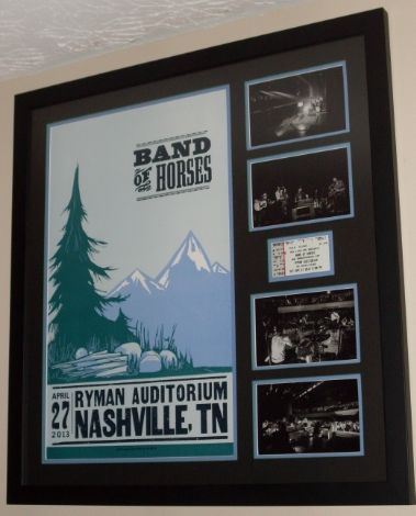
Matte Detail: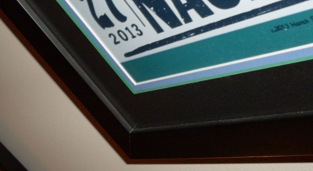
Top Matte is Black with Green Core / Bottom Matte is Periwinkle Blue with white core.
Should have the Night #2 poster back next week!!
:ugeek:'96: Seattle: Key Arena
'98: Seattle: Memorial Stadium 1 & 2
'00: Columbus: Polaris
'03: Columbus: Germain
'10: Columbus: Nationwide Arena
'11: East Troy: Alpine Valley - PJ20 1 & 2 + EV Detroit
'12: Missoula + EV Jacksonville 1 & 2
'13: Chicago / Pittsburgh / Buffalo / Seattle
'14: Cincinnati / St. Louis / Tulsa / Lincoln / Memphis / Detroit / Moline
'15: New York City - Global Citizen Festival
'16: Greenville / Hampton / Raleigh / Columbia / Lexington / Ottawa / Toronto 1 & 2 / Wrigley 1 & 2
'17: Brooklyn - Rock & Roll Hall of Fame Induction Ceremony
'18: London 1 & 2 / Seattle 1 & 2 / Missoula / Wrigley 1
'22: Nashville / St. Louis0 -
That looks really great!derbydave wrote:Band of Horses at The Ryman / Hatch Poster - Night 1:
Matte Detail:
Top Matte is Black with Green Core / Bottom Matte is Periwinkle Blue with white core.
Should have the Night #2 poster back next week!!
:ugeek:We were but stones your light made us stars0 -
Here's my Band of Horses Night #2 at The Ryman Hatch Poster:
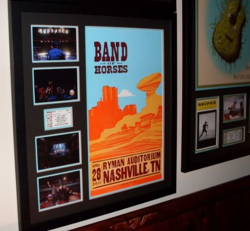
Matte Detail: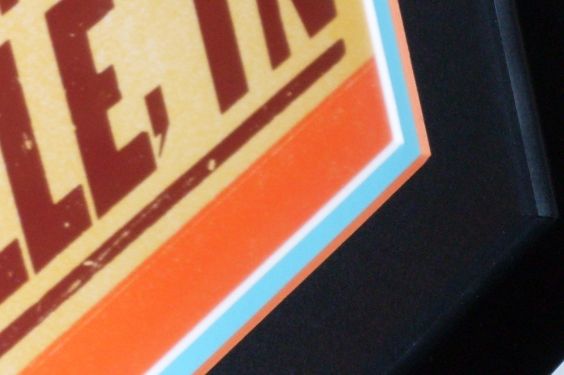
Top Matte is Black with Orange Core / Bottom Matte is Sky Blue with White Core.
Concert Pictures & Ticket Stub: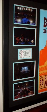
Both Posters hanging on the wall together: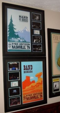
GREAT reminder of an AMAZING WEEKEND at THE RYMAN!!!
:ugeek:'96: Seattle: Key Arena
'98: Seattle: Memorial Stadium 1 & 2
'00: Columbus: Polaris
'03: Columbus: Germain
'10: Columbus: Nationwide Arena
'11: East Troy: Alpine Valley - PJ20 1 & 2 + EV Detroit
'12: Missoula + EV Jacksonville 1 & 2
'13: Chicago / Pittsburgh / Buffalo / Seattle
'14: Cincinnati / St. Louis / Tulsa / Lincoln / Memphis / Detroit / Moline
'15: New York City - Global Citizen Festival
'16: Greenville / Hampton / Raleigh / Columbia / Lexington / Ottawa / Toronto 1 & 2 / Wrigley 1 & 2
'17: Brooklyn - Rock & Roll Hall of Fame Induction Ceremony
'18: London 1 & 2 / Seattle 1 & 2 / Missoula / Wrigley 1
'22: Nashville / St. Louis0 -
A little something for the spare room...

 Nature drunk and High0
 -
Just got my Wrigley / Cracker Jack Poster back from the Framing Center:

Wrigley Trading Card for Each Band Member:
10 Club Happy Hour & BBQ Pass / Wrigley Postcard / Event Sticker:
Photocopy of the back of the poster attached to the back of the frame:
Matte Detail:
VERY HAPPY with the way this one turned out!!
:ugeek:Post edited by derbydave on'96: Seattle: Key Arena
'98: Seattle: Memorial Stadium 1 & 2
'00: Columbus: Polaris
'03: Columbus: Germain
'10: Columbus: Nationwide Arena
'11: East Troy: Alpine Valley - PJ20 1 & 2 + EV Detroit
'12: Missoula + EV Jacksonville 1 & 2
'13: Chicago / Pittsburgh / Buffalo / Seattle
'14: Cincinnati / St. Louis / Tulsa / Lincoln / Memphis / Detroit / Moline
'15: New York City - Global Citizen Festival
'16: Greenville / Hampton / Raleigh / Columbia / Lexington / Ottawa / Toronto 1 & 2 / Wrigley 1 & 2
'17: Brooklyn - Rock & Roll Hall of Fame Induction Ceremony
'18: London 1 & 2 / Seattle 1 & 2 / Missoula / Wrigley 1
'22: Nashville / St. Louis0 -
That's fucking sweet Dave! :thumbup:0
-
derbydave wrote:Just got my Wrigley / Cracker Jack Poster back from the Framing Center:
Wrigley Trading Card for Each Band Member:
10 Club Happy Hour & BBQ Pass / Wrigley Postcard / Event Sticker:
Photocopy of the back of the poster attached to the back of the frame:
Matte Detail:
VERY HAPPY with the way this one turned out!!
:ugeek:
That is fucking AWESOME !!! :clap: :thumbup: :-D
I just went to American Frame yesterday to start getting mine ready. We have some similar ideas but that work is gorgeous!3/22/94 Cleveland, OH
9/21/96 Toronto, ON
8/26/98 Cleveland, OH
5/09/10 Cleveland, OH
9/03/11 East Troy, WI PJ20
9/04/11 East Troy, WI PJ20
7/19/13 Chicago, IL Wrigley Field
10/11/13 Pittsburgh, PA
10/12/13 Buffalo, NY
12/06/13 Seattle, WA
10/16/14 Detroit, MI
10/17/14 Moline, IL
8/20/16 Chicago, IL Wrigley Field
8/22/16 Chicago, IL Wrigley Field0 -
derbydave wrote:Just got my Wrigley / Cracker Jack Poster back from the Framing Center:
VERY HAPPY with the way this one turned out!!
:ugeek:
WOW! What a great Birthday present to yourself today, Dave! That turned out fantastic. What an incredible "souvenir" of that epic time in Chicago! HAPPY BIRTHDAY!!! 0 -
derbydave wrote:Just got my Wrigley / Cracker Jack Poster back from the Framing Center:
Wrigley Trading Card for Each Band Member:
10 Club Happy Hour & BBQ Pass / Wrigley Postcard / Event Sticker:
Photocopy of the back of the poster attached to the back of the frame:
Matte Detail:
VERY HAPPY with the way this one turned out!!
:ugeek:
WOW....Dave....impressive as always.
Looks absolutely amazing!
I haven't taken any of my 4 Wrigley posters to be framed yet, but I was thinking about something similar to this for the Cracker Jack poster. You've definitely inspired me to go with the ticket, 10c travel package badge, and a trading card of each of the band members.
LOOKS ABSOLUTELY FANTASTIC MY FRIEND!!!Bristow, VA - 5.13.10
East Troy, WI - 9.3.11
East Troy, WI - 9.4.11
Atlanta, GA - 9.22.12
Las Vegas, NV - 10.31.12 (EV)
Las Vegas, NV - 11.1.12 (EV)
Chicago, IL - 7.19.13
Dallas, TX - 11.15.13
Oklahoma City, OK - 11.16.13
Seattle, WA - 12.6.13
Lincoln, NE - 10.9.14
Moline, IL - 10.17.14
St. Paul, MN - 10.19.14
Milwaukee, WI - 10.20.14
New York, NY - 5.1.16
New York, NY - 5.2.16
Boston, MA - 8.5.16
Boston, MA - 8.7.16
Chicago, IL - 8.20.160 -
derbydave wrote:Just got my Wrigley / Cracker Jack Poster back from the Framing Center:
Wrigley Trading Card for Each Band Member:
10 Club Happy Hour & BBQ Pass / Wrigley Postcard / Event Sticker:
Photocopy of the back of the poster attached to the back of the frame:
Matte Detail:
VERY HAPPY with the way this one turned out!!
:ugeek:
That looks killer Dave. :thumbup:0 -
derbydave wrote:Just got my Wrigley / Cracker Jack Poster back from the Framing Center:
Wrigley Trading Card for Each Band Member:
10 Club Happy Hour & BBQ Pass / Wrigley Postcard / Event Sticker:
Photocopy of the back of the poster attached to the back of the frame:
Matte Detail:
VERY HAPPY with the way this one turned out!!
:ugeek:
:clap: :clap: :clap: :thumbup:
absolutely AMAZING frame job you did there!!!0 -
Dave that's a stunner, one of the best I've seen0


Categories
- All Categories
- 149.4K Pearl Jam's Music and Activism
- 110.5K The Porch
- 295 Vitalogy
- 35.1K Given To Fly (live)
- 3.5K Words and Music...Communication
- 39.6K Flea Market
- 39.6K Lost Dogs
- 58.8K Not Pearl Jam's Music
- 10.6K Musicians and Gearheads
- 29.1K Other Music
- 17.8K Poetry, Prose, Music & Art
- 1.1K The Art Wall
- 56.9K Non-Pearl Jam Discussion
- 22.2K A Moving Train
- 31.7K All Encompassing Trip
- 2.9K Technical Stuff and Help