framed poster thread
Comments
-
And lastly my mini Kozik since I will NEVER be able to afford an original. This works for me!
 Nov 1, 1995 Salt Lake City, June 21, 1998 Park City, Nov 3, 2000 Boise, July 6 2006 Las Vegas, September 28, 2009 Salt Lake City, September 3, 2011 East Troy, September 4, 2001 East Troy, September 30, 2012 Missoula, July 19/20, 2013 WRIGLEY FIELD, October 29, 2013 C-Ville, Oct 30, 2013 Charlotte, Nov 30, 2013 Spokane0
 -
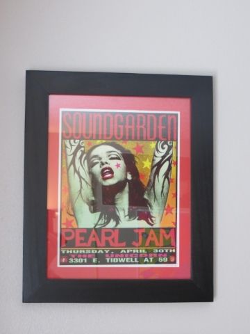
SM209559 wrote:Here is the first of mine that i framed. Still have about 4 others that need to get done.
Nice Job- they all look great...got a mind full of questions and a teacher in my soul...0 -
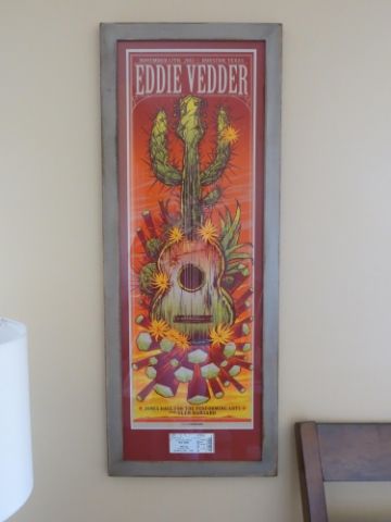
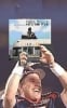
Here is a shot of my billboard. I'll get a better picture tomorrow when I pick it up.
 0
0 -
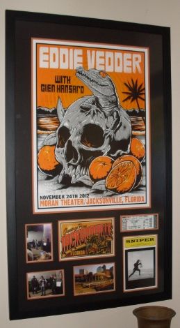
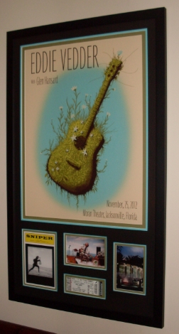
Got my EV Jacksonville 1 poster back from the Framing Center:
Matte Detail: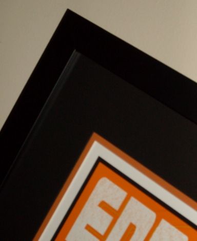
We got to meet Ed after the show that night, so I put the pictures outside by the bus in the frame along with the Mark 5 postcard, My ticket, Sniper playbill & a picture of The Moran Theater: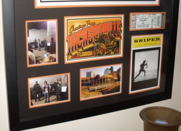
I put this poster on the wall next to the one from my first PJ show in Seattle back in '96: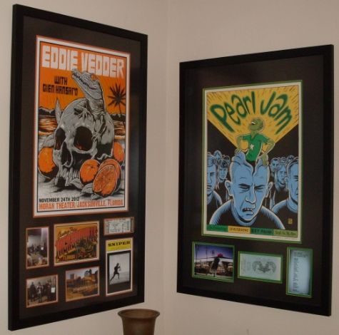
Jacksonville Night 2 is NEXT!! :ugeek:'96: Seattle: Key Arena
'98: Seattle: Memorial Stadium 1 & 2
'00: Columbus: Polaris
'03: Columbus: Germain
'10: Columbus: Nationwide Arena
'11: East Troy: Alpine Valley - PJ20 1 & 2 + EV Detroit
'12: Missoula + EV Jacksonville 1 & 2
'13: Chicago / Pittsburgh / Buffalo / Seattle
'14: Cincinnati / St. Louis / Tulsa / Lincoln / Memphis / Detroit / Moline
'15: New York City - Global Citizen Festival
'16: Greenville / Hampton / Raleigh / Columbia / Lexington / Ottawa / Toronto 1 & 2 / Wrigley 1 & 2
'17: Brooklyn - Rock & Roll Hall of Fame Induction Ceremony
'18: London 1 & 2 / Seattle 1 & 2 / Missoula / Wrigley 1
'22: Nashville / St. Louis0 -
derbydave wrote:Got my EV Jacksonville 1 poster back from the Framing Center:
Matte Detail:
We got to meet Ed after the show that night, so I put the pictures outside by the bus in the frame along with the Mark 5 postcard, My ticket, Sniper playbill & a picture of The Moran Theater:
I put this poster on the wall next to the one from my first PJ show in Seattle back in '96:
Jacksonville Night 2 is NEXT!! :ugeek:
Looks great Dave - I love that Jacksonville print. Also, very cool to incorporate your ticket, Sniper, post card, and photos from the show. Really adds a nice touch that I'm sure brings all the memories from the show together!Bristow, VA - 5.13.10
East Troy, WI - 9.3.11
East Troy, WI - 9.4.11
Atlanta, GA - 9.22.12
Las Vegas, NV - 10.31.12 (EV)
Las Vegas, NV - 11.1.12 (EV)
Chicago, IL - 7.19.13
Dallas, TX - 11.15.13
Oklahoma City, OK - 11.16.13
Seattle, WA - 12.6.13
Lincoln, NE - 10.9.14
Moline, IL - 10.17.14
St. Paul, MN - 10.19.14
Milwaukee, WI - 10.20.14
New York, NY - 5.1.16
New York, NY - 5.2.16
Boston, MA - 8.5.16
Boston, MA - 8.7.16
Chicago, IL - 8.20.160 -
Agreed, both of those look fantastic!YLed2 wrote:derbydave wrote:Got my EV Jacksonville 1 poster back from the Framing Center:
Matte Detail:
We got to meet Ed after the show that night, so I put the pictures outside by the bus in the frame along with the Mark 5 postcard, My ticket, Sniper playbill & a picture of The Moran Theater:
I put this poster on the wall next to the one from my first PJ show in Seattle back in '96:
Jacksonville Night 2 is NEXT!! :ugeek:
Looks great Dave - I love that Jacksonville print. Also, very cool to incorporate your ticket, Sniper, post card, and photos from the show. Really adds a nice touch that I'm sure brings all the memories from the show together!We were but stones your light made us stars0 -
derbydave wrote:Got my EV Jacksonville 1 poster back from the Framing Center:
Matte Detail:
You sir, know your shit when it comes to having PJ posters framed. Outstanding job. Love the layouts.
We got to meet Ed after the show that night, so I put the pictures outside by the bus in the frame along with the Mark 5 postcard, My ticket, Sniper playbill & a picture of The Moran Theater:
I put this poster on the wall next to the one from my first PJ show in Seattle back in '96:
Jacksonville Night 2 is NEXT!! :ugeek:0 -
Here it is finally in my possession.
 0
0 -
 St. Louis 07/02/98, St. Louis 10/11/00, New York 07/08/03, New York 07/09/03, Chicago 05/16/06, Chicago 05/17/06, Bridge School 10/21/06, Bridge School 10/22/06, Chicago 07/05/07, Chicago 07/24/09, Kansas City 05/03/10, St Louis 05/04/10, PJ20 09/03/11, PJ20 09/04/11, Chicago 07/19/13, St. Louis 10/03/14, Ohana 09/24/21 (EV/Earthings), Ohana 09/25/21 (EV/Earthlings), Ohana 09/26/21, Nashville 09/16/22, Louisville 09/17/22, St. Louis 09/18/22, Oklahoma City 09/20/220
 -
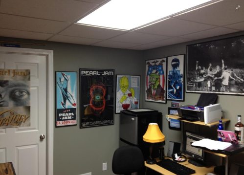
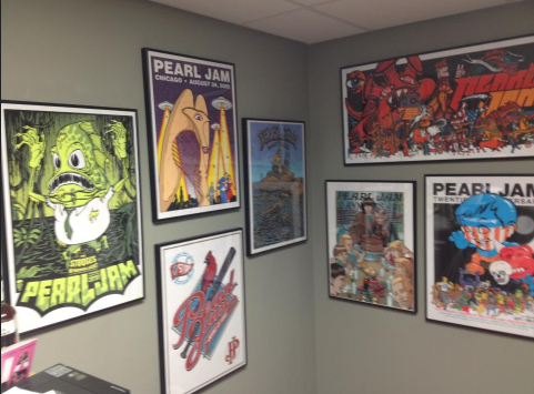
Converted the garage into an office recently, so decided it was time to frame and hang some of the posters.
http://imgur.com/a/KkeDi?gallery
 0
0 -
TJ25487 wrote:derbydave wrote:Got my EV Jacksonville 1 poster back from the Framing Center:
Matte Detail:
You sir, know your shit when it comes to having PJ posters framed. Outstanding job. Love the layouts.
We got to meet Ed after the show that night, so I put the pictures outside by the bus in the frame along with the Mark 5 postcard, My ticket, Sniper playbill & a picture of The Moran Theater:
I put this poster on the wall next to the one from my first PJ show in Seattle back in '96:
Jacksonville Night 2 is NEXT!! :ugeek:
Those look awesome0 -
Here's my Eddie Vedder / Jacksonville Night 2 / Soto poster:
Matte Detail: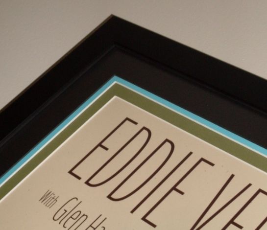
Used my Sniper Playbill, Ticket Stub & a couple of pictures in this frame job: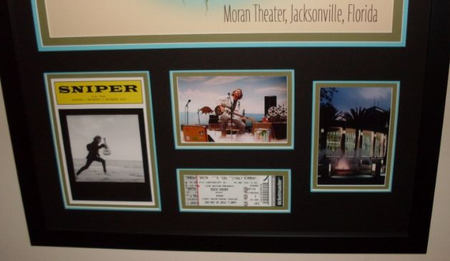
Really like the way this one turned out: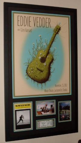
It's hanging with Jacksonville Night #1 & My the poster from my first PJ Show: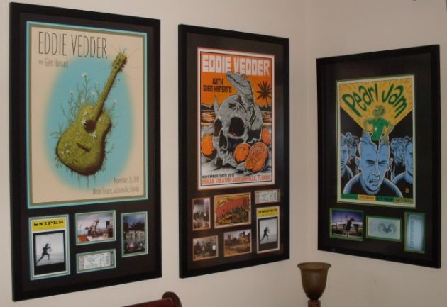
Band of Horses Hatch Prints from their shows at The Ryman in Nashville are NEXT!!

:ugeek:'96: Seattle: Key Arena
'98: Seattle: Memorial Stadium 1 & 2
'00: Columbus: Polaris
'03: Columbus: Germain
'10: Columbus: Nationwide Arena
'11: East Troy: Alpine Valley - PJ20 1 & 2 + EV Detroit
'12: Missoula + EV Jacksonville 1 & 2
'13: Chicago / Pittsburgh / Buffalo / Seattle
'14: Cincinnati / St. Louis / Tulsa / Lincoln / Memphis / Detroit / Moline
'15: New York City - Global Citizen Festival
'16: Greenville / Hampton / Raleigh / Columbia / Lexington / Ottawa / Toronto 1 & 2 / Wrigley 1 & 2
'17: Brooklyn - Rock & Roll Hall of Fame Induction Ceremony
'18: London 1 & 2 / Seattle 1 & 2 / Missoula / Wrigley 1
'22: Nashville / St. Louis0 -

La Plata, Buenos Aires, Argentina, 11/2011Once
Upon a time0 -
Photo is a little weak but this was a gift from my wife, who also loves Pearl Jam:
http://i1277.photobucket.com/albums/y50 ... 13688419060 -
I'm not a poster collector but I've wanted to get this framed a while now as when we moved to Australia from Ireland I knew we would be re-decorating and I want my wall space dammit!
Its box framed and looks awesome :thumbup: "Life comes from within your heart and desire"0
 -
Just arrived today...but had to share!!

This EMEK / Coachella '13 poster MAY be the BEST one in my collection:
I got #97 of 100:
Signed & Doodled (LOVE the singing fish doodle) :
The detail is just AMAZING!!!

Bonus Handbill:
This one will be off to the Framing Center REALLY SOON!!!
:ugeek:'96: Seattle: Key Arena
'98: Seattle: Memorial Stadium 1 & 2
'00: Columbus: Polaris
'03: Columbus: Germain
'10: Columbus: Nationwide Arena
'11: East Troy: Alpine Valley - PJ20 1 & 2 + EV Detroit
'12: Missoula + EV Jacksonville 1 & 2
'13: Chicago / Pittsburgh / Buffalo / Seattle
'14: Cincinnati / St. Louis / Tulsa / Lincoln / Memphis / Detroit / Moline
'15: New York City - Global Citizen Festival
'16: Greenville / Hampton / Raleigh / Columbia / Lexington / Ottawa / Toronto 1 & 2 / Wrigley 1 & 2
'17: Brooklyn - Rock & Roll Hall of Fame Induction Ceremony
'18: London 1 & 2 / Seattle 1 & 2 / Missoula / Wrigley 1
'22: Nashville / St. Louis0 -
derbydave wrote:Just arrived today...but had to share!!
This EMEK / Coachella '13 poster MAY be the BEST one in my collection:
I got #97 of 100:
Signed & Doodled (LOVE the singing fish doodle) :
The detail is just AMAZING!!!
Bonus Handbill:
This one will be off to the Framing Center REALLY SOON!!!
:ugeek:
AMAZING! :shock:
Very cool......you're a lucky guy, enjoy!0 -
Mango wrote:I'm not a poster collector but I've wanted to get this framed a while now as when we moved to Australia from Ireland I knew we would be re-decorating and I want my wall space dammit!
Its box framed and looks awesome :thumbup:
one of my favorites and I believe it is so underrated. I posted this a few pages back but never heard from anyone- any chance of this thing looking different under a black light? Just curious. Wish I had one to try it out!0 -
Finally got my holy grail framed. Not quite a poster, but close enough. I've been after these for probably over 10 years and finally got a few from some great people on this board!
Pearl Jam Do the Evolution animation cels from the video - 6 total. Framed together with mat's in-between to give them some depth. And there's the matching drawing of the girl and plane as the background. It's hard to tell in the pics because there's a lot of reflection from the plastic cels, but it looks awesome.
Images are too big to post, so here's the links:
http://i65.photobucket.com/albums/h228/ ... fcd2b1.jpg
http://i65.photobucket.com/albums/h228/ ... 441abe.jpg
http://i65.photobucket.com/albums/h228/ ... 20cc83.jpg
http://i65.photobucket.com/albums/h228/ ... 3a0a34.jpgWouldn't it be funny if the world ended in 2010, with lots of fire?0 -
I like that, very cool! :thumbup:a5pj wrote:Finally got my holy grail framed. Not quite a poster, but close enough. I've been after these for probably over 10 years and finally got a few from some great people on this board!
Pearl Jam Do the Evolution animation cels from the video - 6 total. Framed together with mat's in-between to give them some depth. And there's the matching drawing of the girl and plane as the background. It's hard to tell in the pics because there's a lot of reflection from the plastic cels, but it looks awesome.
Images are too big to post, so here's the links:
http://i65.photobucket.com/albums/h228/ ... fcd2b1.jpg
http://i65.photobucket.com/albums/h228/ ... 441abe.jpg
http://i65.photobucket.com/albums/h228/ ... 20cc83.jpg
http://i65.photobucket.com/albums/h228/ ... 3a0a34.jpgA wop bop a loo bop a lop bam boom.0


Categories
- All Categories
- 149.4K Pearl Jam's Music and Activism
- 110.5K The Porch
- 295 Vitalogy
- 35.1K Given To Fly (live)
- 3.5K Words and Music...Communication
- 39.6K Flea Market
- 39.6K Lost Dogs
- 58.8K Not Pearl Jam's Music
- 10.6K Musicians and Gearheads
- 29.1K Other Music
- 17.8K Poetry, Prose, Music & Art
- 1.1K The Art Wall
- 56.9K Non-Pearl Jam Discussion
- 22.2K A Moving Train
- 31.7K All Encompassing Trip
- 2.9K Technical Stuff and Help