I don’t think the posters are bad. Art is subjective. But I think people prefer when there is a direct or subtle connection to the city where the show is played. Anything too out of the box seems to get panned.
1996: Randall's Island 2 1998: East Rutherford | MSG 1 & 2 2000: Cincinnati | Columbus | Jones Beach 1, 2, & 3 | Boston 1 | Camden 1 & 2 2003: Philadelphia | Uniondale | MSG 1 & 2 | Holmdel 2005: Atlantic City 1 2006: Camden 1 | East Rutherford 1 & 2 2008: Camden 1 & 2 | MSG 1 & 2 | Newark (EV) 2009: Philadelphia 1, 2 & 4 2010: Newark | MSG 1 & 2 2011: Toronto 1 2013: Wrigley Field | Brooklyn 2 | Philadelphia 1 & 2 | Baltimore 2015: Central Park 2016: Philadelphia 1 & 2 | MSG 1 & 2 | Fenway Park 2 | MSG (TOTD) 2017: Brooklyn (RnR HOF) 2020: MSG | Asbury Park2021: Asbury Park 2022: MSG | Camden | Nashville 2024: MSG 1 & 2 (#50) | Philadelphia 1 & 2 | Baltimore 2025: Raleigh
Any of these posters - probably framed, matted and hung - can look incredible. That’s art 101. Frankly, most people (PJ fans in particular) don’t display their stuff correctly, because it’s expensive or they don’t have an eye for matting etc or because they hang it next to five other things that don’t compliment it or because its being displayed in a Michael’s poster binder in a closet etc. I’ve gone through those threads where people post pictures of their PJ prints framed and hung and all I can say is...yuck. Lots of gutless black frame jobs hung over shitty home office desk furniture. Yeah, of course it looks bad.
These prints aren’t my personal favorites but I could see someone doing something awesome with them.
Friendly rant over!
You can't put lipstick on a pig. These posters are poor
And I am arguing the opposite. Centuries of art and hundreds of art galleries do just that and it works. There are entire art school curriculums that would argue the opposite too. Art is made, in most cases to be displayed. If it is displayed poorly, it will affect the viewer’s appreciation of it. Quality of content matters, but so does context. Diminishing one will diminish the other.
The point is: black frame white matting like so many people put their prints in? Yep, its deficiencies will stand out. Someone with an eye for framing and display could improve just about any picture.
Agree to disagree.
1998-06-30 Minneapolis
2003-06-16 St. Paul
2006-06-26 St. Paul
2007-08-05 Chicago
2009-08-23 Chicago
2009-08-28 San Francisco
2010-05-01 NOLA (Jazz Fest)
2011-07-02 EV Minneapolis
2011-09-03 PJ20
2011-09-04 PJ20
2011-09-17 Winnipeg
2012-06-26 Amsterdam
2012-06-27 Amsterdam
2013-07-19 Wrigley
2013-11-21 San Diego
2013-11-23 Los Angeles
2013-11-24 Los Angeles
2014-07-08 Leeds, UK
2014-07-11 Milton Keynes, UK
2014-10-09 Lincoln
2014-10-19 St. Paul
2014-10-20 Milwaukee
2016-08-20 Wrigley 1
2016-08-22 Wrigley 2 2018-06-18 London 1 2018-08-18 Wrigley 1 2018-08-20 Wrigley 2 2022-09-16 Nashville 2023-08-31 St. Paul 2023-09-02 St. Paul 2023-09-05 Chicago 1 2024-08-31 Wrigley 2 2024-09-15 Fenway 1 2024-09-27 Ohana 1 2024-09-29 Ohana 2
Too many critics. Don’t like it? dont buy it. Moving along
Doesn't work like that. Hanging the poster is an intrinsic part of attending a PJ show and I'll buy and hang it even if it is shit. but that then means I look at a shit poster every day. When the poster is amazing it adds to the whole experience.
Uh, I think you mean to say “Hanging a poster is a part of MY concert experience.” Reread your statement. No one is forcing you to buy the shit poster...except you. Don’t let a poster ruin the show for you.
And, like I said in another post, if you must have it, fork over the dough and get it framed really well.
Ok, ' MY' experience. But don't forget, PJ visit the UK every 4 years or so and I only buy the posters to gigs I go to, so getting a shit poster for one of those gigs DOES hurt. Flipside is I missed out on the Hammersmith Mumford because it was a good poster and the bulk buying flippers were out in force.
Are these the official posters? What's the significance of some of these, such as the first one with the goddess-type woman?
"We have to change the concept of patriotism to one of “matriotism” — love of humanity that transcends war. A matriarch would never send her own children off to wars that kill other people’s children." Cindy Sheehan --- London, Brixton, 14 July 1993 London, Wembley, 1996 London, Wembley, 18 June 2007 London, O2, 18 August 2009 London, Hammersmith Apollo (Ed solo), 31 July 2012 Milton Keynes Bowl, 11 July 2014
London, Hammersmith Apollo (Ed solo), 06 June 2017
Are these the official posters? What's the significance of some of these, such as the first one with the goddess-type woman?
The problem, in my opinion, is that rock posters in general are detached from the show itself.
the fusion of the artists together with that specific show (geographically, date wise etc) is what interests me.
Just getting some guy who's amazing at drawing crows, do draw a crow and throw Pearl Jam on top off it is quite boring to me. Or atlest, a missed opportunity.
"Mostly I think that people react sensitively because they know you’ve got a point"
Are these the official posters? What's the significance of some of these, such as the first one with the goddess-type woman?
The problem, in my opinion, is that rock posters in general are detached from the show itself.
the fusion of the artists together with that specific show (geographically, date wise etc) is what interests me.
Just getting some guy who's amazing at drawing crows, do draw a crow and throw Pearl Jam on top off it is quite boring to me. Or atlest, a missed opportunity.
Well said.
0
buck502000
Birthplace of GIBSON guitar Posts: 8,951
Are these the official posters? What's the significance of some of these, such as the first one with the goddess-type woman?
The problem, in my opinion, is that rock posters in general are detached from the show itself.
the fusion of the artists together with that specific show (geographically, date wise etc) is what interests me.
Just getting some guy who's amazing at drawing crows, do draw a crow and throw Pearl Jam on top off it is quite boring to me. Or atlest, a missed opportunity.
^^^this. Yesterdays poster WAS the o2 Arena, it had elements of the planetarium and even if it wasn't the prettiest. it was relevant.
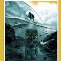
"...Dimitri...He talks to me...'.."The Ghost of Greece..".
"..That's One Happy Fuckin Ghost.."
“..That came up on the Pillow Case...This is for the Greek, With Our Apologies.....”
Are these the official posters? What's the significance of some of these, such as the first one with the goddess-type woman?
The problem, in my opinion, is that rock posters in general are detached from the show itself.
the fusion of the artists together with that specific show (geographically, date wise etc) is what interests me.
Just getting some guy who's amazing at drawing crows, do draw a crow and throw Pearl Jam on top off it is quite boring to me. Or atlest, a missed opportunity.
True. The artwork is awesome but for me since ‘98, maybe 2000, the posters don’t really say “gig poster”. It’s a piece of artwork with Pearl Jam on it. Some are better than others but they don’t really look like concert posters. You can’t deny the talent of the artists but something is missing.
Big if true. 1 per person is how it should be so that it keeps posters, at least initially, in the hands of those who went to the show. Maybe a system of 1 per person before/during show and then open it up to 2 per person once it's over? Might be a happy medium. I know a lot of people pick up a spare for a friend or someone arriving late but the reality is that most people buying 2 are looking to use it as trade bait.
I really don't like modern day gig posters for the most part. I miss the flat, simple style of the 96-2006 era. When they actually looked like gig posters and full-blown illustrations.
EDIT: *NOT* full-blown illustrations
Id Like to see Dan Stiles do some. His style is a little more old school gig poster-ie.
I just looked him up. Yes, I dig his style. Looks like he's done some work for some PJ-related artists, too. I see some Sleater-Kinney, Petty, Midlake, Gaslight Anthem in there.
Are these the official posters? What's the significance of some of these, such as the first one with the goddess-type woman?
The problem, in my opinion, is that rock posters in general are detached from the show itself.
the fusion of the artists together with that specific show (geographically, date wise etc) is what interests me.
Just getting some guy who's amazing at drawing crows, do draw a crow and throw Pearl Jam on top off it is quite boring to me. Or atlest, a missed opportunity.
True. The artwork is awesome but for me since ‘98, maybe 2000, the posters don’t really say “gig poster”. It’s a piece of artwork with Pearl Jam on it. Some are better than others but they don’t really look like concert posters. You can’t deny the talent of the artists but something is missing.
I don't really know what constitutes a gig poster, if not artwork with a band name on it. Haha.
"Mostly I think that people react sensitively because they know you’ve got a point"
0
F Me In The Brain
this knows everybody from other commets Posts: 31,612
Any of these posters - probably framed, matted and hung - can look incredible. That’s art 101. Frankly, most people (PJ fans in particular) don’t display their stuff correctly, because it’s expensive or they don’t have an eye for matting etc or because they hang it next to five other things that don’t compliment it or because its being displayed in a Michael’s poster binder in a closet etc. I’ve gone through those threads where people post pictures of their PJ prints framed and hung and all I can say is...yuck. Lots of gutless black frame jobs hung over shitty home office desk furniture. Yeah, of course it looks bad.
These prints aren’t my personal favorites but I could see someone doing something awesome with them.
Friendly rant over!
Gutless...shitty....would hate to see what a non friendly rant looks like.
Are these the official posters? What's the significance of some of these, such as the first one with the goddess-type woman?
The problem, in my opinion, is that rock posters in general are detached from the show itself.
the fusion of the artists together with that specific show (geographically, date wise etc) is what interests me.
Just getting some guy who's amazing at drawing crows, do draw a crow and throw Pearl Jam on top off it is quite boring to me. Or atlest, a missed opportunity.
True. The artwork is awesome but for me since ‘98, maybe 2000, the posters don’t really say “gig poster”. It’s a piece of artwork with Pearl Jam on it. Some are better than others but they don’t really look like concert posters. You can’t deny the talent of the artists but something is missing.
I don't really know what constitutes a gig poster, if not artwork with a band name on it. Haha.
Like you said though it seems these modern era posters look like a random piece of artwork with Pearl Jam slapped on it. Awesome illustrations but no real connection to the city or the band. Maybe simple is better. If you look at the posters from the late nineties, early 2000’s they were much simpler in design but in my opinion much cooler.
Comments
The point is: black frame white matting like so many people put their prints in? Yep, its deficiencies will stand out. Someone with an eye for framing and display could improve just about any picture.
Agree to disagree.
2003-06-16 St. Paul
2006-06-26 St. Paul
2007-08-05 Chicago
2009-08-23 Chicago
2009-08-28 San Francisco
2010-05-01 NOLA (Jazz Fest)
2011-07-02 EV Minneapolis
2011-09-03 PJ20
2011-09-04 PJ20
2011-09-17 Winnipeg
2012-06-26 Amsterdam
2012-06-27 Amsterdam
2013-07-19 Wrigley
2013-11-21 San Diego
2013-11-23 Los Angeles
2013-11-24 Los Angeles
2014-07-08 Leeds, UK
2014-07-11 Milton Keynes, UK
2014-10-09 Lincoln
2014-10-19 St. Paul
2014-10-20 Milwaukee
2016-08-20 Wrigley 1
2016-08-22 Wrigley 2
2018-06-18 London 1
2018-08-18 Wrigley 1
2018-08-20 Wrigley 2
2022-09-16 Nashville
2023-08-31 St. Paul
2023-09-02 St. Paul
2023-09-05 Chicago 1
2024-08-31 Wrigley 2
2024-09-15 Fenway 1
2024-09-27 Ohana 1
2024-09-29 Ohana 2
---
London, Brixton, 14 July 1993
London, Wembley, 1996
London, Wembley, 18 June 2007
London, O2, 18 August 2009
London, Hammersmith Apollo (Ed solo), 31 July 2012
Milton Keynes Bowl, 11 July 2014
the fusion of the artists together with that specific show (geographically, date wise etc) is what interests me.
Just getting some guy who's amazing at drawing crows, do draw a crow and throw Pearl Jam on top off it is quite boring to me. Or atlest, a missed opportunity.
Well said.
So the keychain has been the only cool thing so far as of merch?
Hyperbole in this thread.
But the stickers and animal-eye-things arent too exciting.
Going crossed eyed looking at that one.
ISO Hollywood & Nashville 2 tickets. PM me to coordinate a drop!
"..That's One Happy Fuckin Ghost.."
“..That came up on the Pillow Case...This is for the Greek, With Our Apologies.....”
@HesCalledDyer
Another Artist that you might like for a PJ print is Rob Schwater. http://tinybirdpress.storenvy.com/
I'd Dig It.