framed poster thread
Comments
-
Thierry Henry wrote:Jesus H Christ Paul.
R u made of money or what?? Amazing collection.
Wouldn't put that EV Chicago AP in the bathroom though.
Mine made it to my living room. I'll have to get my finger out and put up some photos.
Sadly not Pat....I'm retired for now....Its all too expensive, and I'd need a bigger house. I dont want to crowd rooms with posters so I tend to go with a max of 2 per room where possible (one room has 3 because it fits nice).
As for the Chicago. I had it framed especially for there, I'm off the thinking that if It doesnt stay there, it'll go under the bed and whats the point? I might as well enjoy it, take a small calculated chance and if it gets wrecked so be it....I know I;'m crazy, but its only a poster isnt it??? eeeccckkk
My living room has some signed photos of Ed and the band and the hawaii 06 ames, as they all go with the colour scheme in there..
I do hear ya though and totally understand what you are saying.
Look forward to yer pics0 -
Nice stuff Paul! I like the fact that you are using only black and white top mats...just like mine!
I just finished my basement and it will soon be covered with PJ posters............
Apparently, the MTL/TOR 98 s/n I have been looking for is on it's way to my place. I can't wait.....0 -
Ron Burgundy wrote:Nice stuff Paul! I like the fact that you are using only black and white top mats...just like mine!
I just finished my basement and it will soon be covered with PJ posters............
Apparently, the MTL/TOR 98 s/n I have been looking for is on it's way to my place. I can't wait.....
awesome congrats Luc, pleased for you, theres nothing like getting your hands on THE poster...
make sure you pop on some pics buddy0 -
BeerBaron wrote:If you shower in that bathroom, the steam will definitely warp the posters over time. It doesn't matter how well they are "sealed." But if the bathroom has no shower, or a shower that isn't used, there won't be a problem.
Posters look AMAZING by the way
was kinda thinking that the triple matt would protect against any mositure damage making its way onto the print.
even so I take on board what you say, its still just a poster and it'll be far more appreciated on that wall than being popped away in storage...I guess I'll be taking a gamble...
But a gamble that isnt so important, I mean its only worth what it would sell for and I would NEVER sell it....:)0 -
BeerBaron wrote:That's what I have been told by my framer. I am always looking for places to hang prints since I live in a condo and have such little wall space to work with. I haven't been brave enough to frame one for my washrooms yet
")
go for it....we only live once...if it makes you smile for two years, then job done....these things are paper and ink...nothing more nothing less....they are to be enjoyed....bang em up
If they are seen as an investment however do ignore my advice, its probably not very good!!!!") 0
0 -
pdalowsky wrote:Thanks very much, very nice of you to say
I did actually have colour schemes in mind to match the posters, so on moving in, every room got a lick of paint and the posters went up to compliment the decoration. In person they look great in terms of perspective in each room, the camera doesnt really catch it, but the easy street sets off the oakland and sydney so well
Thats ok u are welcome...........I can imagine how much better the would be in real life..........nice colour scheme too...0 -
BeerBaron wrote:That's what I have been told by my framer. I am always looking for places to hang prints since I live in a condo and have such little wall space to work with. I haven't been brave enough to frame one for my washrooms yet
just find one you don't mind putting in the washroom and laminate that bitch...yeah it's monetary value will decrease..but it won't warp and you can enjoy looking at it forever! 0 -
BeerBaron wrote:Sweet! Where did you finally find one?
On BRY, the guy was selling some poster saying he was willing to sell must of his stuff....I checked his EB collection and there it was!!!!!! I asked him if it was S/N. I got an answer about a month later!0 -
Ron Burgundy wrote:On BRY, the guy was selling some poster saying he was willing to sell must of his stuff....I checked his EB collection and there it was!!!!!! I asked him if it was S/N. I got an answer about a month later!
Pjrocks75 Luc??
He is the man!! and boy does he have some posters 0 -
Crazy Breed wrote:just find one you don't mind putting in the washroom and laminate that bitch...yeah it's monetary value will decrease..but it won't warp and you can enjoy looking at it forever!
exactly my angle....
enjoy the art....:)0 -
pdalowsky wrote:Pjrocks75 Luc??
He is the man!! and boy does he have some posters
No, the one he had was not S/N!
Incognito is the one!0 -
pdalowsky wrote:Maui 98
http://i383.photobucket.com/albums/oo275/pdalowsky/new%20frames%2008/DSC01494.jpg
Maui 98 Close Up
http://i383.photobucket.com/albums/oo275/pdalowsky/new%20frames%2008/DSC01495.jpg
Boston and Hartford
http://i383.photobucket.com/albums/oo275/pdalowsky/new%20frames%2008/DSC01490.jpg
Boston 98
http://i383.photobucket.com/albums/oo275/pdalowsky/new%20frames%2008/DSC01485.jpg
Boston 98 close up
http://i383.photobucket.com/albums/oo275/pdalowsky/new%20frames%2008/DSC01486.jpg
Oakland and Sydney
http://i383.photobucket.com/albums/oo275/pdalowsky/new%20frames%2008/DSC01460.jpg
Sydney 98
http://i383.photobucket.com/albums/oo275/pdalowsky/new%20frames%2008/DSC01462.jpg
Sydney 98 Close up
http://i383.photobucket.com/albums/oo275/pdalowsky/new%20frames%2008/DSC01463.jpg
Oakland 97
http://i383.photobucket.com/albums/oo275/pdalowsky/new%20frames%2008/DSC01461.jpg
Oakland 97 close up
http://i383.photobucket.com/albums/oo275/pdalowsky/new%20frames%2008/DSC01464.jpg
Easy Street 05
http://i383.photobucket.com/albums/oo275/pdalowsky/new%20frames%2008/DSC01457.jpg
http://i383.photobucket.com/albums/oo275/pdalowsky/new%20frames%2008/DSC01458.jpg
Easy Street 05 Close up
http://i383.photobucket.com/albums/oo275/pdalowsky/new%20frames%2008/DSC01459.jpg
Ed Ved Portraits
http://i383.photobucket.com/albums/oo275/pdalowsky/new%20frames%2008/DSC01472.jpg
Vedder solo east portrait
http://i383.photobucket.com/albums/oo275/pdalowsky/new%20frames%2008/DSC01478.jpg
Vedder solo west portrait
http://i383.photobucket.com/albums/oo275/pdalowsky/new%20frames%2008/DSC01480.jpg
Vedder solo west portrait close up
http://i383.photobucket.com/albums/oo275/pdalowsky/new%20frames%2008/DSC01481.jpg
Raleigh 98
http://i383.photobucket.com/albums/oo275/pdalowsky/new%20frames%2008/DSC01483.jpg
Raleigh 98 close up
http://i383.photobucket.com/albums/oo275/pdalowsky/new%20frames%2008/DSC01484.jpg
Hartford 08
http://i383.photobucket.com/albums/oo275/pdalowsky/new%20frames%2008/DSC01488.jpg
Hartford 08 close up
http://i383.photobucket.com/albums/oo275/pdalowsky/new%20frames%2008/DSC01489.jpg
Spain 06
http://i383.photobucket.com/albums/oo275/pdalowsky/new%20frames%2008/DSC01503.jpg
Spain 06 close up
http://i383.photobucket.com/albums/oo275/pdalowsky/new%20frames%2008/DSC01505.jpg
Chicago AP and Newcastle 06
http://i383.photobucket.com/albums/oo275/pdalowsky/new%20frames%2008/DSC01508.jpg
Vedder Chicago Ap
http://i383.photobucket.com/albums/oo275/pdalowsky/new%20frames%2008/DSC01524.jpg
Vedder Chicago Ap Close Up
http://i383.photobucket.com/albums/oo275/pdalowsky/new%20frames%2008/DSC01527.jpg
Asia 95
http://i383.photobucket.com/albums/oo275/pdalowsky/DSC01387.jpg
Dusseldorf 07
http://i383.photobucket.com/albums/oo275/pdalowsky/new%20frames%2008/DSC01491.jpg
Dusseldorf 07 close up
http://i383.photobucket.com/albums/oo275/pdalowsky/new%20frames%2008/DSC01492.jpg
DC 06
http://i383.photobucket.com/albums/oo275/pdalowsky/new%20frames%2008/DSC01518.jpg
DC 06 close up
http://i383.photobucket.com/albums/oo275/pdalowsky/new%20frames%2008/DSC01522.jpg
East troy 03
http://i383.photobucket.com/albums/oo275/pdalowsky/new%20frames%2008/DSC01511.jpg
East Troy 03 close up
http://i383.photobucket.com/albums/oo275/pdalowsky/new%20frames%2008/DSC01512.jpg
Newcastle benefit 06
http://i383.photobucket.com/albums/oo275/pdalowsky/new%20frames%2008/DSC01506.jpg
Newcastle benefit close up
http://i383.photobucket.com/albums/oo275/pdalowsky/new%20frames%2008/DSC01507.jpg
Hawaii 06 Klausen
http://i383.photobucket.com/albums/oo275/pdalowsky/new%20frames%2008/DSC01500.jpg
Hawaii 06 Klausen close up
http://i383.photobucket.com/albums/oo275/pdalowsky/new%20frames%2008/DSC01501.jpg
Hawaii 06 ames
http://i383.photobucket.com/albums/oo275/pdalowsky/new%20frames%2008/DSC01496.jpg
Hawaii 06 Ames close up
http://i383.photobucket.com/albums/oo275/pdalowsky/new%20frames%2008/DSC01497.jpg
decided to change the spain 06 to a light brown frame....god I'm dumb, it sticks out like a sore thumb where it is because all my art in that hallways, landing area has light frames0 -
My Istanbul
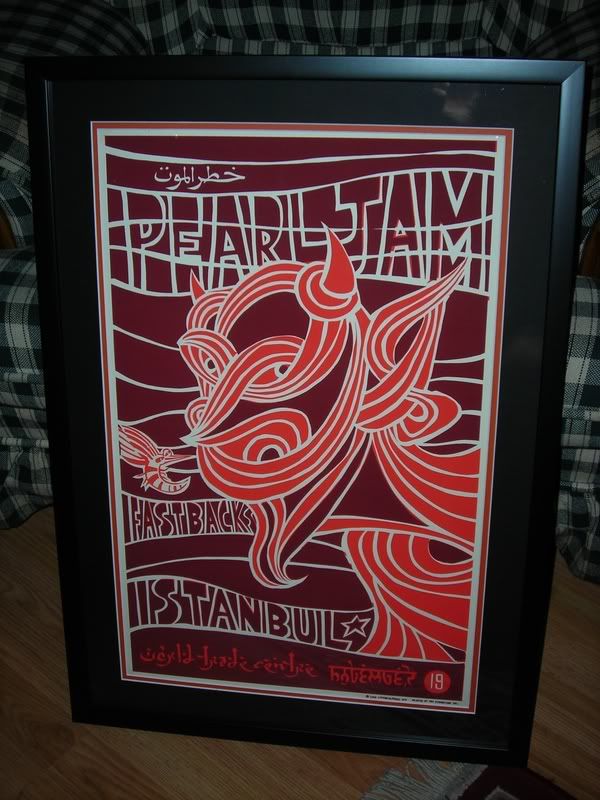 0
0 -
Dublin '96, '00, '06, '10
Lisbon '06 (x2)
Katowice '07
London '07 '09 (x2), '10
MSG NY '08 (x2)
Manchester '09 '12
Belfast '10
PJ20 Alpine '11 (x2)
Leeds '140 -
pdalowsky wrote:Maui 98
http://i383.photobucket.com/albums/oo275/pdalowsky/new%20frames%2008/DSC01494.jpg
Maui 98 Close Up
http://i383.photobucket.com/albums/oo275/pdalowsky/new%20frames%2008/DSC01495.jpg
Boston and Hartford
http://i383.photobucket.com/albums/oo275/pdalowsky/new%20frames%2008/DSC01490.jpg
Boston 98
http://i383.photobucket.com/albums/oo275/pdalowsky/new%20frames%2008/DSC01485.jpg
Boston 98 close up
http://i383.photobucket.com/albums/oo275/pdalowsky/new%20frames%2008/DSC01486.jpg
Oakland and Sydney
http://i383.photobucket.com/albums/oo275/pdalowsky/new%20frames%2008/DSC01460.jpg
Sydney 98
http://i383.photobucket.com/albums/oo275/pdalowsky/new%20frames%2008/DSC01462.jpg
Sydney 98 Close up
http://i383.photobucket.com/albums/oo275/pdalowsky/new%20frames%2008/DSC01463.jpg
Oakland 97
http://i383.photobucket.com/albums/oo275/pdalowsky/new%20frames%2008/DSC01461.jpg
Oakland 97 close up
http://i383.photobucket.com/albums/oo275/pdalowsky/new%20frames%2008/DSC01464.jpg
Easy Street 05
http://i383.photobucket.com/albums/oo275/pdalowsky/new%20frames%2008/DSC01457.jpg
http://i383.photobucket.com/albums/oo275/pdalowsky/new%20frames%2008/DSC01458.jpg
Easy Street 05 Close up
http://i383.photobucket.com/albums/oo275/pdalowsky/new%20frames%2008/DSC01459.jpg
Ed Ved Portraits
http://i383.photobucket.com/albums/oo275/pdalowsky/new%20frames%2008/DSC01472.jpg
Vedder solo east portrait
http://i383.photobucket.com/albums/oo275/pdalowsky/new%20frames%2008/DSC01478.jpg
Vedder solo west portrait
http://i383.photobucket.com/albums/oo275/pdalowsky/new%20frames%2008/DSC01480.jpg
Vedder solo west portrait close up
http://i383.photobucket.com/albums/oo275/pdalowsky/new%20frames%2008/DSC01481.jpg
Raleigh 98
http://i383.photobucket.com/albums/oo275/pdalowsky/new%20frames%2008/DSC01483.jpg
Raleigh 98 close up
http://i383.photobucket.com/albums/oo275/pdalowsky/new%20frames%2008/DSC01484.jpg
Hartford 08
http://i383.photobucket.com/albums/oo275/pdalowsky/new%20frames%2008/DSC01488.jpg
Hartford 08 close up
http://i383.photobucket.com/albums/oo275/pdalowsky/new%20frames%2008/DSC01489.jpg
Spain 06
http://i383.photobucket.com/albums/oo275/pdalowsky/new%20frames%2008/DSC01503.jpg
Spain 06 close up
http://i383.photobucket.com/albums/oo275/pdalowsky/new%20frames%2008/DSC01505.jpg
Chicago AP and Newcastle 06
http://i383.photobucket.com/albums/oo275/pdalowsky/new%20frames%2008/DSC01508.jpg
Vedder Chicago Ap
http://i383.photobucket.com/albums/oo275/pdalowsky/new%20frames%2008/DSC01524.jpg
Vedder Chicago Ap Close Up
http://i383.photobucket.com/albums/oo275/pdalowsky/new%20frames%2008/DSC01527.jpg
Asia 95
http://i383.photobucket.com/albums/oo275/pdalowsky/DSC01387.jpg
Dusseldorf 07
http://i383.photobucket.com/albums/oo275/pdalowsky/new%20frames%2008/DSC01491.jpg
Dusseldorf 07 close up
http://i383.photobucket.com/albums/oo275/pdalowsky/new%20frames%2008/DSC01492.jpg
DC 06
http://i383.photobucket.com/albums/oo275/pdalowsky/new%20frames%2008/DSC01518.jpg
DC 06 close up
http://i383.photobucket.com/albums/oo275/pdalowsky/new%20frames%2008/DSC01522.jpg
East troy 03
http://i383.photobucket.com/albums/oo275/pdalowsky/new%20frames%2008/DSC01511.jpg
East Troy 03 close up
http://i383.photobucket.com/albums/oo275/pdalowsky/new%20frames%2008/DSC01512.jpg
Newcastle benefit 06
http://i383.photobucket.com/albums/oo275/pdalowsky/new%20frames%2008/DSC01506.jpg
Newcastle benefit close up
http://i383.photobucket.com/albums/oo275/pdalowsky/new%20frames%2008/DSC01507.jpg
Hawaii 06 Klausen
http://i383.photobucket.com/albums/oo275/pdalowsky/new%20frames%2008/DSC01500.jpg
Hawaii 06 Klausen close up
http://i383.photobucket.com/albums/oo275/pdalowsky/new%20frames%2008/DSC01501.jpg
Hawaii 06 ames
http://i383.photobucket.com/albums/oo275/pdalowsky/new%20frames%2008/DSC01496.jpg
Hawaii 06 Ames close up
http://i383.photobucket.com/albums/oo275/pdalowsky/new%20frames%2008/DSC01497.jpg
as others have already said, your collection is VERY impressive - nice work! I think you've done a great job framing these and love how you have them all other your house! thanks for sharing them! 0 -
Anybody have a Columbia '08 framed? If so, please post.0
-
insidethequiet wrote:Anybody have a Columbia '08 framed? If so, please post.
here ya go
http://www.blackredyellow.com/bryforums/index.php?autocom=gallery&req=si&img=21540 -
Quick question...what is the mail order frame place?"I'm not present, I'm a drug that makes you dream"0


Categories
- All Categories
- 149.4K Pearl Jam's Music and Activism
- 110.5K The Porch
- 295 Vitalogy
- 35.1K Given To Fly (live)
- 3.5K Words and Music...Communication
- 39.6K Flea Market
- 39.6K Lost Dogs
- 58.8K Not Pearl Jam's Music
- 10.6K Musicians and Gearheads
- 29.1K Other Music
- 17.8K Poetry, Prose, Music & Art
- 1.1K The Art Wall
- 56.9K Non-Pearl Jam Discussion
- 22.2K A Moving Train
- 31.7K All Encompassing Trip
- 2.9K Technical Stuff and Help