framed poster thread
Comments
-
Finally got a few PJ prints framed. First time going with a white mat because I couldn't decide on a color for each. I like how they turned out.
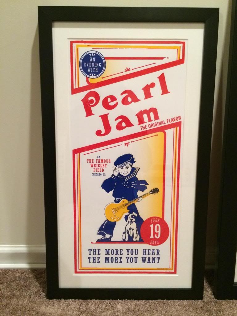
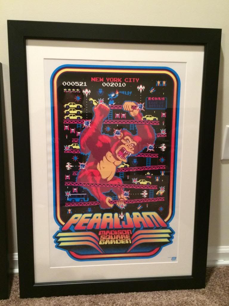 Post edited by 63schoefflin on'08- Camden 1-2 '09- Chicago 2; Spectrum 1-4
'10- MSG 1-2 '11- PJ20
'12- MIA; DeLuna '13- Wrigley; Pitt; Brooklyn 1-2; Philly 1-2; Baltimore; Seattle
'14- Denver '16- Philly 1-2; MSG 2
'17- Pilgrimage Music Fest (Eddie)
'18- Fenway0 -
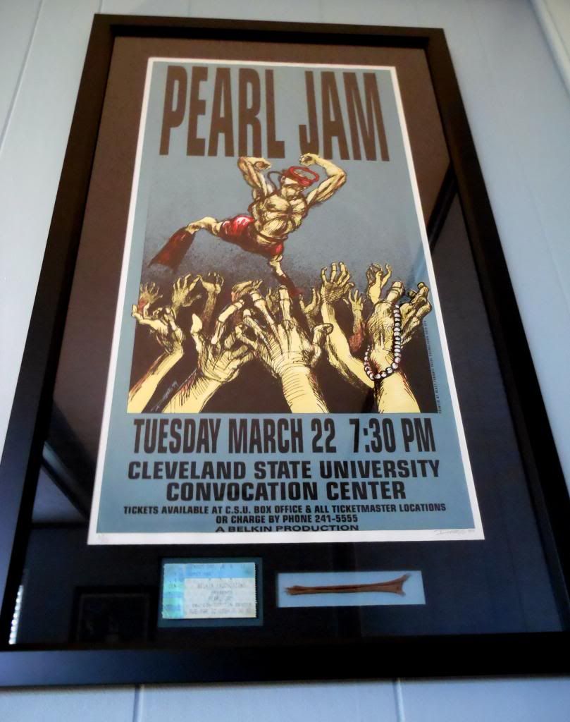
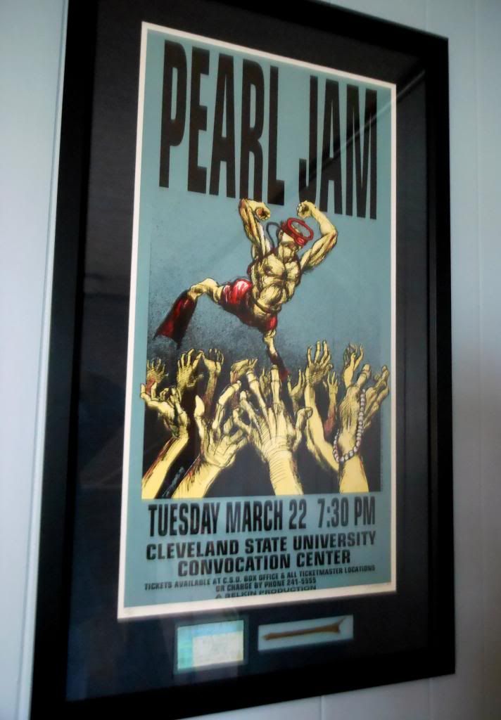
At DerbyDave's request, here are a couple pics of Julia's work on my 94 Hess. This is the first print I ever bought from my first PJ show. #67 of 350 bought directly from Derek Hess at a record show for a whopping $20. She did an amazing job. Unfortunately, the pics don't do it justice as you can't really see the detail in the matte which has a really nice, almost blue/black texture to it. I tried to get some tight shots but it just doesn't read very well. She also floated my beat up ticket stub as well as another little souvenier that has a story behind it.
 0
0 -
derbydave said:
Just got home from the Framing Center...picked up these beauties!!
PJ Portland '13 / EMEK:
Matte Detail:
The top matte has a shiny gold linen finish and the fillet between the mattes has a blue wash to match the bottom matte!!
Because the back of this one is almost as nice as the front...Julia cut a black matte and used a sheet of plexiglass to protect the back of the poster.
HUGE thanks to my Seattle '13 ticket buddy Crazy Marcus for grabbing this poster for me at the Portland show...one of my favorites from the Lightning Bolt tour!!
Julia also did an AMAZING job framing this EMEK handbill for me.
When I dropped it off, I told her to just "Surprise" me with the finished project...here's what she did!!
I LOVE the different textures & finishes she used in the mattes & frame:
The frame itself is basically a silver mirror and really looks sweet!!
Dropped off my Band Of Horses / Acoustic at The Ryman Hatch print today and should have it back in a few weeks!!
AND...Just wait until you see what Julia did for Matt / Heisenberg's Cleveland '94 Hess print...It's INCREDIBLE!!
Incredible as usual Dave !!!
Those look great !!!
I have that '94 Hess print framed also so I'm anxious to see that one too.
So Dave, I was wondering, with all of these fantastic frame jobs you have, is every room in your house a 2 story room and completely absent of any windows and the walls completely covered in all of this great artwork? 3/22/94 Cleveland, OH
9/21/96 Toronto, ON
8/26/98 Cleveland, OH
5/09/10 Cleveland, OH
9/03/11 East Troy, WI PJ20
9/04/11 East Troy, WI PJ20
7/19/13 Chicago, IL Wrigley Field
10/11/13 Pittsburgh, PA
10/12/13 Buffalo, NY
12/06/13 Seattle, WA
10/16/14 Detroit, MI
10/17/14 Moline, IL
8/20/16 Chicago, IL Wrigley Field
8/22/16 Chicago, IL Wrigley Field0 -
Didn't you hear, Jason? Dave and I are going to open a PJ Poster museum in Findley to display all of the masterpieces!jason_94 said:derbydave said:Just got home from the Framing Center...picked up these beauties!!
PJ Portland '13 / EMEK:
Matte Detail:
The top matte has a shiny gold linen finish and the fillet between the mattes has a blue wash to match the bottom matte!!
Because the back of this one is almost as nice as the front...Julia cut a black matte and used a sheet of plexiglass to protect the back of the poster.
HUGE thanks to my Seattle '13 ticket buddy Crazy Marcus for grabbing this poster for me at the Portland show...one of my favorites from the Lightning Bolt tour!!
Julia also did an AMAZING job framing this EMEK handbill for me.
When I dropped it off, I told her to just "Surprise" me with the finished project...here's what she did!!
I LOVE the different textures & finishes she used in the mattes & frame:
The frame itself is basically a silver mirror and really looks sweet!!
Dropped off my Band Of Horses / Acoustic at The Ryman Hatch print today and should have it back in a few weeks!!
AND...Just wait until you see what Julia did for Matt / Heisenberg's Cleveland '94 Hess print...It's INCREDIBLE!!
Incredible as usual Dave !!!
Those look great !!!
I have that '94 Hess print framed also so I'm anxious to see that one too.
So Dave, I was wondering, with all of these fantastic frame jobs you have, is every room in your house a 2 story room and completely absent of any windows and the walls completely covered in all of this great artwork?
 2013 Wrigley, Pittsburgh, Buffalo
2014 Cincy, Detroit, Moline, & Milwaukee
2015 Central Park
2016 Lexington, Ottawa, Toronto 1 & 2, Boston 1 & 2, Chicago 1 & 2
2017 Rock and Roll Hall of Fame Induction Ceremony
2018 Seattle 1 & 2, Missoula, Chicago 10 -
More amazing stuff. Wow. Derbydave, these prices are insanely low for what you are getting. We went to Michaels with our wedding show poster (EV solo Memphis 2012) and ended up making it more simple and simple to lower the price. In the end, we got no matte, and a frame around it and I think we paid like 160 dollars for that. We were high-spirited when we went there, and also wanted to get our PJ20 Brad Klausen framed, but decided against it because it was so freaking expensive. Now we resorted to getting regular frames and a matte custom cut every now and then to frame our posters. I remember that back in Germany, it was equally painful to find proper framing as the poster from the Netherlands said. Eurpoe has a different framing tradition. I think in the US stuff is more readily available and people get more creative for less money because framing memorabilia like sports team jeryes and stuff like that is very popular here. It is like a different framing culture. In Germany, I usually got my frames from Ikea. My Dad had a matte cutter that I used. It was not fancy, but they looked okay. We are still planning on getting our red LB LP framed with all the stickers and tickets to the shows we went to last fall, but that will have to wait. House renovation is more important right now...
And is that PJ poster museum a real idea of you guys?! Let us know when and where if so Please, Pearl Jam, consider a Benaroya Hall vinyl reissue! http://community.pearljam.com/discussion/148993/please-pearl-jam-consider-a-vinyl-benaroya-hall-re-issue0
 -
Oopsie, double post ...Post edited by Leezestarr313 onPlease, Pearl Jam, consider a Benaroya Hall vinyl reissue! http://community.pearljam.com/discussion/148993/please-pearl-jam-consider-a-vinyl-benaroya-hall-re-issue0
-
My framing shop has a sign in their window that says "Our normal prices are BETTER than Michael's 60% off coupons" and then I get a 25% discount because of all the work I have done there...PLUS, I'm supporting a smaller LOCAL business instead of a big box retailer...it's a WIN/WIN if you ask me!!'96: Seattle: Key Arena
'98: Seattle: Memorial Stadium 1 & 2
'00: Columbus: Polaris
'03: Columbus: Germain
'10: Columbus: Nationwide Arena
'11: East Troy: Alpine Valley - PJ20 1 & 2 + EV Detroit
'12: Missoula + EV Jacksonville 1 & 2
'13: Chicago / Pittsburgh / Buffalo / Seattle
'14: Cincinnati / St. Louis / Tulsa / Lincoln / Memphis / Detroit / Moline
'15: New York City - Global Citizen Festival
'16: Greenville / Hampton / Raleigh / Columbia / Lexington / Ottawa / Toronto 1 & 2 / Wrigley 1 & 2
'17: Brooklyn - Rock & Roll Hall of Fame Induction Ceremony
'18: London 1 & 2 / Seattle 1 & 2 / Missoula / Wrigley 1
'22: Nashville / St. Louis0 -
Definitely ^:)^ =D>Please, Pearl Jam, consider a Benaroya Hall vinyl reissue! http://community.pearljam.com/discussion/148993/please-pearl-jam-consider-a-vinyl-benaroya-hall-re-issue0
-
Heisenberg said:
At DerbyDave's request, here are a couple pics of Julia's work on my 94 Hess. This is the first print I ever bought from my first PJ show. #67 of 350 bought directly from Derek Hess at a record show for a whopping $20. She did an amazing job. Unfortunately, the pics don't do it justice as you can't really see the detail in the matte which has a really nice, almost blue/black texture to it. I tried to get some tight shots but it just doesn't read very well. She also floated my beat up ticket stub as well as another little souvenier that has a story behind it.


Looks great!!!
That was also my 1st show.
How were your seats/GA?
Also, what is that you have next to the ticket?
3/22/94 Cleveland, OH
9/21/96 Toronto, ON
8/26/98 Cleveland, OH
5/09/10 Cleveland, OH
9/03/11 East Troy, WI PJ20
9/04/11 East Troy, WI PJ20
7/19/13 Chicago, IL Wrigley Field
10/11/13 Pittsburgh, PA
10/12/13 Buffalo, NY
12/06/13 Seattle, WA
10/16/14 Detroit, MI
10/17/14 Moline, IL
8/20/16 Chicago, IL Wrigley Field
8/22/16 Chicago, IL Wrigley Field0 -
I KNOW what it is...but Matt has to tell you the story Jason...It's a GOOD ONE!!jason_94 said:Heisenberg said:At DerbyDave's request, here are a couple pics of Julia's work on my 94 Hess. This is the first print I ever bought from my first PJ show. #67 of 350 bought directly from Derek Hess at a record show for a whopping $20. She did an amazing job. Unfortunately, the pics don't do it justice as you can't really see the detail in the matte which has a really nice, almost blue/black texture to it. I tried to get some tight shots but it just doesn't read very well. She also floated my beat up ticket stub as well as another little souvenier that has a story behind it.


Looks great!!!
That was also my 1st show.
How were your seats/GA?
Also, what is that you have next to the ticket?
Let's just say he DEFINITELY had GA tickets for this show!!!
^:)^'96: Seattle: Key Arena
'98: Seattle: Memorial Stadium 1 & 2
'00: Columbus: Polaris
'03: Columbus: Germain
'10: Columbus: Nationwide Arena
'11: East Troy: Alpine Valley - PJ20 1 & 2 + EV Detroit
'12: Missoula + EV Jacksonville 1 & 2
'13: Chicago / Pittsburgh / Buffalo / Seattle
'14: Cincinnati / St. Louis / Tulsa / Lincoln / Memphis / Detroit / Moline
'15: New York City - Global Citizen Festival
'16: Greenville / Hampton / Raleigh / Columbia / Lexington / Ottawa / Toronto 1 & 2 / Wrigley 1 & 2
'17: Brooklyn - Rock & Roll Hall of Fame Induction Ceremony
'18: London 1 & 2 / Seattle 1 & 2 / Missoula / Wrigley 1
'22: Nashville / St. Louis0 -
I want to know, too! Says little sister following behind her big brothers! lol2013 Wrigley, Pittsburgh, Buffalo
2014 Cincy, Detroit, Moline, & Milwaukee
2015 Central Park
2016 Lexington, Ottawa, Toronto 1 & 2, Boston 1 & 2, Chicago 1 & 2
2017 Rock and Roll Hall of Fame Induction Ceremony
2018 Seattle 1 & 2, Missoula, Chicago 10 -
derbydave said:
I KNOW what it is...but Matt has to tell you the story Jason...It's a GOOD ONE!!jason_94 said:Heisenberg said:At DerbyDave's request, here are a couple pics of Julia's work on my 94 Hess. This is the first print I ever bought from my first PJ show. #67 of 350 bought directly from Derek Hess at a record show for a whopping $20. She did an amazing job. Unfortunately, the pics don't do it justice as you can't really see the detail in the matte which has a really nice, almost blue/black texture to it. I tried to get some tight shots but it just doesn't read very well. She also floated my beat up ticket stub as well as another little souvenier that has a story behind it.


Looks great!!!
That was also my 1st show.
How were your seats/GA?
Also, what is that you have next to the ticket?
Let's just say he DEFINITELY had GA tickets for this show!!!
^:)^
I figured as much! 3/22/94 Cleveland, OH
9/21/96 Toronto, ON
8/26/98 Cleveland, OH
5/09/10 Cleveland, OH
9/03/11 East Troy, WI PJ20
9/04/11 East Troy, WI PJ20
7/19/13 Chicago, IL Wrigley Field
10/11/13 Pittsburgh, PA
10/12/13 Buffalo, NY
12/06/13 Seattle, WA
10/16/14 Detroit, MI
10/17/14 Moline, IL
8/20/16 Chicago, IL Wrigley Field
8/22/16 Chicago, IL Wrigley Field0 -
Story???"This here's a REQUEST!"
EV intro to Chloe Dancer / Crown of Thorns
10/25/13 Hartford0 -
So essentially the story is this... As Jason_94 can attest, during "Porch" Ed was standing up on top of part of the PA to the side of the stage. I was about 3 people deep on the barricade. As he got down from the PA and started across the stage I suddenly got decked by security. When I looked to see why I just got a forearm in my face, I realized it was because Ed was basically laying next to me in the pit. He had stage dived only instead of passing him around, they caught him and half of the idiot crowd started tearing at him. You could hear him saying "Pick me up!". As I grabbed on to help lift him up, his shirt tore away and my friend and I ended up with part of it in our hands. That's what is in the frame. It's dorky but how the hell can you throw away a piece of Ed's shirt from your 1st PJ show? When I was looking for elements to put in the frame, I decided it should go in.0
-
Fantastic story and memory, Heisenberg! Not dorky at all. Thanks for sharing.
Classic that the poster is a "stage diver". Torn shirt from stage diving Eddie is the perfect accompaniment!2013 Wrigley, Pittsburgh, Buffalo
2014 Cincy, Detroit, Moline, & Milwaukee
2015 Central Park
2016 Lexington, Ottawa, Toronto 1 & 2, Boston 1 & 2, Chicago 1 & 2
2017 Rock and Roll Hall of Fame Induction Ceremony
2018 Seattle 1 & 2, Missoula, Chicago 10 -
Wow, some amazing frame jobs on this page!! I love you guys dedication to this.Like a book among the many on a shelf...
Dublin 02 Arena - 22/6/10. Belfast Odyssey Arena - 23/6/10. London Hyde Park - 25/6/10. Berlin Wuhlheide - 30/6/10.
Manchester MEN - 20/06/12. Manchester MEN - 21/06/120 -
Just got this back from the poster shop today
 2000 - Chicago, IL
2003 - Champaign, IL
2006 - Chicago, IL 1 & 2
2007 - Chicago, IL Lollapalooza
2009 - Chicago, IL 1 & 2
2010 - St. Louis, MO
2011 - East Troy, WI 1 & 2 (PJ20 Destination Weekend)
2012 - Atlanta, GA, Missoula, MT
2013 - Chicago, IL (Wrigley Field), Dallas, TX, Oklahoma City, OK
2014 - St. Louis, MO, Tulsa, OK, Moline, IL (No Code, IL), Saint Paul, MN, Milwaukee, WI (Yield, WI)
2016 - Greenville, SC (Vs, SC), Raleigh, NC, Columbia, SC, Boston, MA (Fenway Park 1), Chicago, IL (Wrigley Field 1 & 2)2018 - Seattle, WA (Safeco Field 2), Chicago, IL (Wrigley Field 1 & 2), Boston, MA (Fenway Park 2)2020 - Nashville, TN, St. Louis, MO, Oklahoma City, OK, Phoenix, AZ, ??
2022 - Nashville, TN, St. Louis, MO, Oklahoma City, OK, Phoenix, AZ, Las Vegas, NV
2023 - St. Paul, MN 2, Fort Worth, TX 2, Austin, TX 1, and Austin, TX 22024 - Portland, OR and Chicago, IL (Wrigley Field 1 & 2)2025 - Pittsburgh, PA1 & Pittsburgh PA22012 - Temple of the Dog East Troy, WI (PJ20 Destination Weekend)
2014 - Soundgarden Tinley Park, IL (with Nine Inch Nails)2014 - Alice in Chains Davenport, IA2016 - Chris Cornell Solo Madison, WI and Peoria, IL (official hometown show)2016 - Temple of the Dog San Francisco, CA (both shows)
2017 - Soundgarden Dallas (cancelled) RIP Chris Cornell2018 - Smashing Pumpkins Chicago, IL (first show)2019 - Alice in Chains Milwaukee, WI2022 - Jerry Cantrell Chicago, IL
2023 - Jerry Cantrell Milwaukee, WIRIP Andrew Wood, Kurt Cobain, Layne Staley, and Chris CornellRIP Mom (may your star shine the brightest in the sky, our family loves and misses you very much, we'll meet again)0 -
Hi, Matt. Love the story behind this! Tour dates soon, I hope...then you and Dave can decide on Beck at Red Rocks. Definitely will want to meet up with you if the Beck show is in the cards for you guys!Heisenberg said:At DerbyDave's request, here are a couple pics of Julia's work on my 94 Hess. This is the first print I ever bought from my first PJ show. #67 of 350 bought directly from Derek Hess at a record show for a whopping $20. She did an amazing job. Unfortunately, the pics don't do it justice as you can't really see the detail in the matte which has a really nice, almost blue/black texture to it. I tried to get some tight shots but it just doesn't read very well. She also floated my beat up ticket stub as well as another little souvenier that has a story behind it.


I'll ride the wave where it takes me...Orlando 4/24/92 & 8/23/92, Miami 3/28/94, Ft Laud 10/7/96, Alpine Valley 6/26/98, Missoula 9/30/12, EV Jax 11/24/12 & 11/25/12, Chicago (Wrigley) 7/19/13, Charlottesville 10/29/13, Charlotte 10/30/13, Tulsa 10/8/14, Lincoln 10/9/14, Denver 10/22/14, Jacksonville 4/12/16, Greenville 4/16/16, Telluride 7/9/16, Boston (Fenway) 8/5/16 & 8/7/16, Seattle (Safeco) 8/10/18, Boston (Fenway) 9/2/18 & 9/4/18, Dana Point 10/1/21 & 10/2/21, MSG 9/11/22, Denver 9/22/22, Austin 9/18/23 & 9/19/23.0 -
Hey Ginger...PorchgirlCO said:
Hi, Matt. Love the story behind this! Tour dates soon, I hope...then you and Dave can decide on Beck at Red Rocks. Definitely will want to meet up with you if the Beck show is in the cards for you guys!Heisenberg said:At DerbyDave's request, here are a couple pics of Julia's work on my 94 Hess. This is the first print I ever bought from my first PJ show. #67 of 350 bought directly from Derek Hess at a record show for a whopping $20. She did an amazing job. Unfortunately, the pics don't do it justice as you can't really see the detail in the matte which has a really nice, almost blue/black texture to it. I tried to get some tight shots but it just doesn't read very well. She also floated my beat up ticket stub as well as another little souvenier that has a story behind it.


We pretty much decided to skip the Beck shows at The Ryman & Red Rocks...
Matt went to the Santa Barbara show when we were out in Vegas for the NAB Convention in April and we are seeing him here in Columbus and up in Detroit in June!!
Let's try and figure out a good PJ show that we can all hit on the fall tour...I'd love to see you and JP too if we can all get together!!'96: Seattle: Key Arena
'98: Seattle: Memorial Stadium 1 & 2
'00: Columbus: Polaris
'03: Columbus: Germain
'10: Columbus: Nationwide Arena
'11: East Troy: Alpine Valley - PJ20 1 & 2 + EV Detroit
'12: Missoula + EV Jacksonville 1 & 2
'13: Chicago / Pittsburgh / Buffalo / Seattle
'14: Cincinnati / St. Louis / Tulsa / Lincoln / Memphis / Detroit / Moline
'15: New York City - Global Citizen Festival
'16: Greenville / Hampton / Raleigh / Columbia / Lexington / Ottawa / Toronto 1 & 2 / Wrigley 1 & 2
'17: Brooklyn - Rock & Roll Hall of Fame Induction Ceremony
'18: London 1 & 2 / Seattle 1 & 2 / Missoula / Wrigley 1
'22: Nashville / St. Louis0 -
Julia finished my Band Of Horses / Hatch print from their show at The Ryman back in March...

Matte Detail:
Julia did a custom cut on the top matte to match a Ryman patch I bought at the gift shop and floated it on a gold textured matte.
She put a blue denim textured matte around the print to go with the ink color...and used a dark brown linen matte for the pictures from the show and a postcard of The Ryman's stained glass windows. She also floated my ticket stub on top of this matte!!
I'm not sure...BUT...I may be FINISHED with my framing projects for now!!
Finally running out of wall space and would have to take something down to put a new project up!!'96: Seattle: Key Arena
'98: Seattle: Memorial Stadium 1 & 2
'00: Columbus: Polaris
'03: Columbus: Germain
'10: Columbus: Nationwide Arena
'11: East Troy: Alpine Valley - PJ20 1 & 2 + EV Detroit
'12: Missoula + EV Jacksonville 1 & 2
'13: Chicago / Pittsburgh / Buffalo / Seattle
'14: Cincinnati / St. Louis / Tulsa / Lincoln / Memphis / Detroit / Moline
'15: New York City - Global Citizen Festival
'16: Greenville / Hampton / Raleigh / Columbia / Lexington / Ottawa / Toronto 1 & 2 / Wrigley 1 & 2
'17: Brooklyn - Rock & Roll Hall of Fame Induction Ceremony
'18: London 1 & 2 / Seattle 1 & 2 / Missoula / Wrigley 1
'22: Nashville / St. Louis0
Categories
- All Categories
- 149.2K Pearl Jam's Music and Activism
- 110.3K The Porch
- 287 Vitalogy
- 35.1K Given To Fly (live)
- 3.5K Words and Music...Communication
- 39.4K Flea Market
- 39.4K Lost Dogs
- 58.7K Not Pearl Jam's Music
- 10.6K Musicians and Gearheads
- 29.1K Other Music
- 17.8K Poetry, Prose, Music & Art
- 1.1K The Art Wall
- 56.8K Non-Pearl Jam Discussion
- 22.2K A Moving Train
- 31.7K All Encompassing Trip
- 2.9K Technical Stuff and Help


