Least favorite album cover?
Comments
-
Pearl Jam
If I operated the trap door chair switch, you'd go through the floor. bahhhhhhh (full transparency; a vote against No Code album cover!)riley540 said:No love for back spacerPost edited by evsgjamm onVancouver '03, Paramount Theatre '05, Saskatoon '05, Calgary '05, Edmonton '05, Saskatoon '11, Calgary '11, Calgary '13
2010 WATCH IT GO TO FIRE!!0 -
Backspacer reminds me of something KISS would have put out around the late 70's really a very ordinary album cover and that is being polite.0
-
Pearl JamVoting self titled, I don't mind the cover art but can't get past the inner sleeves, band images, etc. Love the album tho0
-
Backspacer
Thats exactly why I love that one. Its clear evidence what and who was emerging from that 80s scene. The clothes are amazing! Tights and all.Abe Froman said:Ten is easily the worst. Super cheesy group high five. The reissue is slightly better with changing that really bad pink coloring of the original.
I love the rest of their album covers. Especially No Code & Binaural easily my two favorites0 -
BackspacerReally a toss up out of the last 4 for me, but I think Backspacer snuck in.0
-
Backspacer
I just simply don't like it. Tom Tomorrow is a great artist but this just didn't work for me.
Yield for the win.
0 -
Riot act
The fact that the cover has forced us to call it the "Avocado album" is reason enough to vote against self-titled.....drummerboy_73 said:Self-titled is my least favorite. Great album, but the cover is the least creative in my opinion.0 -
Backspacer
I am not in love with the cover (I don't hate it either - I mean, it's a halved avocado. How is that THAT bad?Spiritual_Chaos said:Pearl Jam is visual disaster. Sort of. Just so weird how they come to the decision to go with that art direction.
Backspacer doesn't have an illustration-style I really dig. The digital coloring and the gradients looks cheap. It is also weird having the cover split up in 9 tiles like that. Maybe should have been 9 variants instead.
Lightning bolt looks like "adobe illustrator tutorial for beginners No1". Not a fan of that clean look. Didn't work at all printed and on t-shirts and such.
Riot Act, Vitalogy and No Code are the champs.") ). But the inner gatefold art on that album is super duper cool IMO. I find it impossible to separate that from the front of it.
). But the inner gatefold art on that album is super duper cool IMO. I find it impossible to separate that from the front of it.
With all its sham, drudgery, and broken dreams, it is still a beautiful world. Be careful. Strive to be happy. ~ Desiderata0 -
Pearl Jamhuntersthompson said:
The fact that the cover has forced us to call it the "Avocado album" is reason enough to vote against self-titled.....drummerboy_73 said:Self-titled is my least favorite. Great album, but the cover is the least creative in my opinion.2014: Cincinnati
2016: Lexington and Wrigley 10 -
BackspacerWho said Vitalogy? Get a rope...0
-
Star Lake 00 / Pittsburgh 03 / State College 03 / Bristow 03 / Cleveland 06 / Camden II 06 / DC 08 / Pittsburgh 13 / Baltimore 13 / Charlottesville 13 / Cincinnati 14 / St. Paul 14 / Hampton 16 / Wrigley I 16 / Wrigley II 16 / Baltimore 20 / Camden 22 / Baltimore 24 / Raleigh I 25 / Raleigh II 25 / Pittsburgh I 250
-
Lightning bolt
excellent point.PJ_Soul said:
I am not in love with the cover (I don't hate it either - I mean, it's a halved avocado. How is that THAT bad?Spiritual_Chaos said:Pearl Jam is visual disaster. Sort of. Just so weird how they come to the decision to go with that art direction.
Backspacer doesn't have an illustration-style I really dig. The digital coloring and the gradients looks cheap. It is also weird having the cover split up in 9 tiles like that. Maybe should have been 9 variants instead.
Lightning bolt looks like "adobe illustrator tutorial for beginners No1". Not a fan of that clean look. Didn't work at all printed and on t-shirts and such.
Riot Act, Vitalogy and No Code are the champs. ). But the inner gatefold art on that album is super duper cool IMO. I find it impossible to separate that from the front of it. By The Time They Figure Out What Went Wrong, We'll Be Sitting On A Beach, Earning Twenty Percent.0 -
No Code
That would be sweet. @MedozK is more than welcome to use these results and a conclusion to round 1.HesCalledDyer said:We should get @MedozK to do an Album Cover weakest link.0 -
Pearl Jam
Votes for No Code and Vitalogy are rare cases that violate freedom of speech.tempo_n_groove said:Who said Vitalogy? Get a rope...Vancouver '03, Paramount Theatre '05, Saskatoon '05, Calgary '05, Edmonton '05, Saskatoon '11, Calgary '11, Calgary '13
2010 WATCH IT GO TO FIRE!!0 -
No Code
There's a set of lips on No Code that I just don't like very much. It's an an annoying set of lips to me.evsgjamm said:
Votes for No Code and Vitalogy are rare cases that violate freedom of speech.tempo_n_groove said:Who said Vitalogy? Get a rope...0 -
Pearl Jamhahaha. Just laughing over here. Fair enough to the odd set of lips.
That cover, when I first saw it in my early teen years, was all kinds of confusing to me too. Creepy in ways. Probably because of those damn lips! hahah.Vancouver '03, Paramount Theatre '05, Saskatoon '05, Calgary '05, Edmonton '05, Saskatoon '11, Calgary '11, Calgary '13
2010 WATCH IT GO TO FIRE!!0 -
Backspacerriley540 said:
There's a set of lips on No Code that I just don't like very much. It's an an annoying set of lips to me.evsgjamm said:
Votes for No Code and Vitalogy are rare cases that violate freedom of speech.tempo_n_groove said:Who said Vitalogy? Get a rope...
This gave me the giggles. Never heard lips described as "annoying" before.0 -
Vitalogy
I don't like letters with swirls...
Charlotte '96
Raleigh '03
Charlotte '13
Cincinnati '14
Greenville '16, Columbia '16
Nashville '220 -
Pearl Jamhaha. ahhhhhh too funny.Vancouver '03, Paramount Theatre '05, Saskatoon '05, Calgary '05, Edmonton '05, Saskatoon '11, Calgary '11, Calgary '13
2010 WATCH IT GO TO FIRE!!0 -
Pearl JamDW139059 said:
I don't like letters with swirls...
riley540 said:
There's a set of lips on No Code that I just don't like very much. It's an an annoying set of lips to me.evsgjamm said:
Votes for No Code and Vitalogy are rare cases that violate freedom of speech.tempo_n_groove said:Who said Vitalogy? Get a rope...Yeah, that must really make it worse than this...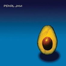 "Mostly I think that people react sensitively because they know you’ve got a point"0


Categories
- All Categories
- 148.9K Pearl Jam's Music and Activism
- 110.1K The Porch
- 274 Vitalogy
- 35K Given To Fly (live)
- 3.5K Words and Music...Communication
- 39.2K Flea Market
- 39.2K Lost Dogs
- 58.7K Not Pearl Jam's Music
- 10.6K Musicians and Gearheads
- 29.1K Other Music
- 17.8K Poetry, Prose, Music & Art
- 1.1K The Art Wall
- 56.8K Non-Pearl Jam Discussion
- 22.2K A Moving Train
- 31.7K All Encompassing Trip
- 2.9K Technical Stuff and Help