Ten Club members- Deep 3 Poster Contest
Comments
-
id say the first one too... and nice choice on the openers! my 3 favorite singers at one show would be pretty sweet!BetterManningNYG wrote:i had been working on three different designs when i found out that the contest was limited to one entry per person. so i decided to finish all three and then pick out the one that i wanted to submit...
but i'm having some trouble deciding. so if anyone wants to give me their opinion on which of the three posters below i should submit, it would be greatly appreciated.")
1) http://s169.photobucket.com/albums/u207/nyy2451/?action=view¤t=pearljam_entry1.jpg
2) http://s169.photobucket.com/albums/u207/nyy2451/?action=view¤t=pearljam_entry2.jpg
3) http://s169.photobucket.com/albums/u207/nyy2451/?action=view¤t=pearljam_entry3.jpg
i think i like the graphic on #1 the best, but the lettering looks kinda sloppy compared to #2 and #3.
help me out if you can... thanks!0 -
as stated in the contest thread (and Santos confirmed 1 entry per member):bertan wrote:ok i've got some questions:
1) are we definately sure that it is 1 entry per member?
2) is there a file size limit for online sumbissions? or for the dimensions for the jpg? should it be print quality?
3) i didn't recieve my copy of deep, does it say anything else than the website? for example, should the subject of the email for online submissions be something specific?
it's my first competition, i'm quite nervous)
thanks a lot
RULES:
* 11 x 17 inches, 4 colors maximum
* You must include your full name, member number, address, phone number and email address with your entry
* The Ten Club reserves the right to include your name and winning entry in Ten Club promotional material including the next newsletter and/or the pearljam.com website.
* Entries will be considered property of the Ten Club and will not be returned.
* Do not use or send any hazardous or harmful materials with your entry or you will be disqualified and legal action may be taken against you.
* You must be an active Ten Club member to participate.
* All entries must be postmarked by December 31, 2007 to qualify.
* By entering this contest, you acknowledge these rules and agree to abide by them.0 -
all4PearlJam wrote:as stated in the contest thread (and Santos confirmed 1 entry per member):
RULES:
* 11 x 17 inches, 4 colors maximum
* You must include your full name, member number, address, phone number and email address with your entry
* The Ten Club reserves the right to include your name and winning entry in Ten Club promotional material including the next newsletter and/or the pearljam.com website.
* Entries will be considered property of the Ten Club and will not be returned.
* Do not use or send any hazardous or harmful materials with your entry or you will be disqualified and legal action may be taken against you.
* You must be an active Ten Club member to participate.
* All entries must be postmarked by December 31, 2007 to qualify.
* By entering this contest, you acknowledge these rules and agree to abide by them.
well i've seen this, but it doesn't say anything about file size. what concerns me is that, it didn't say anything about number of submissions as well, but look what happened..."hey na na na na hey that's something"
30.09.2006 Athens | 18.06.2007 London | 18.08.2009 London | 05.07.2014 Werchter | 17.07.2018 London | 08.07.2022 London0 -
1 submission - trust me. Santos or Rubysdad posted 1 per member. And as for file size, I dunno - I mailed mine in. I would contact the 10C about that...bertan wrote:well i've seen this, but it doesn't say anything about file size. what concerns me is that, it didn't say anything about number of submissions as well, but look what happened...0 -
BetterManningNYG wrote:i had been working on three different designs when i found out that the contest was limited to one entry per person. so i decided to finish all three and then pick out the one that i wanted to submit...
but i'm having some trouble deciding. so if anyone wants to give me their opinion on which of the three posters below i should submit, it would be greatly appreciated.
1) http://s169.photobucket.com/albums/u207/nyy2451/?action=view¤t=pearljam_entry1.jpg
2) http://s169.photobucket.com/albums/u207/nyy2451/?action=view¤t=pearljam_entry2.jpg
3) http://s169.photobucket.com/albums/u207/nyy2451/?action=view¤t=pearljam_entry3.jpg
i think i like the graphic on #1 the best, but the lettering looks kinda sloppy compared to #2 and #3.
help me out if you can... thanks!
I like #1 the best...i'd prolly buy it2005: Borgata 2, Philly
2006: Camden 1&2, East Ruth 1&2
2008: BONNAROO, MSG1, MSG2, Hartford
2009: Philly 1, 2, 4
2010: Hartford, MSG1, MSG2
2012: Made in America
2013: BK1, BK2, Hartford
2015: Global Citizens
2016: MSG 2 (ISO MSG1)
EV Solo: NJPAC 2008; Tower Theatre, PA 2009; Hartford 20110 -
CantKeepFukinUp wrote:Definitely the first one. It kicks ass man!
I just sent mine in. I'm pretty happy with it. Just wish I could send in multiple entries though. Fingers crossed.sgossard3 wrote:id say the first one too... and nice choice on the openers! my 3 favorite singers at one show would be pretty sweet!Yellow Bedwetter wrote:I like #1 the best...i'd prolly buy it
thanks!
i'll probably end up going with the first one. that seems to be the consensus. i'm not expecting to win, but i'm happy with that one as an entry.
good luck to everyone! 0 -
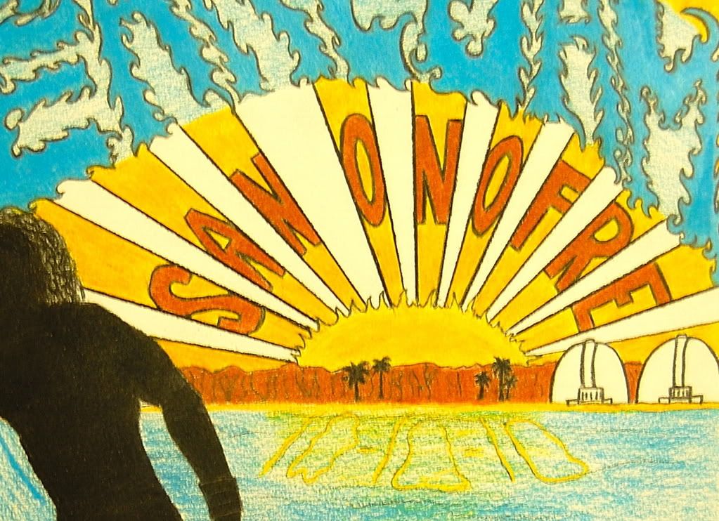
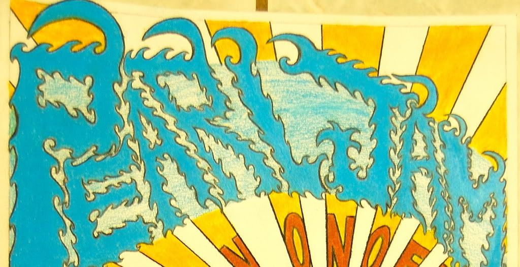
Wheh! Finally finished. All drawn by hand, colored in photoshop.
http://img263.imageshack.us/img263/1480/1117li0.jpg
Detail
http://img263.imageshack.us/img263/424/detailjc3.jpg0 -
You drew that by hand? Incredible.Max_Powers wrote:Wheh! Finally finished. All drawn by hand, colored in photoshop.
http://img263.imageshack.us/img263/1480/1117li0.jpg
Detail
http://img263.imageshack.us/img263/424/detailjc3.jpg "I'd rather be with an animal." "Those that can be trusted can change their mind." "The in between is mine." "If I don't lose control, explore and not explode, a preternatural other plane with the power to maintain." "Yeh this is living." "Life is what you make it."0 -
I just finished mine and sent it out.
It was hand drawn then illustrated in Adobe Illustrator.
A bit controversial but hey, it's Pearl Jam.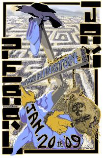
I am having a run of 25 printed as 11x17. I will mail out a copy to the first 20 people who PM me their mailing info, if anyone would like one.
I think it would be cool to set up a poster swap thread once all the entries are submitted for anyone interseted.0 -
Hey did any of you got email confirmation from 10c that your poster is received????
anything???CAN'T KEEP CRAZY MARY IN MY TREE NO WAY NOT FOR YOU. ALL THOSE YESTERDAY JEREMY is ALONE, SAD with RATS & BUGS it's HARD TO IMAGINE a JEREMY a BETTER MAN.
LIFE WASTED, BLOOD on the PORCH, LAST KISS is a WISHLIST DEEP DOWN NOTHING AS IT SEEMS WHY GO COME BACK ALIVE SPIN THE BLACK CIRCLE and SMILE.0 -
Have a problem. Working on a poster. But I don't know what type of text top use. Should it be incoorporated into the design or not. So here are two versions, what works best? (the poster is not finished but yeah I think you get the point)

or "Mostly I think that people react sensitively because they know you’ve got a point"0
 -
I like the red type but maybe change the font for ToTD to make it stand apart a bit. I really like the starkness of your design, it translates well.0
-
We Need To See All The Posters And Vote For The Best!!0
-
Spiritual_Chaos wrote:Have a problem. Working on a poster. But I don't know what type of text top use. Should it be incoorporated into the design or not. So here are two versions, what works best? (the poster is not finished but yeah I think you get the point)
or
incorporate it in the design.
excellent work by the way. very clever concept and very well executed. it looks great!0 -
Spiritual_Chaos wrote:Have a problem. Working on a poster. But I don't know what type of text top use. Should it be incoorporated into the design or not. So here are two versions, what works best? (the poster is not finished but yeah I think you get the point)
or
Holy crap. Why did I even try for this contest... All the posters are sooooo good.
TEN C hire your fans instead!!!!!!!! (sorry bk )
p.s. I like the red color, but feel the typo is too simple and your poster seems too divided in two parts now. The second one istoo much. I had the same trouble with the typography...and still not totallyhappy with it...
Please post your images in the ART-WALL after your finished...pretty please") Why not be mediocre and be the best at it that you can be?0
Why not be mediocre and be the best at it that you can be?0 -
Spiritual_Chaos wrote:Have a problem. Working on a poster. But I don't know what type of text top use. Should it be incoorporated into the design or not. So here are two versions, what works best? (the poster is not finished but yeah I think you get the point)
or
i really like the second one (i'm always a big fan of the lettering being incorporated into the design). but i also like the atmosphere created by the addition of the red color.
if there's a way for you to use the second one but still incorporate the red color, i think that could be cool...0 -
here is mine, pics taken by me and then afterworks in photoshop
http://www.dobbeld.be/pjpostersmall.jpgGreets Dave
Antwerp -Belgium- Europe0 -
yielder - nice one!
Mine is sent in now. I choose not to use the "pearl jam text in water" thing and just red letters. Will be fun to see more submissions and see who wins. I bet 1000+ is entering this contest "Mostly I think that people react sensitively because they know you’ve got a point"0 -
What happens if you send in several posters, do the judge the last one? Got another idea for the text on my poster so thinking about sending in a new one tomorrow..."Mostly I think that people react sensitively because they know you’ve got a point"0
-
Here is part of my poster, I am not ready to show the entire thing yet.
 0
0


Categories
- All Categories
- 148.9K Pearl Jam's Music and Activism
- 110.1K The Porch
- 275 Vitalogy
- 35.1K Given To Fly (live)
- 3.5K Words and Music...Communication
- 39.2K Flea Market
- 39.2K Lost Dogs
- 58.7K Not Pearl Jam's Music
- 10.6K Musicians and Gearheads
- 29.1K Other Music
- 17.8K Poetry, Prose, Music & Art
- 1.1K The Art Wall
- 56.8K Non-Pearl Jam Discussion
- 22.2K A Moving Train
- 31.7K All Encompassing Trip
- 2.9K Technical Stuff and Help