framed poster thread
Comments
-
you do this at Michaels? you remember what blue you used? that exactly the way i wanna frame minemrussel1 said:
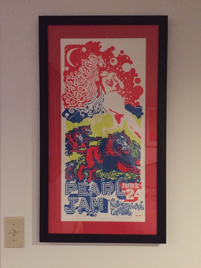
So I framed something with beige as the base and I didn't like it. I felt like it neutralized the whole piece, rather than making the colors pop. I ended up putting blue on top and I'm much happier. Your results may vary, but I just didn't like it when it was done. Here they are:Holland said:
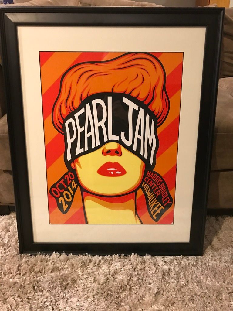
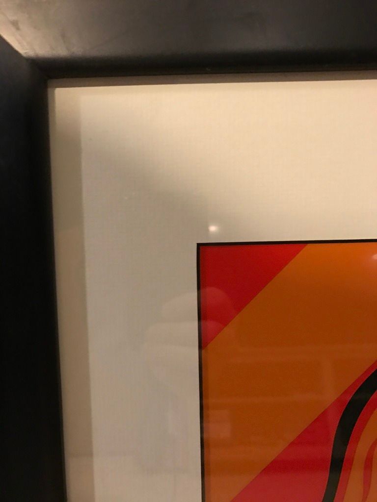
I just followed this advice with The Catch and used brown as a matte. It really makes Pearl Jam pop out but not sure if I want to be so close to the Worcester matte. I am never going to decide haha.fl4tdriven said:
A bit of advice that I recently learned is that a good starting point is to use the same or a similar color to the main focus of the print. So if the letters 'Pearl Jam' are in a light blue, start with a light blue and work from there.Holland said:Another quick question. While trying to match up mattes I seem to want to match a colour that is displayed on the print. For example I can not get away from trying to use a blue and/or red matte for The Catch and with my Worcester 1 poster I keep going back to orange and brown. Is this the way most people do their framing by trying to match and bring out colours that are already in the print?
 Marquee 91
Wetlands 91
CBGB 91
Roseland 91
and many, many more0 -
I do the same and it's always been the recommendation of my framer.mrussel1 said:
That's what I do.. try to draw colors out. I'm not sure a real artist would do that or not though.Holland said:Another quick question. While trying to match up mattes I seem to want to match a colour that is displayed on the print. For example I can not get away from trying to use a blue and/or red matte for The Catch and with my Worcester 1 poster I keep going back to orange and brown. Is this the way most people do their framing by trying to match and bring out colours that are already in the print?
Star Lake 00 / Pittsburgh 03 / State College 03 / Bristow 03 / Cleveland 06 / Camden II 06 / DC 08 / Pittsburgh 13 / Baltimore 13 / Charlottesville 13 / Cincinnati 14 / St. Paul 14 / Hampton 16 / Wrigley I 16 / Wrigley II 16 / Baltimore 20 / Camden 22 / Baltimore 24 / Raleigh I 25 / Raleigh II 25 / Pittsburgh I 250 -
I did it myself but the two bottom mats were from Michael's and the top blue was from AC Moore. Michael's has a very similar blue. The good thing about this poster is that there are several different shades of blue in it, so almost any of them will match and look good. I have found that AC Moore has MANY more options when it comes to the 'standard' colors... the ones that are 8.99 vs the premium which go from $15 to $50. I use those when I want something textured or the color is unique. The frame is from Michael's too.JP218404 said:
you do this at Michaels? you remember what blue you used? that exactly the way i wanna frame minemrussel1 said:
So I framed something with beige as the base and I didn't like it. I felt like it neutralized the whole piece, rather than making the colors pop. I ended up putting blue on top and I'm much happier. Your results may vary, but I just didn't like it when it was done. Here they are:Holland said:
I just followed this advice with The Catch and used brown as a matte. It really makes Pearl Jam pop out but not sure if I want to be so close to the Worcester matte. I am never going to decide haha.fl4tdriven said:
A bit of advice that I recently learned is that a good starting point is to use the same or a similar color to the main focus of the print. So if the letters 'Pearl Jam' are in a light blue, start with a light blue and work from there.Holland said:Another quick question. While trying to match up mattes I seem to want to match a colour that is displayed on the print. For example I can not get away from trying to use a blue and/or red matte for The Catch and with my Worcester 1 poster I keep going back to orange and brown. Is this the way most people do their framing by trying to match and bring out colours that are already in the print?
0 -
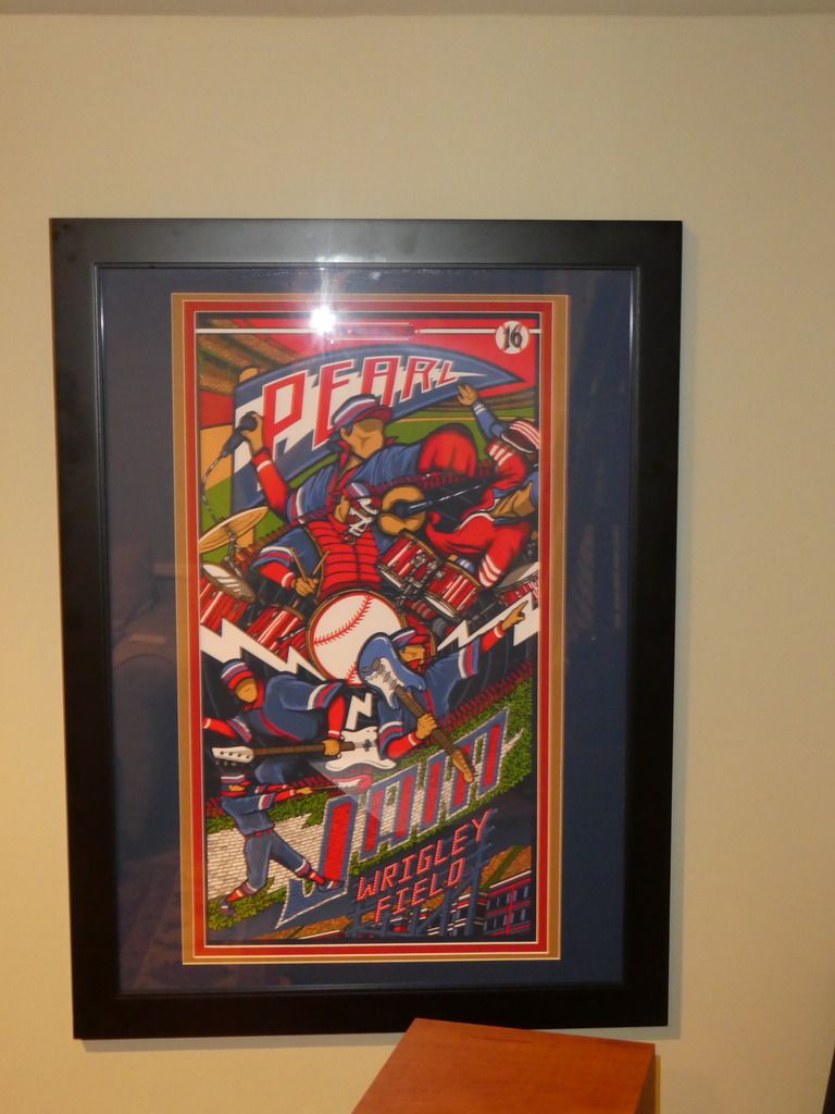
I actually framed that one already but it's a straight up 12 X 36 with no bells and whistles. Maybe down the road I may give it the proper treatment but I think with all of its colors it looks pretty good on its own.mrussel1 said:
Sounds good. Love to see Quebec when that's done too. I have that as well and need to figure out what to do. I really like the print though.Holland said:
I agree the blue does look better. Great job. I felt the same way with the brown for my print. I am now looking at doing a top matte of Bay blue and a bottom one of dark chocolate. It will still bring the brown out of the name but not overshadow the print. I am all set with my worcester print too. I am going with a tangerine orange on top and dark chocolate again for the bottom. Hopefully having 2 dark chocolate mattes look good side by side in the same room. If not I may split them up with Quebec in the middle.mrussel1 said:
So I framed something with beige as the base and I didn't like it. I felt like it neutralized the whole piece, rather than making the colors pop. I ended up putting blue on top and I'm much happier. Your results may vary, but I just didn't like it when it was done. Here they are:Holland said:
I just followed this advice with The Catch and used brown as a matte. It really makes Pearl Jam pop out but not sure if I want to be so close to the Worcester matte. I am never going to decide haha.fl4tdriven said:
A bit of advice that I recently learned is that a good starting point is to use the same or a similar color to the main focus of the print. So if the letters 'Pearl Jam' are in a light blue, start with a light blue and work from there.Holland said:Another quick question. While trying to match up mattes I seem to want to match a colour that is displayed on the print. For example I can not get away from trying to use a blue and/or red matte for The Catch and with my Worcester 1 poster I keep going back to orange and brown. Is this the way most people do their framing by trying to match and bring out colours that are already in the print?
0 -
thanks. with the $79 deal going on planned on dropped it offmrussel1 said:
I did it myself but the two bottom mats were from Michael's and the top blue was from AC Moore. Michael's has a very similar blue. The good thing about this poster is that there are several different shades of blue in it, so almost any of them will match and look good. I have found that AC Moore has MANY more options when it comes to the 'standard' colors... the ones that are 8.99 vs the premium which go from $15 to $50. I use those when I want something textured or the color is unique. The frame is from Michael's too.JP218404 said:
you do this at Michaels? you remember what blue you used? that exactly the way i wanna frame minemrussel1 said:
So I framed something with beige as the base and I didn't like it. I felt like it neutralized the whole piece, rather than making the colors pop. I ended up putting blue on top and I'm much happier. Your results may vary, but I just didn't like it when it was done. Here they are:Holland said:
I just followed this advice with The Catch and used brown as a matte. It really makes Pearl Jam pop out but not sure if I want to be so close to the Worcester matte. I am never going to decide haha.fl4tdriven said:
A bit of advice that I recently learned is that a good starting point is to use the same or a similar color to the main focus of the print. So if the letters 'Pearl Jam' are in a light blue, start with a light blue and work from there.Holland said:Another quick question. While trying to match up mattes I seem to want to match a colour that is displayed on the print. For example I can not get away from trying to use a blue and/or red matte for The Catch and with my Worcester 1 poster I keep going back to orange and brown. Is this the way most people do their framing by trying to match and bring out colours that are already in the print?
Marquee 91
Wetlands 91
CBGB 91
Roseland 91
and many, many more0 -
What does the 80 bucks get you? Is that just the labor and then frame and mat(s) are on top of it? Also, will they do multiple mats or just single for that price?JP218404 said:
thanks. with the $79 deal going on planned on dropped it offmrussel1 said:
I did it myself but the two bottom mats were from Michael's and the top blue was from AC Moore. Michael's has a very similar blue. The good thing about this poster is that there are several different shades of blue in it, so almost any of them will match and look good. I have found that AC Moore has MANY more options when it comes to the 'standard' colors... the ones that are 8.99 vs the premium which go from $15 to $50. I use those when I want something textured or the color is unique. The frame is from Michael's too.JP218404 said:
you do this at Michaels? you remember what blue you used? that exactly the way i wanna frame minemrussel1 said:
So I framed something with beige as the base and I didn't like it. I felt like it neutralized the whole piece, rather than making the colors pop. I ended up putting blue on top and I'm much happier. Your results may vary, but I just didn't like it when it was done. Here they are:Holland said:
I just followed this advice with The Catch and used brown as a matte. It really makes Pearl Jam pop out but not sure if I want to be so close to the Worcester matte. I am never going to decide haha.fl4tdriven said:
A bit of advice that I recently learned is that a good starting point is to use the same or a similar color to the main focus of the print. So if the letters 'Pearl Jam' are in a light blue, start with a light blue and work from there.Holland said:Another quick question. While trying to match up mattes I seem to want to match a colour that is displayed on the print. For example I can not get away from trying to use a blue and/or red matte for The Catch and with my Worcester 1 poster I keep going back to orange and brown. Is this the way most people do their framing by trying to match and bring out colours that are already in the print?
0 -
can choose from 5 different colored frames, one standard color mat and uv glass all for $79. was $85 with tax. runs til the end of the month.mrussel1 said:
What does the 80 bucks get you? Is that just the labor and then frame and mat(s) are on top of it? Also, will they do multiple mats or just single for that price?JP218404 said:
thanks. with the $79 deal going on planned on dropped it offmrussel1 said:
I did it myself but the two bottom mats were from Michael's and the top blue was from AC Moore. Michael's has a very similar blue. The good thing about this poster is that there are several different shades of blue in it, so almost any of them will match and look good. I have found that AC Moore has MANY more options when it comes to the 'standard' colors... the ones that are 8.99 vs the premium which go from $15 to $50. I use those when I want something textured or the color is unique. The frame is from Michael's too.JP218404 said:
you do this at Michaels? you remember what blue you used? that exactly the way i wanna frame minemrussel1 said:
So I framed something with beige as the base and I didn't like it. I felt like it neutralized the whole piece, rather than making the colors pop. I ended up putting blue on top and I'm much happier. Your results may vary, but I just didn't like it when it was done. Here they are:Holland said:
I just followed this advice with The Catch and used brown as a matte. It really makes Pearl Jam pop out but not sure if I want to be so close to the Worcester matte. I am never going to decide haha.fl4tdriven said:
A bit of advice that I recently learned is that a good starting point is to use the same or a similar color to the main focus of the print. So if the letters 'Pearl Jam' are in a light blue, start with a light blue and work from there.Holland said:Another quick question. While trying to match up mattes I seem to want to match a colour that is displayed on the print. For example I can not get away from trying to use a blue and/or red matte for The Catch and with my Worcester 1 poster I keep going back to orange and brown. Is this the way most people do their framing by trying to match and bring out colours that are already in the print?
Post edited by JP218404 onMarquee 91
Wetlands 91
CBGB 91
Roseland 91
and many, many more0 -
Just picked up this one yesterday. Kinda wish I went with a double matte with black on the inside instead of the single matte with white and black on the inner part, but it still turned out pretty good. It's such a sharp looking poster...looks great in person.
 0
0 -
-
Very Nice! One of my recent favs.Indifference71 said:Just picked up this one yesterday. Kinda wish I went with a double matte with black on the inside instead of the single matte with white and black on the inner part, but it still turned out pretty good. It's such a sharp looking poster...looks great in person.
0 -
Just picked up tonight.
Post edited by KC138045 onColumbus-2000
Columbus-2003
Cincinnati-2006
Columbus-2010
Wrigley-2013
Cincinnati-2014
Lexington-2016
Wrigley 1 & 2-20180 -
I went with the red frame for the red sox. The green of the tickets plays well with the monster green.Post edited by UNH1995 onLalapalooza 1992, Orphium Boston 1994, Hartford 1998, Mansfield 1998, Mansfield 2000, Mansfield 2003(1&3), West Palm 2003, State College 2003, Boston 2004, Albany 2006, Hartford 2006, Chicago 2006, Boston 2006, Mansfield 2008(1&2), Hartford 2008, Hartford 2010, Boston 2010, Worcester 2013 (1&2), All Four Fenway shows 2016 & 2018.0
-

Lalapalooza 1992, Orphium Boston 1994, Hartford 1998, Mansfield 1998, Mansfield 2000, Mansfield 2003(1&3), West Palm 2003, State College 2003, Boston 2004, Albany 2006, Hartford 2006, Chicago 2006, Boston 2006, Mansfield 2008(1&2), Hartford 2008, Hartford 2010, Boston 2010, Worcester 2013 (1&2), All Four Fenway shows 2016 & 2018.0 -
Excellent job! I'm a fan of this print to begin with, but the red frame just makes it that much better.UNH1995 said:Philly 10/21/13 - MSG 5/1/16 - Fenway 8/5/16 - TOTD 11/4/160 -
This looks great. Mine is getting framed right now and is basically exactly the same just with a black frame, just because I use the same black fram for all of mine.UNH1995 said:9/1/00, 4/28/03, 7/5/03, 7/6/03, 7/12/03, 10/1/04, 9/28/05, 5/27/06, 5/28/06, 6/1/06, 6/27/08, 6/30/08, 8/7/08 (EV), 6/12/09 (EV), 10/27/09, 10/28/09,10/30/09, 10/31/09, 5/21/10, 6/15/11 (EV), 9/2/12, 7/19/13, 10/21/13, 10/22/13, 10/27/13, 4/28/16, 4/29/16, 8/7/16, 11/4/16 (TOTD), 8/18/18, 8/20/18, 9/24/21 (EV&Earthlings), 9/26/21, 9/11/2022, 9/14/2022, 9/7/2024, 9/9/2024, 9/12/2024, 5/16/2025, 5/18/20250 -
I like that. The red & white works well with the trapezoidal "frame" around the background in the image itself. Gives the artwork a sort of 3D look to it.UNH1995 said:Star Lake 00 / Pittsburgh 03 / State College 03 / Bristow 03 / Cleveland 06 / Camden II 06 / DC 08 / Pittsburgh 13 / Baltimore 13 / Charlottesville 13 / Cincinnati 14 / St. Paul 14 / Hampton 16 / Wrigley I 16 / Wrigley II 16 / Baltimore 20 / Camden 22 / Baltimore 24 / Raleigh I 25 / Raleigh II 25 / Pittsburgh I 250 -
Agree, I like itHesCalledDyer said:
I like that. The red & white works well with the trapezoidal "frame" around the background in the image itself. Gives the artwork a sort of 3D look to it.UNH1995 said:0 -
A lot of great frame jobs going on here. Remember to submit your pics to www.shouldabeenframed.com to help give other folks inspiration for framing/matting in a searchable database of images.
There haven't been a lot of updates to the site because submissions have been slow. I have a few more pics going up tonight.
You can always email pics to ben@shouldabeenframed.com or PM me some links of images and I will get them live on the site. Keep the great frame jobs coming!0 -
Sent you 2 over the weekend, hope you got them (MIA and a Brandon Boyd print). Will hopefully be sending you a few more in the next couple weeks. Great work!BB162610 said:A lot of great frame jobs going on here. Remember to submit your pics to www.shouldabeenframed.com to help give other folks inspiration for framing/matting in a searchable database of images.
There haven't been a lot of updates to the site because submissions have been slow. I have a few more pics going up tonight.
You can always email pics to ben@shouldabeenframed.com or PM me some links of images and I will get them live on the site. Keep the great frame jobs coming!9/1/00, 4/28/03, 7/5/03, 7/6/03, 7/12/03, 10/1/04, 9/28/05, 5/27/06, 5/28/06, 6/1/06, 6/27/08, 6/30/08, 8/7/08 (EV), 6/12/09 (EV), 10/27/09, 10/28/09,10/30/09, 10/31/09, 5/21/10, 6/15/11 (EV), 9/2/12, 7/19/13, 10/21/13, 10/22/13, 10/27/13, 4/28/16, 4/29/16, 8/7/16, 11/4/16 (TOTD), 8/18/18, 8/20/18, 9/24/21 (EV&Earthlings), 9/26/21, 9/11/2022, 9/14/2022, 9/7/2024, 9/9/2024, 9/12/2024, 5/16/2025, 5/18/20250


Categories
- All Categories
- 149.4K Pearl Jam's Music and Activism
- 110.5K The Porch
- 294 Vitalogy
- 35.1K Given To Fly (live)
- 3.5K Words and Music...Communication
- 39.6K Flea Market
- 39.6K Lost Dogs
- 58.8K Not Pearl Jam's Music
- 10.6K Musicians and Gearheads
- 29.1K Other Music
- 17.8K Poetry, Prose, Music & Art
- 1.1K The Art Wall
- 56.9K Non-Pearl Jam Discussion
- 22.2K A Moving Train
- 31.7K All Encompassing Trip
- 2.9K Technical Stuff and Help