framed poster thread
Comments
-
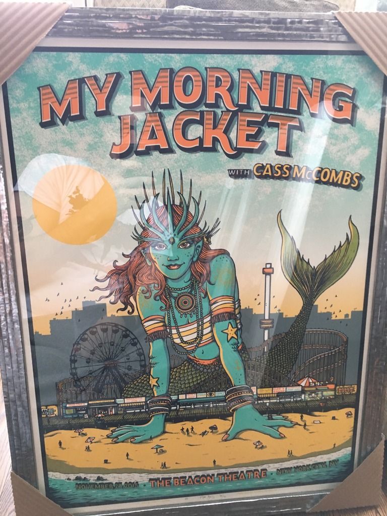
Very sharpdancinacrossthewater said: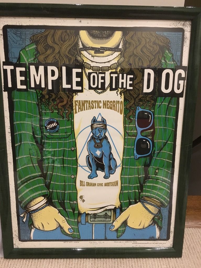
 1996: Randall's Island 2 1998: East Rutherford | MSG 1 & 2 2000: Cincinnati | Columbus | Jones Beach 1, 2, & 3 | Boston 1 | Camden 1 & 2 2003: Philadelphia | Uniondale | MSG 1 & 2 | Holmdel 2005: Atlantic City 1 2006: Camden 1 | East Rutherford 1 & 2 2008: Camden 1 & 2 | MSG 1 & 2 (#25) | Newark (EV) 2009: Philadelphia 1, 2 & 4 2010: Newark | MSG 1 & 2 2011: Toronto 1 2013: Wrigley Field | Brooklyn 2 | Philadelphia 1 & 2 | Baltimore 2015: Central Park 2016: Philadelphia 1 & 2 | MSG 1 & 2 | Fenway Park 2 | MSG (TOTD) 2017: Brooklyn (RnR HOF) 2020: MSG | Asbury Park 2021: Asbury Park 2022: MSG | Camden | Nashville 2024: MSG 1 & 2 (#50) | Philadelphia 1 & 2 | Baltimore 2025: Raleigh 20
 -
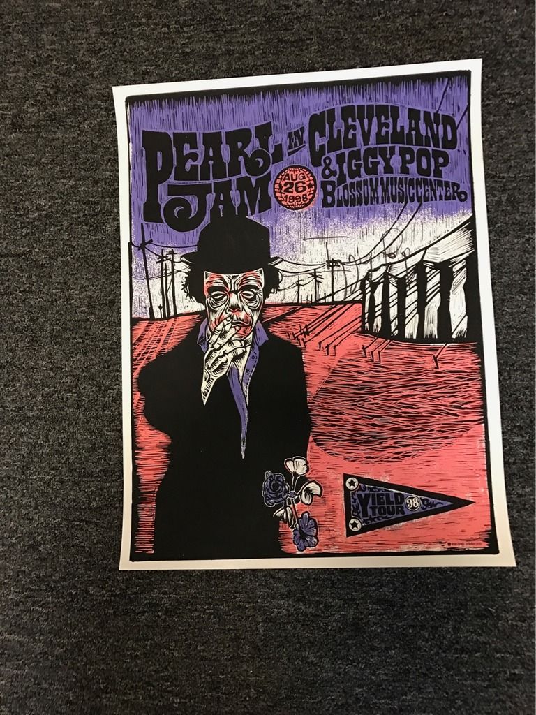
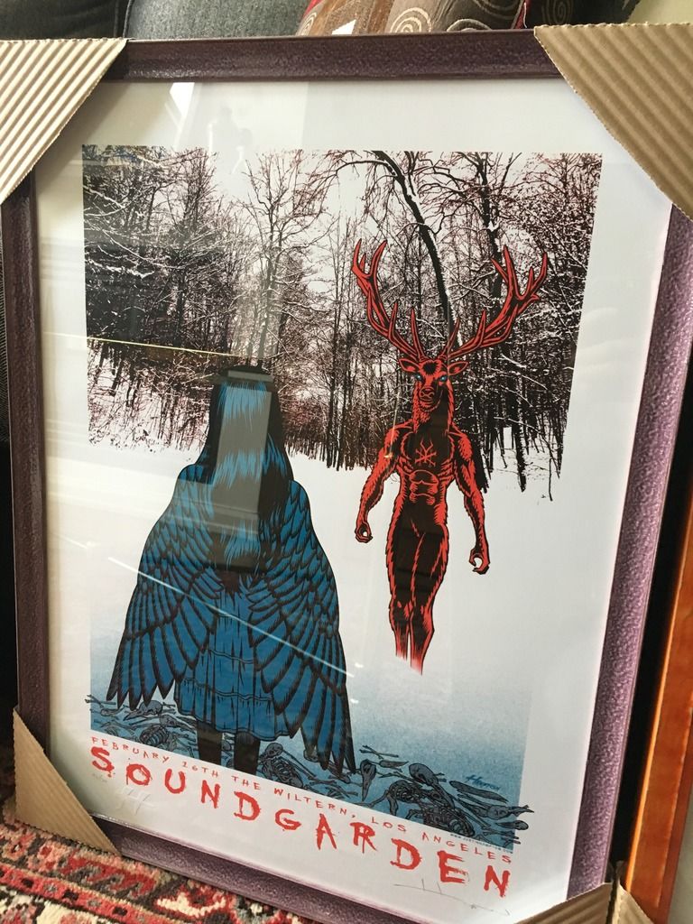
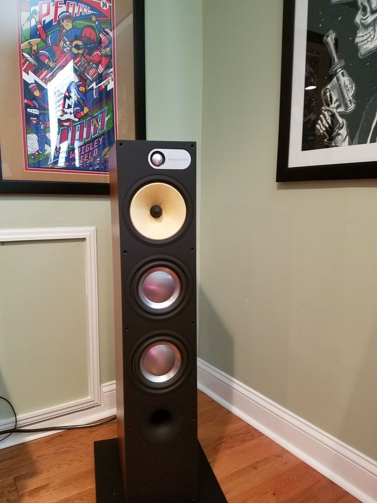
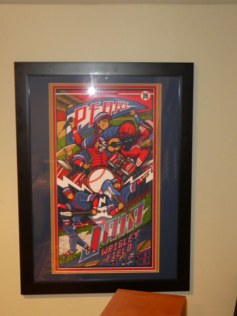
autograped by Iggy!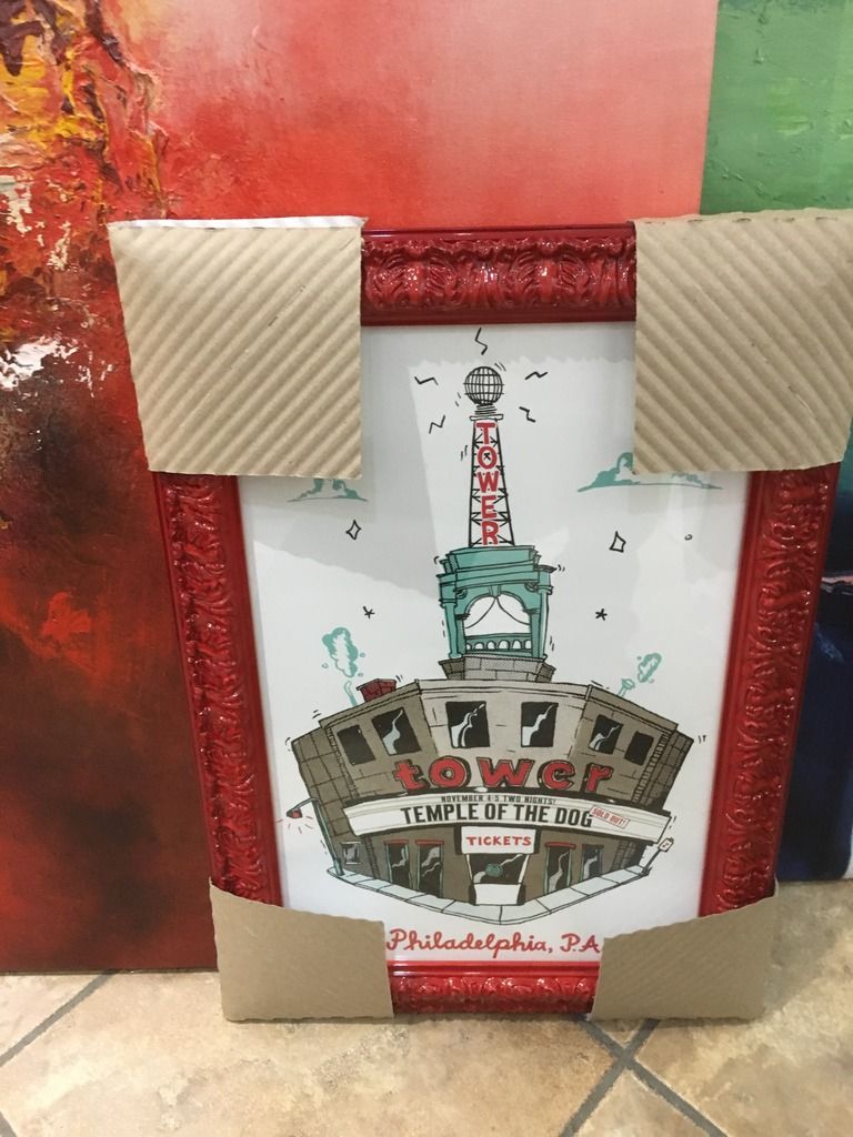
0 -
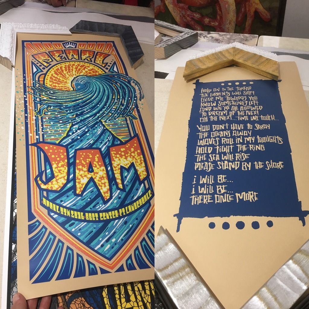
^^ Very nice. BTW, I also framed up my TOTD flyer from night 1. That was really nice quality. I was impressed that they handed that out.0
-
could be an afterthought kind of poster but a funky frame does a lot. definitely a special one for me0
-
 0
0 -
will post better pics when everything's hung up!0
-
I have those two to frame too. But they both have problems... the Sperry is so large that I need a bigger frame cutter. And 12x36 are a pain because you have to custom make a frame if you want any mats on them. I have several 12x36 posters and need to figure out what to do with them.dancinacrossthewater said:will post better pics when everything's hung up!
0 -
Yeah 12 x 36 are tough0
-
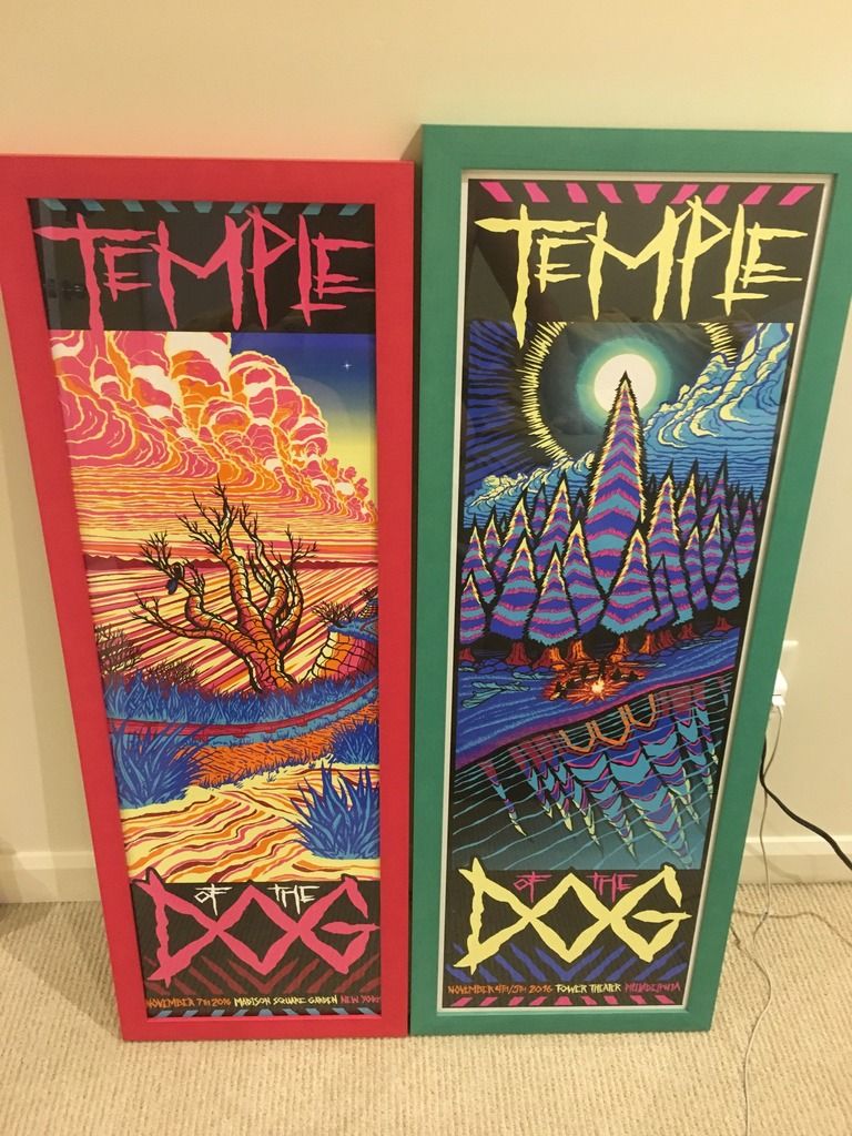
Great job on all of those. I especially like the TOTD Philly posters since I have them and needed some ideas on what to do.Philly 10/21/13 - MSG 5/1/16 - Fenway 8/5/16 - TOTD 11/4/160
-
I really love both of those TOTD prints0
-
Is there a site out there that will let you play around with different mattes? I am heading into Michaels tonight and want an idea of what I like before I go in and frame The Catch poster.0
-
I usually use American Frame for that purpose. I forget which ones are the same as what Michael's carries, but it's the one with the most color options if that helps.Holland said:Is there a site out there that will let you play around with different mattes? I am heading into Michaels tonight and want an idea of what I like before I go in and frame The Catch poster.
Philly 10/21/13 - MSG 5/1/16 - Fenway 8/5/16 - TOTD 11/4/160 -
Thanks. I will try messing around with that.fl4tdriven said:
I usually use American Frame for that purpose. I forget which ones are the same as what Michael's carries, but it's the one with the most color options if that helps.Holland said:Is there a site out there that will let you play around with different mattes? I am heading into Michaels tonight and want an idea of what I like before I go in and frame The Catch poster.
0 -
Another quick question. While trying to match up mattes I seem to want to match a colour that is displayed on the print. For example I can not get away from trying to use a blue and/or red matte for The Catch and with my Worcester 1 poster I keep going back to orange and brown. Is this the way most people do their framing by trying to match and bring out colours that are already in the print?0
-
That's what I do.. try to draw colors out. I'm not sure a real artist would do that or not though.Holland said:Another quick question. While trying to match up mattes I seem to want to match a colour that is displayed on the print. For example I can not get away from trying to use a blue and/or red matte for The Catch and with my Worcester 1 poster I keep going back to orange and brown. Is this the way most people do their framing by trying to match and bring out colours that are already in the print?
0 -
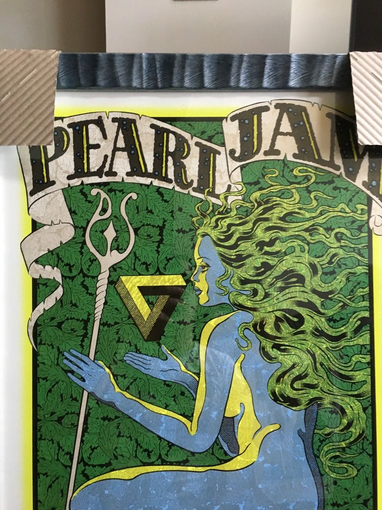
A bit of advice that I recently learned is that a good starting point is to use the same or a similar color to the main focus of the print. So if the letters 'Pearl Jam' are in a light blue, start with a light blue and work from there.Holland said:Another quick question. While trying to match up mattes I seem to want to match a colour that is displayed on the print. For example I can not get away from trying to use a blue and/or red matte for The Catch and with my Worcester 1 poster I keep going back to orange and brown. Is this the way most people do their framing by trying to match and bring out colours that are already in the print?
Philly 10/21/13 - MSG 5/1/16 - Fenway 8/5/16 - TOTD 11/4/160 -
I just followed this advice with The Catch and used brown as a matte. It really makes Pearl Jam pop out but not sure if I want to be so close to the Worcester matte. I am never going to decide haha.fl4tdriven said:
A bit of advice that I recently learned is that a good starting point is to use the same or a similar color to the main focus of the print. So if the letters 'Pearl Jam' are in a light blue, start with a light blue and work from there.Holland said:Another quick question. While trying to match up mattes I seem to want to match a colour that is displayed on the print. For example I can not get away from trying to use a blue and/or red matte for The Catch and with my Worcester 1 poster I keep going back to orange and brown. Is this the way most people do their framing by trying to match and bring out colours that are already in the print?
0 -
So I framed something with beige as the base and I didn't like it. I felt like it neutralized the whole piece, rather than making the colors pop. I ended up putting blue on top and I'm much happier. Your results may vary, but I just didn't like it when it was done. Here they are:Holland said:
I just followed this advice with The Catch and used brown as a matte. It really makes Pearl Jam pop out but not sure if I want to be so close to the Worcester matte. I am never going to decide haha.fl4tdriven said:
A bit of advice that I recently learned is that a good starting point is to use the same or a similar color to the main focus of the print. So if the letters 'Pearl Jam' are in a light blue, start with a light blue and work from there.Holland said:Another quick question. While trying to match up mattes I seem to want to match a colour that is displayed on the print. For example I can not get away from trying to use a blue and/or red matte for The Catch and with my Worcester 1 poster I keep going back to orange and brown. Is this the way most people do their framing by trying to match and bring out colours that are already in the print?
 0
0 -
I agree the blue does look better. Great job. I felt the same way with the brown for my print. I am now looking at doing a top matte of Bay blue and a bottom one of dark chocolate. It will still bring the brown out of the name but not overshadow the print. I am all set with my worcester print too. I am going with a tangerine orange on top and dark chocolate again for the bottom. Hopefully having 2 dark chocolate mattes look good side by side in the same room. If not I may split them up with Quebec in the middle.mrussel1 said:
So I framed something with beige as the base and I didn't like it. I felt like it neutralized the whole piece, rather than making the colors pop. I ended up putting blue on top and I'm much happier. Your results may vary, but I just didn't like it when it was done. Here they are:Holland said:
I just followed this advice with The Catch and used brown as a matte. It really makes Pearl Jam pop out but not sure if I want to be so close to the Worcester matte. I am never going to decide haha.fl4tdriven said:
A bit of advice that I recently learned is that a good starting point is to use the same or a similar color to the main focus of the print. So if the letters 'Pearl Jam' are in a light blue, start with a light blue and work from there.Holland said:Another quick question. While trying to match up mattes I seem to want to match a colour that is displayed on the print. For example I can not get away from trying to use a blue and/or red matte for The Catch and with my Worcester 1 poster I keep going back to orange and brown. Is this the way most people do their framing by trying to match and bring out colours that are already in the print?
0 -
Sounds good. Love to see Quebec when that's done too. I have that as well and need to figure out what to do. I really like the print though.Holland said:
I agree the blue does look better. Great job. I felt the same way with the brown for my print. I am now looking at doing a top matte of Bay blue and a bottom one of dark chocolate. It will still bring the brown out of the name but not overshadow the print. I am all set with my worcester print too. I am going with a tangerine orange on top and dark chocolate again for the bottom. Hopefully having 2 dark chocolate mattes look good side by side in the same room. If not I may split them up with Quebec in the middle.mrussel1 said:
So I framed something with beige as the base and I didn't like it. I felt like it neutralized the whole piece, rather than making the colors pop. I ended up putting blue on top and I'm much happier. Your results may vary, but I just didn't like it when it was done. Here they are:Holland said:
I just followed this advice with The Catch and used brown as a matte. It really makes Pearl Jam pop out but not sure if I want to be so close to the Worcester matte. I am never going to decide haha.fl4tdriven said:
A bit of advice that I recently learned is that a good starting point is to use the same or a similar color to the main focus of the print. So if the letters 'Pearl Jam' are in a light blue, start with a light blue and work from there.Holland said:Another quick question. While trying to match up mattes I seem to want to match a colour that is displayed on the print. For example I can not get away from trying to use a blue and/or red matte for The Catch and with my Worcester 1 poster I keep going back to orange and brown. Is this the way most people do their framing by trying to match and bring out colours that are already in the print?
0


Categories
- All Categories
- 149.4K Pearl Jam's Music and Activism
- 110.5K The Porch
- 294 Vitalogy
- 35.1K Given To Fly (live)
- 3.5K Words and Music...Communication
- 39.6K Flea Market
- 39.6K Lost Dogs
- 58.8K Not Pearl Jam's Music
- 10.6K Musicians and Gearheads
- 29.1K Other Music
- 17.8K Poetry, Prose, Music & Art
- 1.1K The Art Wall
- 56.9K Non-Pearl Jam Discussion
- 22.2K A Moving Train
- 31.7K All Encompassing Trip
- 2.9K Technical Stuff and Help