framed poster thread
Comments
-
Interesting. I just called them. You choose from 5 mouldings, all wood - black, white, gold, and 2 others. They also have a 55 and 20 deal, where you get 55% off, then you take another 20% off of that. I usually use Hobby Lobby but I am intrigued. Has anyone looked into and/or used this?fl4tdriven said:A friend of mine sent this to me: https://www.michaels.com/on/demandware.store/Sites-MichaelsUS-Site/default/Coupons-PrintPreview?dataValue=current&printPreviewData=30362
Frame, single mat, uv glass at Michael's for $79. Ends December 31st.Post edited by pjpitt89 on9/1/00, 4/28/03, 7/5/03, 7/6/03, 7/12/03, 10/1/04, 9/28/05, 5/27/06, 5/28/06, 6/1/06, 6/27/08, 6/30/08, 8/7/08 (EV), 6/12/09 (EV), 10/27/09, 10/28/09,10/30/09, 10/31/09, 5/21/10, 6/15/11 (EV), 9/2/12, 7/19/13, 10/21/13, 10/22/13, 10/27/13, 4/28/16, 4/29/16, 8/7/16, 11/4/16 (TOTD), 8/18/18, 8/20/18, 9/24/21 (EV&Earthlings), 9/26/21, 9/11/2022, 9/14/2022, 9/7/2024, 9/9/2024, 9/12/2024, 5/16/2025, 5/18/20250 -
The guy that sent it to me used it. Hasn't gotten the print back of course, but the person he dealt with said they use conservation glass, archival mounting, and acid free board/mat. I'll be dropping off at least one print on Friday.pjpitt89 said:
Interesting. I just called them. You choose from 5 mouldings, all wood - black, white, gold, and 2 others. They also have a 55 and 20 deal, where you get 55% off, then you take another 20% off of that. I usually use Hobby Lobby but I am intrigued. Has anyone looked into and/or used this?fl4tdriven said:A friend of mine sent this to me: https://www.michaels.com/on/demandware.store/Sites-MichaelsUS-Site/default/Coupons-PrintPreview?dataValue=current&printPreviewData=30362
Frame, single mat, uv glass at Michael's for $79. Ends December 31st.Philly 10/21/13 - MSG 5/1/16 - Fenway 8/5/16 - TOTD 11/4/160 -
I'm using this deal too. Hoping to get at least 2 done. The 55% plus 20% deal is their standard all the time deal. It floats back and forth each week from one frame collection to the next. Sometimes it's more than 55% (I've seen up to 70%). Even with that deal I usually spend around $120-$150 depending on which frame I choose and I always get double mattes, archival backing and UV glass. The $79 deal for a single matte is a great deal and I'm excited bc I have a few I was planning to only do a single matte anyway.5/3/92 Omaha, NE
6/19/95 Red Rocks
9/11/98 MSG
11/19/12 EV solo Tulsa
7/19/13 Wrigley 10/19/13 Brooklyn 2 10/21/13 Philly 1 10/22/13 Philly 2 10/25/13 Hartford
10/08/14 Tulsa 10/09/14 Lincoln
9/26/15 NYC Global Citizen
4/16/16 Greenville 4/28/16 Philly 1 4/29/16 Philly 2 5/1/16 MSG 1 5/2/16 MSG 2 8/7/16 Fenway 2 8/20/16 Wrigley 1
4/7/17 RRHOF New York City
9/2/18 Fenway 1 9/4/2018 Fenway 2
9/18/21 Asbury Park
2/4/22 EV Earthlings NYC 2/6/22 EV Earthlings Newark 9/11/22 MSG 9/14/22 Camden
9/3/24 MSG 1 9/4/24 MSG 2 9/7/24 Philly 1 9/9/24 Philly 20 -
Took a few new photos today. The Edmonton is still probably my favorite.
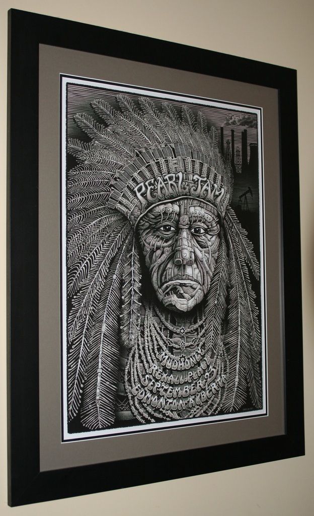
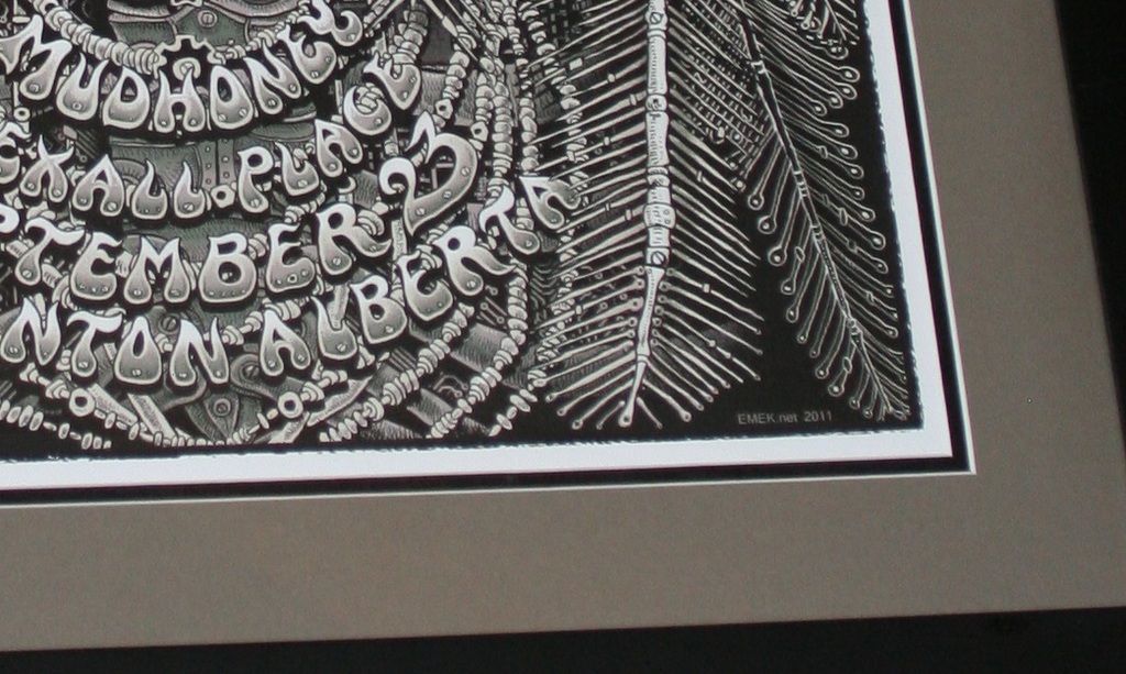 0
0 -
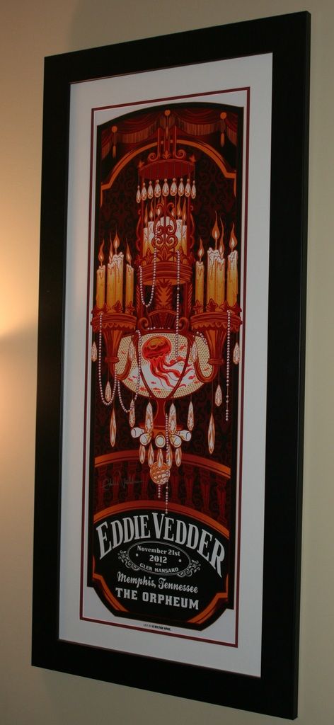
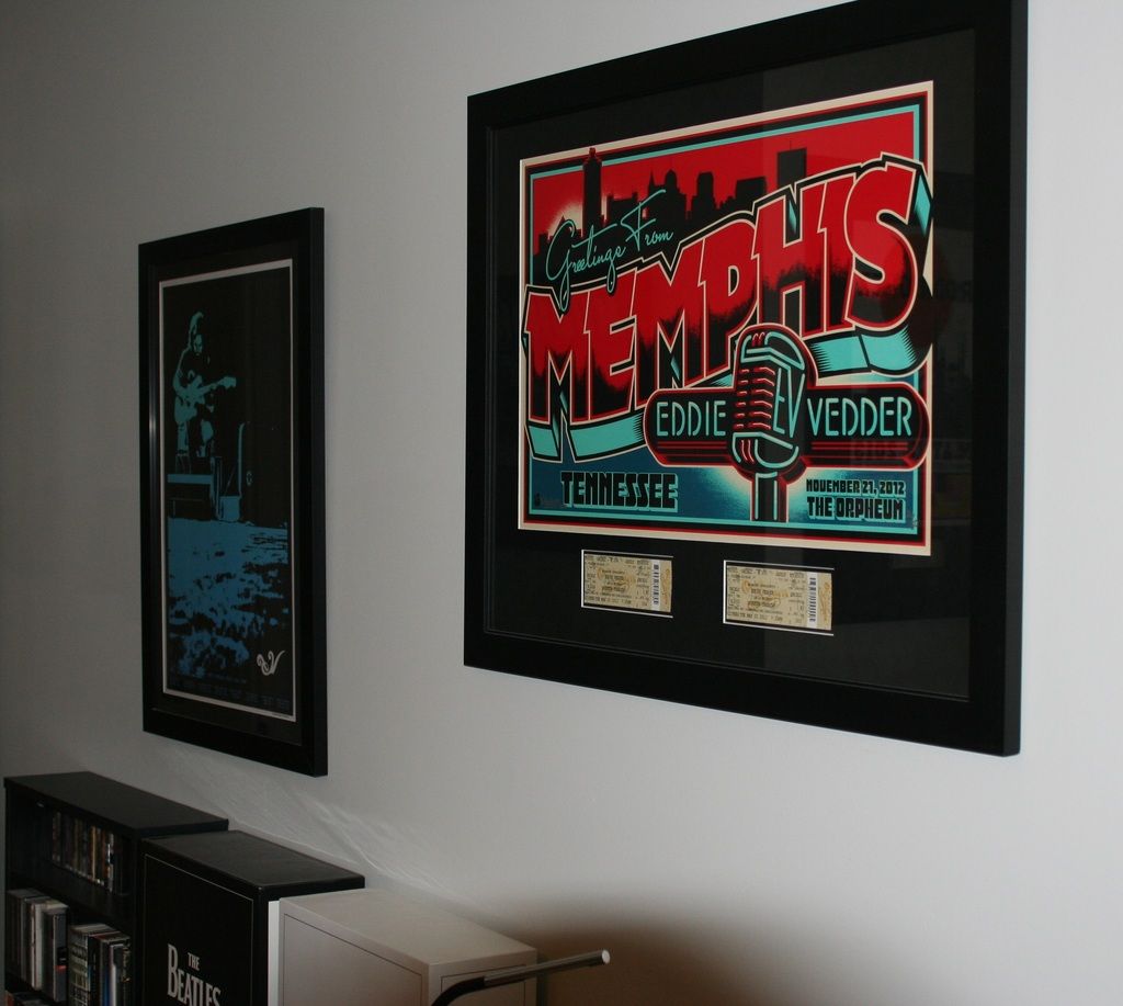
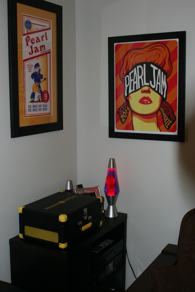
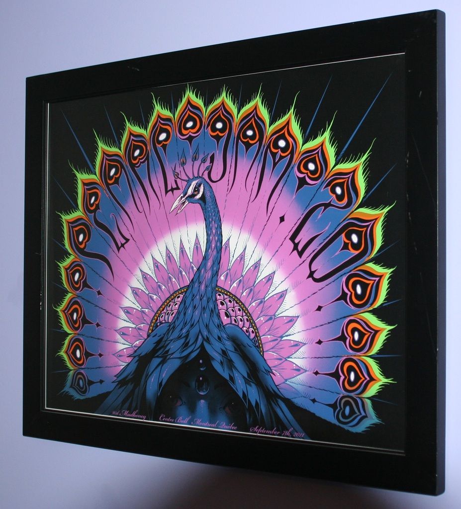 Post edited by MedozK on0
 -
Some of the Non-PJ collection
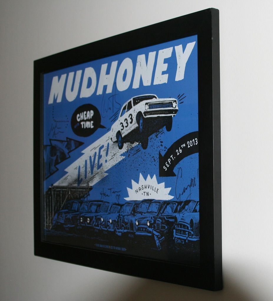
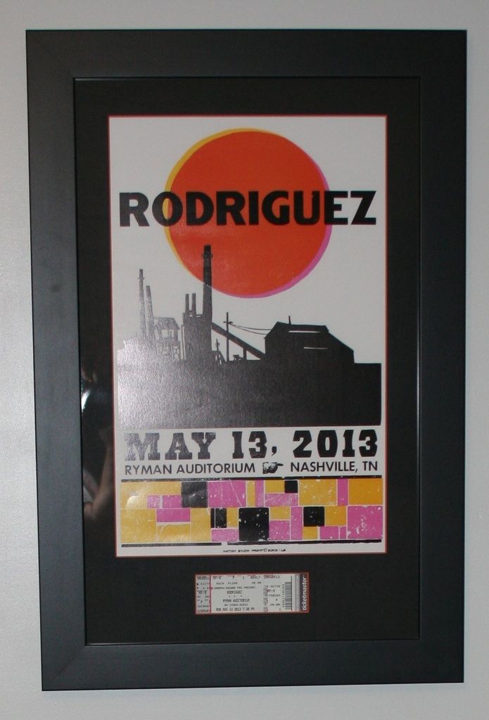
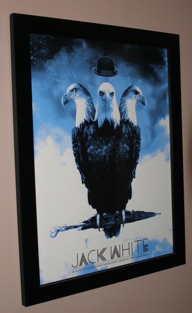 0
0 -
[img]http://i.imgur.com/BaJQ309.jpg[/img]
[img]http://i.imgur.com/PdKjhph.jpg[/img]
Finally Finished the Moline! By far my favorite poster I own. Wifey kicked ass on the christmas gift!
Post edited by chitownp76 on2014: Moline, IL
2015: EV Solo (Metro Chicago)
2016: Philadelphia PA 1, Philadelphia PA 2, New York City NY- MSG 1, EV Solo (Metro Chicago), Boston MA Fenway 1, Wrigley 1, Wrigley 2
2017: EV Ohana Fest (Dana Point, CA), EV/Pete Townshend Quadrophenia Rosemont, IL
2018: Seattle WA 1, Seattle WA 2, Missoula MT, Wrigley 1, Wrigley 2, Boston MA Fenway 1, Boston MA Fenway 2
2019: EV Tempe, AZ
2020: PPD
2022: EV & Earthlings Chicago 1 & 2, Phoenix AZ, Camden NJ, Nashville TN, St. Louis MO
2023: EV Tempe, AZ, St Paul, MN 2, Chicago 1 & 2
2024: Noblesville, IN, Wrigley 1, Wrigley 20 -
I am hoping to get 2 done as well. I went in yesterday to talk to them. The $79 deal only includes this one wooden frame that is a little larger than the metal ones I typically use. I think I'm going to use the deal to frame my MIA poster though, since I was going to do a single matte (white?) since the poster has so much going on itself. I may do the other deal for a Fenway poster, not sure yet.shetellsherself said:I'm using this deal too. Hoping to get at least 2 done. The 55% plus 20% deal is their standard all the time deal. It floats back and forth each week from one frame collection to the next. Sometimes it's more than 55% (I've seen up to 70%). Even with that deal I usually spend around $120-$150 depending on which frame I choose and I always get double mattes, archival backing and UV glass. The $79 deal for a single matte is a great deal and I'm excited bc I have a few I was planning to only do a single matte anyway.
9/1/00, 4/28/03, 7/5/03, 7/6/03, 7/12/03, 10/1/04, 9/28/05, 5/27/06, 5/28/06, 6/1/06, 6/27/08, 6/30/08, 8/7/08 (EV), 6/12/09 (EV), 10/27/09, 10/28/09,10/30/09, 10/31/09, 5/21/10, 6/15/11 (EV), 9/2/12, 7/19/13, 10/21/13, 10/22/13, 10/27/13, 4/28/16, 4/29/16, 8/7/16, 11/4/16 (TOTD), 8/18/18, 8/20/18, 9/24/21 (EV&Earthlings), 9/26/21, 9/11/2022, 9/14/2022, 9/7/2024, 9/9/2024, 9/12/2024, 5/16/2025, 5/18/20250 -
finally got round to framing
 Glasgow 00
Leeds 06
London 07
London Berlin London 09
Dublin Belfast London Berlin Arras Werchter Bilbao 10
East Troy East Troy Montreal Toronto Toronto 11
Manchester Manchester Berlin Berlin Stockholm EV Manchester 12
San Diego LA Oakland Portland Vancouver Seattle 13
Berlin Leeds Tulsa Lincoln 14
Pete Townshend & EV Chicago Global Citizen New York 15
Philadelphia Philadelphia New York New York 16
EV Tarmonia Tarmonia 17
London,London,Prague,Krakow,Berlin 180 -
Love the Munk One Toronto. One of my favorite posters1996: Randall's Island 2 1998: East Rutherford | MSG 1 & 2 2000: Cincinnati | Columbus | Jones Beach 1, 2, & 3 | Boston 1 | Camden 1 & 2 2003: Philadelphia | Uniondale | MSG 1 & 2 | Holmdel 2005: Atlantic City 1 2006: Camden 1 | East Rutherford 1 & 2 2008: Camden 1 & 2 | MSG 1 & 2 (#25) | Newark (EV) 2009: Philadelphia 1, 2 & 4 2010: Newark | MSG 1 & 2 2011: Toronto 1 2013: Wrigley Field | Brooklyn 2 | Philadelphia 1 & 2 | Baltimore 2015: Central Park 2016: Philadelphia 1 & 2 | MSG 1 & 2 | Fenway Park 2 | MSG (TOTD) 2017: Brooklyn (RnR HOF) 2020: MSG | Asbury Park 2021: Asbury Park 2022: MSG | Camden | Nashville 2024: MSG 1 & 2 (#50) | Philadelphia 1 & 2 | Baltimore 2025: Raleigh 20
-
Just dropped off my GCF Pendleton, should be ready by the end of next week! Y'all should dig itfl4tdriven said:A friend of mine sent this to me: https://www.michaels.com/on/demandware.store/Sites-MichaelsUS-Site/default/Coupons-PrintPreview?dataValue=current&printPreviewData=30362
Frame, single mat, uv glass at Michael's for $79. Ends December 31st.0 -
I went to Michael's today with the intention of dropping off one poster and ended up having three prints done and my Philly 1 2013 redone as I had that framed with a cheap frame and glass the first time.
I didn't think they'd allow more than one print with the sale, but the manager said that he had a guy come in and drop off 14 prints this past week, which used up all of the black frame so he gave us a much better one for the sale. Philly 10/21/13 - MSG 5/1/16 - Fenway 8/5/16 - TOTD 11/4/160
 -
Ha! Awesome for you, too bad we all didn't get so lucky. I stopped into a Michaels earlier in the week to discuss the $79 sale and told the lady I'd be back later in the week. When I did, she said they were out if the black option for the frame. I immediately said "oh then nevermind I can't do it." She said "well we'll use another similar frame" with me figuring she meant WITH the same deal. She finished up and says so thats $179. I was like uhhh, you gotta be kidding me.fl4tdriven said:I went to Michael's today with the intention of dropping off one poster and ended up having three prints done and my Philly 1 2013 redone as I had that framed with a cheap frame and glass the first time.
I didn't think they'd allow more than one print with the sale, but the manager said that he had a guy come in and drop off 14 prints this past week, which used up all of the black frame so he gave us a much better one for the sale.
Drove across the street and got it done in exactly the same matte frame combo at Hobby Lobby for $89.9/1/00, 4/28/03, 7/5/03, 7/6/03, 7/12/03, 10/1/04, 9/28/05, 5/27/06, 5/28/06, 6/1/06, 6/27/08, 6/30/08, 8/7/08 (EV), 6/12/09 (EV), 10/27/09, 10/28/09,10/30/09, 10/31/09, 5/21/10, 6/15/11 (EV), 9/2/12, 7/19/13, 10/21/13, 10/22/13, 10/27/13, 4/28/16, 4/29/16, 8/7/16, 11/4/16 (TOTD), 8/18/18, 8/20/18, 9/24/21 (EV&Earthlings), 9/26/21, 9/11/2022, 9/14/2022, 9/7/2024, 9/9/2024, 9/12/2024, 5/16/2025, 5/18/20250 -
Well that's pretty shitty on Michael's part. Even if they're under no obligation to substitute, she should have made it clear that the different frame would be an upcharge instead of wasting your time.pjpitt89 said:
Ha! Awesome for you, too bad we all didn't get so lucky. I stopped into a Michaels earlier in the week to discuss the $79 sale and told the lady I'd be back later in the week. When I did, she said they were out if the black option for the frame. I immediately said "oh then nevermind I can't do it." She said "well we'll use another similar frame" with me figuring she meant WITH the same deal. She finished up and says so thats $179. I was like uhhh, you gotta be kidding me.fl4tdriven said:I went to Michael's today with the intention of dropping off one poster and ended up having three prints done and my Philly 1 2013 redone as I had that framed with a cheap frame and glass the first time.
I didn't think they'd allow more than one print with the sale, but the manager said that he had a guy come in and drop off 14 prints this past week, which used up all of the black frame so he gave us a much better one for the sale.
Drove across the street and got it done in exactly the same matte frame combo at Hobby Lobby for $89.
At least you got what you wanted at hobby lobby, even if it was $10 more. Philly 10/21/13 - MSG 5/1/16 - Fenway 8/5/16 - TOTD 11/4/160
 -
Dickson City? I heard the same story lolfl4tdriven said:I went to Michael's today with the intention of dropping off one poster and ended up having three prints done and my Philly 1 2013 redone as I had that framed with a cheap frame and glass the first time.
I didn't think they'd allow more than one print with the sale, but the manager said that he had a guy come in and drop off 14 prints this past week, which used up all of the black frame so he gave us a much better one for the sale. 0
0 -
That's the one haha.sandercock.erik said:
Dickson City? I heard the same story lolfl4tdriven said:I went to Michael's today with the intention of dropping off one poster and ended up having three prints done and my Philly 1 2013 redone as I had that framed with a cheap frame and glass the first time.
I didn't think they'd allow more than one print with the sale, but the manager said that he had a guy come in and drop off 14 prints this past week, which used up all of the black frame so he gave us a much better one for the sale. Philly 10/21/13 - MSG 5/1/16 - Fenway 8/5/16 - TOTD 11/4/160
 -
I thought about trying to track down that Ed Memphis postcard, much larger than I was expecting. Looks good, though!MedozK said:
 0
0
Categories
- All Categories
- 149.2K Pearl Jam's Music and Activism
- 110.4K The Porch
- 290 Vitalogy
- 35.1K Given To Fly (live)
- 3.5K Words and Music...Communication
- 39.5K Flea Market
- 39.5K Lost Dogs
- 58.7K Not Pearl Jam's Music
- 10.6K Musicians and Gearheads
- 29.1K Other Music
- 17.8K Poetry, Prose, Music & Art
- 1.1K The Art Wall
- 56.8K Non-Pearl Jam Discussion
- 22.2K A Moving Train
- 31.7K All Encompassing Trip
- 2.9K Technical Stuff and Help


