framed poster thread
Comments
-
 0
0 -
 0
0 -
Nice work buck!0
-
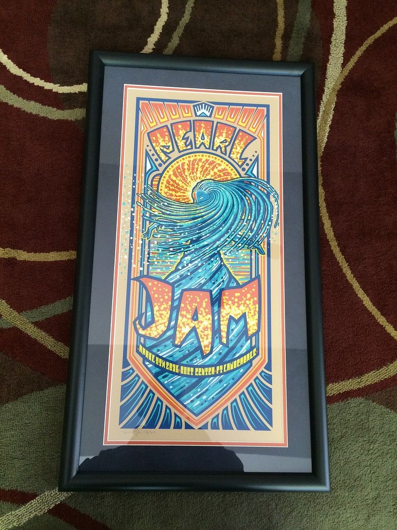
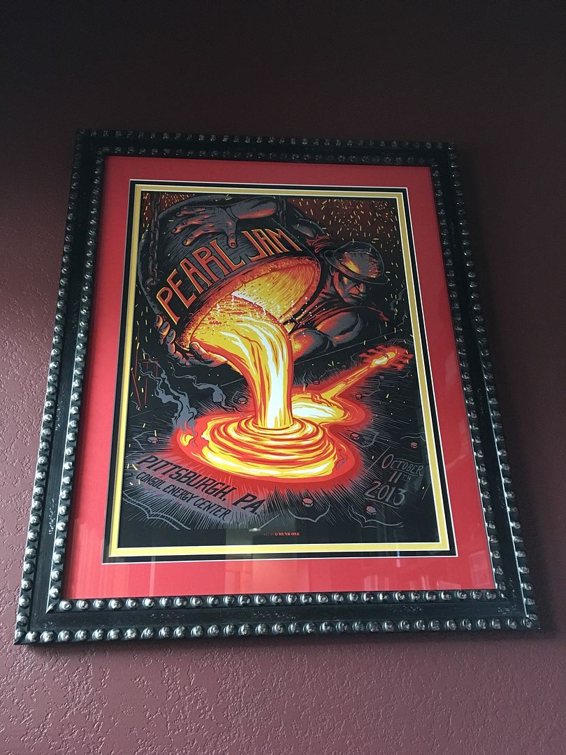
Thanks - can you tell which one has museum glass?0
-
Thanks for the insight. I think Michaels has a program that allows you to play around with the mats and see what they look like. I might try that. I thought of going with a black frame and 2"-2.5" black mat as a conservative look but maybe I should try different colours.mwplum said:
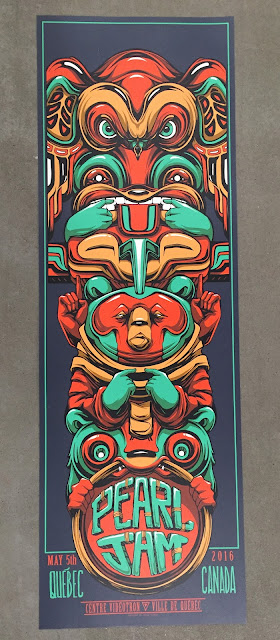
I always do my framing at a shop in Vancouver called Opus. It's great because they allow you to do everything yourself (with some loose oversight from Emily Carr art students that work there) and as such, you save about half price in materials.PJNB said:Anyone have any ideas on the Quebec poster yet? I have never framed a poster before and would like some ideas.
The best part about doing it in person is that you can take the matting samples and place them beside the image. That allows you to see how the final product will look. I usually do a double mat, and depending on the size of the print, often aim for about 2.5 inches on the top mat, and about 1/4 inch on the lower mat.
The main thing to consider (in my opinion) for mat colours is to ask yourself "what colours are going to make the image POP". For example, you want to use colours from the image, but not so much that the matting dominates. I usually try for more or a dark or muted colour for the top mat, with a brighter colour for the lower mat (as it only shows about 1/4 inch) as that tends to brighten it up. For example when I matted the Ames PJ20 poster my top mat was black, and the lower mat was orange. For the PJ 2014 Oslo Rhys Cooper I used a charcoal grey (the same colour of the Pearl Jam writing that is shaped like a raven ) with the lower mat that ice blue colour of the beard.
However, that doesn't always work, and sometimes I've used bright colours for the top mat which have turned out really well. For example, the 2011 Toronto Munk One Moose Purple Variant, where I used the violet colour of the background as the top mat, with the cream colour as the bottom mat. Or the PJ20 Klausen where I used the electric blue as the top mat and the orange colour of the word "Jam" as the bottom mat.
This poster is kind of unique as it has a built in green border. Therefore, if you wanted to save $, you could probably get away with a single mat, as the green boarder kind of has the same effect of a second mat anyways. You could use either a top mat that is the same as the background for a grey/green boarder effect, or you could use the green as the top mat which would create a green/grey/green effect.
I will be framing my Quebec one sometime in the coming month or so. Without playing with the mats, its hard to say. Most of the colours in this poster go against what I normally try and do with the top mat (i.e. the green, red, and/or yellow are all seemingly too bright for the top mat). However, in person, they might look rad. Usually I go with a less dominant colour from the image, but here there are very few colours other than Green, Grey, Red, or Burnt yellow. I think white would look weird as a top mat, and other than that, there really aren't any colours to extract from the image.
I'm thinking that I will probably go double mat, using the grey background colour for the top mat, with a 1/4 inch lower mat that is the yellow burnt mustard colour (or if that looks weird, then the red colour).
Anyways those are just my thoughts. The funnest part about framing is getting to put your own personal stamp on it. Someone else might completely disagree with my thoughts, and that's kind of the interesting part in seeing how everyone's frames turn out.
Hope that helps somewhat.
Cheers,
Matt0 -
Sperry?buck502000 said:Thanks - can you tell which one has museum glass?
...just got a fresh bottle.0 -
"The heart and mind are the true lens of the camera." - Yusuf Karsh
0 -
You are correct no glare0
-
Any feedback on this possible mat color selection I'm debating? TIA!0 -
He who forgets.... will be destined to remember
Raleigh - Lollapalooza '92, Raleigh'98, Charlotte'00,State College'03,Raleigh'03, Charlotte'03, Pittsburgh'13, Charlotte'13, Greenville'16, Columbia'16,Toronto'160 -
my two favorite from munk onePost edited by Packfan11 onHe who forgets.... will be destined to remember
Raleigh - Lollapalooza '92, Raleigh'98, Charlotte'00,State College'03,Raleigh'03, Charlotte'03, Pittsburgh'13, Charlotte'13, Greenville'16, Columbia'16,Toronto'160 -
***Post edited by dankind onI SAW PEARL JAM0
-
Nice job Buck. Do you have a black mat around the Klausen or is that a shade of dark blue?2005 - London
2009 - Toronto
2010 - Buffalo
2011 - Toronto 1&2
2013 - London, Pittsburgh, Buffalo
2014 - Cincinnati, St. Louis, Detroit
2016 - Ft. Lauderdale, Miami, Ottawa, Toronto 1
2018 - Fenway 1&2
2022 - Hamilton, Toronto
2023 - Chicago 1&2
2024 - Las Vegas 1&20 -
Strong work, Packfan11!!!I SAW PEARL JAM0
-
It's a dark blue - hard to tell in the pics - but I am extremely happy with both of my new childrenBLACK35 said:Nice job Buck. Do you have a black mat around the Klausen or is that a shade of dark blue?
")
0 -
That's nice, Buck. Mine are fucking jerks! Must be from their mother.buck502000 said:
It's a dark blue - hard to tell in the pics - but I am extremely happy with both of my new childrenBLACK35 said:Nice job Buck. Do you have a black mat around the Klausen or is that a shade of dark blue?
I SAW PEARL JAM0 -
Though it was a blue.buck502000 said:
It's a dark blue - hard to tell in the pics - but I am extremely happy with both of my new childrenBLACK35 said:Nice job Buck. Do you have a black mat around the Klausen or is that a shade of dark blue?
2005 - London
2009 - Toronto
2010 - Buffalo
2011 - Toronto 1&2
2013 - London, Pittsburgh, Buffalo
2014 - Cincinnati, St. Louis, Detroit
2016 - Ft. Lauderdale, Miami, Ottawa, Toronto 1
2018 - Fenway 1&2
2022 - Hamilton, Toronto
2023 - Chicago 1&2
2024 - Las Vegas 1&20 -
I'd go with a light-blue outer mat and yellow bottom mat for that print. Possibly triple-matted with a red mat on the bottom and the yellow mat in the middle.SK20613 said:
Any feedback on this possible mat color selection I'm debating? TIA!Post edited by Brane_of_JFK on0 -
Loldankind said:
That's nice, Buck. Mine are fucking jerks! Must be from their mother.buck502000 said:
It's a dark blue - hard to tell in the pics - but I am extremely happy with both of my new childrenBLACK35 said:Nice job Buck. Do you have a black mat around the Klausen or is that a shade of dark blue?
0 -
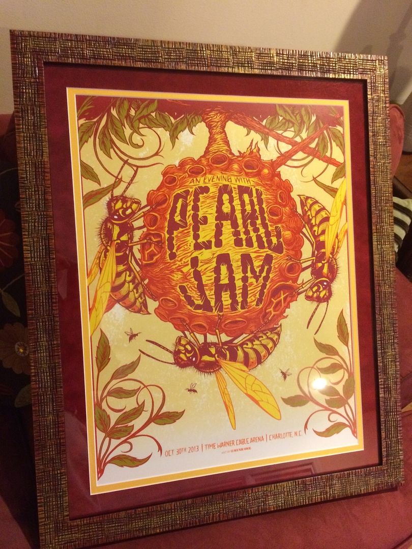
Love the mattes on this one....Packfan11 said:Raleigh, NC., 8/31/98, Charlotte, NC., 8/4/00, Greensboro, NC., 8/6/00, Mountain View, CA., 10/31/00, Raleigh, NC., 4/15/03, Charlotte, NC., 4/16/03, Mountain View, CA., 10/25/03, Asheville, NC., 10/6/04, Philadelphia, PA., 10/3/05, Washington D.C, 5/30/06, Virginia Beach, VA., 6/17/07, Philadelphia, PA., 10/28/09, Charlottesville, VA., 10/29/13, Charlotte, NC., 10/30/13, Memphis, TN., 10/14/14, Greenville, SC., 4/16/16, Hampton, VA., 4/19/16,Raleigh, NC., 4/20/16, Columbia, SC., 4/21/16, Boston, MA., 8/5/16, Boston 9/2/18 & 9/4/18., Nashville, TN., 4/2/20., Nashville, TN., 9/16/22, Las Vegas, NV., 5/16/24 & 5/18/24., Raleigh, NC., 5/11/25 & 5/13/25.
EV Solo - Washington, D.C., 8/17/08, Atlanta, GA., 6/24/09, Orlando, FL., 11/27/12.0


Categories
- All Categories
- 149.4K Pearl Jam's Music and Activism
- 110.5K The Porch
- 294 Vitalogy
- 35.1K Given To Fly (live)
- 3.5K Words and Music...Communication
- 39.6K Flea Market
- 39.6K Lost Dogs
- 58.8K Not Pearl Jam's Music
- 10.6K Musicians and Gearheads
- 29.1K Other Music
- 17.8K Poetry, Prose, Music & Art
- 1.1K The Art Wall
- 56.9K Non-Pearl Jam Discussion
- 22.2K A Moving Train
- 31.7K All Encompassing Trip
- 2.9K Technical Stuff and Help