framed poster thread
Comments
-
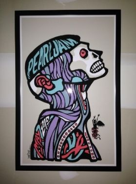
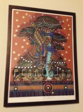
NYCPJ wrote:I have a few, which i havent gotten around to framing yet (MSG 2 2010, Philly 3 2009, Perth 2009) but i did get this one recently for my birthday, which is now on my living room wall!
http://www.flickr.com/photos/jlbnyc/105 ... /lightbox/
Here is some other PJ stuff I've accumulated over the years (mostly vinyl), not sure if the basketball picture disc is authentic, but i didnt pay much for it.
http://www.flickr.com/photos/jlbnyc/set ... 597676135/
You are livin' the life my friend........ I couldn't stop clicking through your flick pics, they are so compelling!
You have so many amazing shots of so many amazing shows. :shock: You have a really good eye and a great camera.
I also love all the city, beach and food shot. I never thought to photograph all my concert stubs, what a great idea.
It really sucks the way they would rip tickets in half back in the day, I have many like that.
You're a fortunate man!0 -

Our fall swag ... Nothing compared to others in this thread, but we did it ourselves and on a budget I love the looks of it. Please, Pearl Jam, consider a Benaroya Hall vinyl reissue! http://community.pearljam.com/discussion/148993/please-pearl-jam-consider-a-vinyl-benaroya-hall-re-issue0
 -
Leezestarr313 wrote:

Our fall swag ... Nothing compared to others in this thread, but we did it ourselves and on a budget I love the looks of it.
Those look great, Lisa and Matt! :thumbup: Hoping our Pitt one will be done this week. 2013 Wrigley, Pittsburgh, Buffalo
2014 Cincy, Detroit, Moline, & Milwaukee
2015 Central Park
2016 Lexington, Ottawa, Toronto 1 & 2, Boston 1 & 2, Chicago 1 & 2
2017 Rock and Roll Hall of Fame Induction Ceremony
2018 Seattle 1 & 2, Missoula, Chicago 10 -
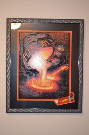
That Pitt print looks dope with the black on black matte and frame.Bristow, VA - 5.13.10
East Troy, WI - 9.3.11
East Troy, WI - 9.4.11
Atlanta, GA - 9.22.12
Las Vegas, NV - 10.31.12 (EV)
Las Vegas, NV - 11.1.12 (EV)
Chicago, IL - 7.19.13
Dallas, TX - 11.15.13
Oklahoma City, OK - 11.16.13
Seattle, WA - 12.6.13
Lincoln, NE - 10.9.14
Moline, IL - 10.17.14
St. Paul, MN - 10.19.14
Milwaukee, WI - 10.20.14
New York, NY - 5.1.16
New York, NY - 5.2.16
Boston, MA - 8.5.16
Boston, MA - 8.7.16
Chicago, IL - 8.20.160 -
atovissi wrote:
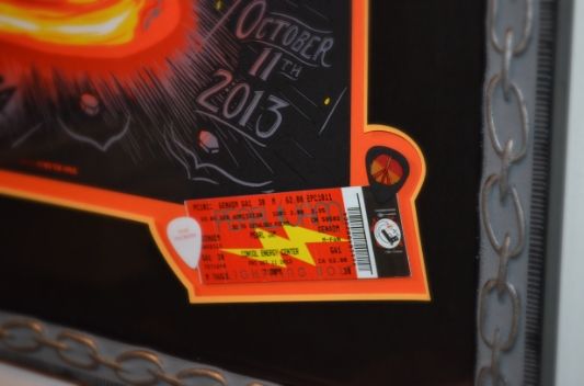
This looks really cool! Love the special cut around the picks and stub!2013 Wrigley, Pittsburgh, Buffalo
2014 Cincy, Detroit, Moline, & Milwaukee
2015 Central Park
2016 Lexington, Ottawa, Toronto 1 & 2, Boston 1 & 2, Chicago 1 & 2
2017 Rock and Roll Hall of Fame Induction Ceremony
2018 Seattle 1 & 2, Missoula, Chicago 10 -
State College '03

Double-matted black on olive (both white core; the bottom mat is closer to the green in the poster than appears in the pic)
UV glassStar Lake 00 / Pittsburgh 03 / State College 03 / Bristow 03 / Cleveland 06 / Camden II 06 / DC 08 / Pittsburgh 13 / Baltimore 13 / Charlottesville 13 / Cincinnati 14 / St. Paul 14 / Hampton 16 / Wrigley I 16 / Wrigley II 16 / Baltimore 20 / Camden 22 / Baltimore 24 / Raleigh I 25 / Raleigh II 25 / Pittsburgh I 250 -
HesCalledDyer wrote:State College '03

Double-matted black on olive (both white core; the bottom mat is closer to the green in the poster than appears in the pic)
UV glass
Nice job! 1996: Randall's Island 2 1998: East Rutherford | MSG 1 & 2 2000: Cincinnati | Columbus | Jones Beach 1, 2, & 3 | Boston 1 | Camden 1 & 2 2003: Philadelphia | Uniondale | MSG 1 & 2 | Holmdel 2005: Atlantic City 1 2006: Camden 1 | East Rutherford 1 & 2 2008: Camden 1 & 2 | MSG 1 & 2 (#25) | Newark (EV) 2009: Philadelphia 1, 2 & 4 2010: Newark | MSG 1 & 2 2011: Toronto 1 2013: Wrigley Field | Brooklyn 2 | Philadelphia 1 & 2 | Baltimore 2015: Central Park 2016: Philadelphia 1 & 2 | MSG 1 & 2 | Fenway Park 2 | MSG (TOTD) 2017: Brooklyn (RnR HOF) 2020: MSG | Asbury Park 2021: Asbury Park 2022: MSG | Camden | Nashville 2024: MSG 1 & 2 (#50) | Philadelphia 1 & 2 | Baltimore 2025: Raleigh 20
 -
Thanks! Debating on whether to frame Baltimore next or Wrigley "Dirty Frank."on2legs wrote:
Nice job!HesCalledDyer wrote:State College '03
Double-matted black on olive (both white core; the bottom mat is closer to the green in the poster than appears in the pic)
UV glass Star Lake 00 / Pittsburgh 03 / State College 03 / Bristow 03 / Cleveland 06 / Camden II 06 / DC 08 / Pittsburgh 13 / Baltimore 13 / Charlottesville 13 / Cincinnati 14 / St. Paul 14 / Hampton 16 / Wrigley I 16 / Wrigley II 16 / Baltimore 20 / Camden 22 / Baltimore 24 / Raleigh I 25 / Raleigh II 25 / Pittsburgh I 250
 -
atovissi wrote:
That is freakin spectacular! Love the tix/pix cut-out! :clap:Star Lake 00 / Pittsburgh 03 / State College 03 / Bristow 03 / Cleveland 06 / Camden II 06 / DC 08 / Pittsburgh 13 / Baltimore 13 / Charlottesville 13 / Cincinnati 14 / St. Paul 14 / Hampton 16 / Wrigley I 16 / Wrigley II 16 / Baltimore 20 / Camden 22 / Baltimore 24 / Raleigh I 25 / Raleigh II 25 / Pittsburgh I 250 -
atovissi wrote:
Wow, that's a beautiful framing job for sure!! I really like the chain link around the frame keeping with the whole steel mill theme of the print itself.
RM0 -
-
-
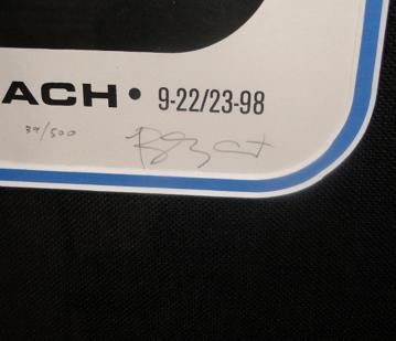
Cleveland 2010: 2 days after this show, we found out we were pregnant. I recently reached out to the artist and asked if he had any extra laying around as I didn't want to drop $350+ on this thing. He said he had 1 with a printing flaw. I took it as I don't notice tiny imperfections. He signed it 29/100 and also wrote "Happy Mothers Day" for my now 3yr old. Guy Burwell was awesome to work with. Simply copper frame here.
 0
0 -
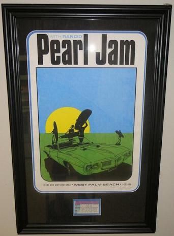
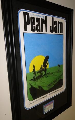
Pearl Jam - ST. PETERSBURG, FL 3-29-94 / WEST PALM BEACH, FL 9-22-98 / TAMPA, FL 8-12-00 / CHARLOTTE, NC 10/30/13 / ST. LOUIS, MO 10-03-2014 / TAMPA, FL 4-11-16 / JACKSONVILLE, FL 4-13-16
Eddie Vedder - JACKSONVILLE, FL 11/24/12 / JACKSONVILLE, FL 11/25/12 / ORLANDO, FL 11-28-120 -
2013 Wrigley, Pittsburgh, Buffalo
2014 Cincy, Detroit, Moline, & Milwaukee
2015 Central Park
2016 Lexington, Ottawa, Toronto 1 & 2, Boston 1 & 2, Chicago 1 & 2
2017 Rock and Roll Hall of Fame Induction Ceremony
2018 Seattle 1 & 2, Missoula, Chicago 10 -
I appreciate it.
I am very happy with the way that this poster framed out. I wanted the curved edges and the pictures truly do not show the pop in color this poster has.Pearl Jam - ST. PETERSBURG, FL 3-29-94 / WEST PALM BEACH, FL 9-22-98 / TAMPA, FL 8-12-00 / CHARLOTTE, NC 10/30/13 / ST. LOUIS, MO 10-03-2014 / TAMPA, FL 4-11-16 / JACKSONVILLE, FL 4-13-16
Eddie Vedder - JACKSONVILLE, FL 11/24/12 / JACKSONVILLE, FL 11/25/12 / ORLANDO, FL 11-28-120 -
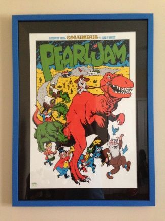
Here's my Pitt poster framed.


Next up the Wrigley Ames Variant! 2013 Wrigley, Pittsburgh, Buffalo
2014 Cincy, Detroit, Moline, & Milwaukee
2015 Central Park
2016 Lexington, Ottawa, Toronto 1 & 2, Boston 1 & 2, Chicago 1 & 2
2017 Rock and Roll Hall of Fame Induction Ceremony
2018 Seattle 1 & 2, Missoula, Chicago 10 -
Got my most recent framing project back from the framers!!!
2013 Coachella AP by EMEK...
Matte Detail:
The top matte is a deep purple linen.
Second level is a gold "fillet" or "slip" and the bottom matte is called Bermuda Mist!!
I got #97 of 100
I love the singing fish doodle and the "scale" look of the frame too!!
I also received a matching handbill with this poster & check out what my framer did with this one.
Love the different colored "bubbles" she cut in the matte!!
The handbill is floating on top of a silver fillet inside the frame.
The bottom matte is black linen!!
Dropped off my Pittsburgh '13 - Munk One when I picked this one up...Should have that beauty back soon!!
:ugeek:'96: Seattle: Key Arena
'98: Seattle: Memorial Stadium 1 & 2
'00: Columbus: Polaris
'03: Columbus: Germain
'10: Columbus: Nationwide Arena
'11: East Troy: Alpine Valley - PJ20 1 & 2 + EV Detroit
'12: Missoula + EV Jacksonville 1 & 2
'13: Chicago / Pittsburgh / Buffalo / Seattle
'14: Cincinnati / St. Louis / Tulsa / Lincoln / Memphis / Detroit / Moline
'15: New York City - Global Citizen Festival
'16: Greenville / Hampton / Raleigh / Columbia / Lexington / Ottawa / Toronto 1 & 2 / Wrigley 1 & 2
'17: Brooklyn - Rock & Roll Hall of Fame Induction Ceremony
'18: London 1 & 2 / Seattle 1 & 2 / Missoula / Wrigley 1
'22: Nashville / St. Louis0 -
jlaustin wrote:Here's my Pitt poster framed.


Next up the Wrigley Ames Variant!
Looks GREAT LeeAnn...
Really like the black matte with the grey frame you picked out for this one!!!
Can't wait to see your Wrigley Ames Bros. :ugeek:'96: Seattle: Key Arena
'98: Seattle: Memorial Stadium 1 & 2
'00: Columbus: Polaris
'03: Columbus: Germain
'10: Columbus: Nationwide Arena
'11: East Troy: Alpine Valley - PJ20 1 & 2 + EV Detroit
'12: Missoula + EV Jacksonville 1 & 2
'13: Chicago / Pittsburgh / Buffalo / Seattle
'14: Cincinnati / St. Louis / Tulsa / Lincoln / Memphis / Detroit / Moline
'15: New York City - Global Citizen Festival
'16: Greenville / Hampton / Raleigh / Columbia / Lexington / Ottawa / Toronto 1 & 2 / Wrigley 1 & 2
'17: Brooklyn - Rock & Roll Hall of Fame Induction Ceremony
'18: London 1 & 2 / Seattle 1 & 2 / Missoula / Wrigley 1
'22: Nashville / St. Louis0 -
What a Long Strange Trip It's Been!0
Categories
- All Categories
- 149.2K Pearl Jam's Music and Activism
- 110.3K The Porch
- 287 Vitalogy
- 35.1K Given To Fly (live)
- 3.5K Words and Music...Communication
- 39.4K Flea Market
- 39.4K Lost Dogs
- 58.7K Not Pearl Jam's Music
- 10.6K Musicians and Gearheads
- 29.1K Other Music
- 17.8K Poetry, Prose, Music & Art
- 1.1K The Art Wall
- 56.8K Non-Pearl Jam Discussion
- 22.2K A Moving Train
- 31.7K All Encompassing Trip
- 2.9K Technical Stuff and Help


