Album Artwork

Glorified KC
KCMO Native Posts: 2,818
in The Porch
Which of the 10 studio albums has your favorite artwork?
I wish I was a sacrifice, but somehow still lived on.
Album Artwork 143 votes
Ten
0%
Vs.
2%


 4 votes
Vitalogy
14%


 21 votes
No Code
30%


 44 votes
Yield
24%


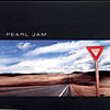


 35 votes
Binaural
9%


 14 votes
Riot Act
13%


Avocado
1%

 2 votes
Backspacer
1%

 2 votes
Lightning Bolt
0%
 1 vote
0
Comments
-
Riot ActGot to be honest . I looked at the options and thought. None are that good. Just my opinion.
this song is meant to be called i got shit,itshould be called i got shit tickets-hartford 06 -0 -
No CodeI was thinking the same thing. No code was innovative and riot act matched the darkness of the album. But none have that wow factor.
But it I would rather have them focus on the music than the covers any day.Peace,Love and Pearl Jam.0 -
No CodeI agree there’s no wow factor on their covers, but that’s why I enjoy them so much. No Code is my favorite given the innovation with the polaroids on the cover and inside of the booklet.I wish I was a sacrifice, but somehow still lived on.0
-
Riot ActI like Riot Act the most. Because it doesn't look boringly digital (THE FUCKING DIGITAL GRADIENTS ON AVOCADO AND BACKSPACER ARE THE WORST) but is still slick and stylish and moody. Simple, good looking font on the front and the analogue "grungy" handwriting on the back that still is kept small enough to keep it elegant. And the warm photo of them in the studio when opened (even though it goes against the aesthetic on the front).
The booklet is also really nice with it's analogue look of the scanned typewriter pages and the black and white photos.
Post edited by Spiritual_Chaos on"Mostly I think that people react sensitively because they know you’ve got a point"0 -
No Codeyield... no code...Hamilton 9-13-05; Toronto 5-9-06, Toronto 8-21-09, Toronto 9-12-11, Hamilton 9-15-11....0
-
No CodeI love the perspective on Riot Act, I hadn't thought about a lot of this. When I ranked these a little while back, I had Riot Act down at #8.
I wish I was a sacrifice, but somehow still lived on.0 -
Riot ActIve always liked the Riot Act art. Both inside and out. I think it represents the album very well."I got memories, I got shit"0
-
Binaural
Agreed that none of the covers really make you step back and say wow. The wow factor has always been in the song writing. Ill take that over any album artwork any day.cdthomas1981 said:I agree there’s no wow factor on their covers, but that’s why I enjoy them so much. No Code is my favorite given the innovation with the polaroids on the cover and inside of the booklet.0 -
No Code
While it's not "wow" I still covet how they put together their album artwork and booklets. I just feel authenticity of the band when I go through them. They're always staying true to themselves.Ray J. T. said:
Agreed that none of the covers really make you step back and say wow. The wow factor has always been in the song writing. Ill take that over any album artwork any day.cdthomas1981 said:I agree there’s no wow factor on their covers, but that’s why I enjoy them so much. No Code is my favorite given the innovation with the polaroids on the cover and inside of the booklet.
I wish I was a sacrifice, but somehow still lived on.0 -
Binaural
Agreed. I still admire what the band puts together with their artwork. I think it best describes who they are.cdthomas1981 said:
While it's not "wow" I still covet how they put together their album artwork and booklets. I just feel authenticity of the band when I go through them. They're always staying true to themselves.Ray J. T. said:
Agreed that none of the covers really make you step back and say wow. The wow factor has always been in the song writing. Ill take that over any album artwork any day.cdthomas1981 said:I agree there’s no wow factor on their covers, but that’s why I enjoy them so much. No Code is my favorite given the innovation with the polaroids on the cover and inside of the booklet.0 -
Riot Act
Up till Riot Act.cdthomas1981 said:
While it's not "wow" I still covet how they put together their album artwork and booklets. I just feel authenticity of the band when I go through them. They're always staying true to themselves.Ray J. T. said:
Agreed that none of the covers really make you step back and say wow. The wow factor has always been in the song writing. Ill take that over any album artwork any day.cdthomas1981 said:I agree there’s no wow factor on their covers, but that’s why I enjoy them so much. No Code is my favorite given the innovation with the polaroids on the cover and inside of the booklet.
Avocado, (especially) backspacer and Lightning Bolt are misfires. No way around that."Mostly I think that people react sensitively because they know you’ve got a point"0 -
No Code
That's fair enough. You mentioned the digital gradients on those three. What makes that different?Spiritual_Chaos said:
Up till Riot Act.cdthomas1981 said:
While it's not "wow" I still covet how they put together their album artwork and booklets. I just feel authenticity of the band when I go through them. They're always staying true to themselves.Ray J. T. said:
Agreed that none of the covers really make you step back and say wow. The wow factor has always been in the song writing. Ill take that over any album artwork any day.cdthomas1981 said:I agree there’s no wow factor on their covers, but that’s why I enjoy them so much. No Code is my favorite given the innovation with the polaroids on the cover and inside of the booklet.
Avocado, (especially) backspacer and Lightning Bolt are misfires. No way around that.
I wish I was a sacrifice, but somehow still lived on.0 -
No CodeOops, accidentally sent that comment twice. ^
Post edited by Glorified KC onI wish I was a sacrifice, but somehow still lived on.0 -
No CodeTen's cover is a bit hokey. Vs is ugly - but my favourite album still. Vitalogy is nice but was frustrating in the CD age. Yield and Binaural are cool but still land behind No Code.0
-
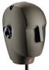
BinauralGotta go with outer space and her sexy hourglass figure!!
Star Lake 00 / Pittsburgh 03 / State College 03 / Bristow 03 / Cleveland 06 / Camden II 06 / DC 08 / Pittsburgh 13 / Baltimore 13 / Charlottesville 13 / Cincinnati 14 / St. Paul 14 / Hampton 16 / Wrigley I 16 / Wrigley II 16 / Baltimore 20 / Camden 22 / Baltimore 24 / Raleigh I 25 / Raleigh II 25 / Pittsburgh I 250 -
YieldYield for me but Binaural is cool too. I like the polaroid visual of No Code but not the pictures0
-
No CodeIn order...
No Code - those polaroids!!
Riot Act - great moody cover
Binaural - love the nebula
Vitalogy - very clean and simple
Yield - just cool
VS - always liked the cover
Avocado - also clean and simple
Backspacer - interesting but a little too busy
Lightning Bolt - meh, it’s ok
Ten - iconic? yes. Super cheesy? Absolutely. Do I still love it? Yes because it was where I started with my favorite band of all time0 -
No CodeI did this ranking a couple of months ago. I’m seriously rethinking Riot Act.

I wish I was a sacrifice, but somehow still lived on.0 -
No CodeNo code, yield and vitalogy are my top three.I'll ride the wave where it takes me......0
-
Riot act for me. It sums up the mood of a lot of nations around that time. The cover
i wish i wish i wish i wish, i guess it never stops0


Categories
- All Categories
- 149.1K Pearl Jam's Music and Activism
- 110.2K The Porch
- 283 Vitalogy
- 35.1K Given To Fly (live)
- 3.5K Words and Music...Communication
- 39.3K Flea Market
- 39.3K Lost Dogs
- 58.7K Not Pearl Jam's Music
- 10.6K Musicians and Gearheads
- 29.1K Other Music
- 17.8K Poetry, Prose, Music & Art
- 1.1K The Art Wall
- 56.8K Non-Pearl Jam Discussion
- 22.2K A Moving Train
- 31.7K All Encompassing Trip
- 2.9K Technical Stuff and Help