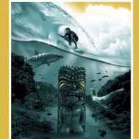
'The Home Shows' X 'The Away Shows' Merch
Comments
-
-
The more I look at The Jackson it's becoming the clear winner for me. The Thomas is great too, but the Jackson in person in pretty damn awesome.
Post edited by wall232 onNYPJ0 -
cannot deny Paul Jackson's talent there0
-
I didnt notice it until Brad Klausen said it but the dimensions in the artwork are really cool. You cant see it there in the sketch tho. Excited to get this onedemetrios said:Paul Jackson ... The original drawing for @pearljam at the Wrigley Field in Chicago 2018.#pearljam #pauljackson #wrigleyfield #showposter #gigposter #screenprinting #screenprint #hawk #cop #prohibition #ink #pen #stippling #dotwork

 0
0 -
Something about the face/eyes is just really off to me. Much more white in one eye than the other and the eyebrows are... crooked? It's hard to articulate (and, more importantly, un-see) and the main reason I didn't really want one.0
-
You just gave her a lazy eye I now can not un-see HAHAHAmikeliska said:Something about the face/eyes is just really off to me. Much more white in one eye than the other and the eyebrows are... crooked? It's hard to articulate (and, more importantly, un-see) and the main reason I didn't really want one.
0 -
Damnit I knew I should have kept that to myself.0
-
I still think she is beautiful
0 -
Looks more like a sexy squint to me.
Also I am dying to see what the Mumford looks like. Love the colours in the sneak peak.0 -
The colors look bright in all of them and very little unused space.....so pumped!!0
-
I think the Jackson poster is far and away the best of the lot from Chicago. The Thomas is nice, but nowhere near as good as his Catch from Boston in 2016.
My opinion, of course.0 -
I shouldn’t make an assumption based off blurry images, but considering we know the names of the artists involved, I already have hopes that these blow away the 2016 Fenway posters. (Which shouldn’t be tough IMO, outside of The Catch they were pretty underwhelming)Redrumh2o said:The colors look bright in all of them and very little unused space.....so pumped!!0 -
the Jackson is a sweet poster.I'm like an opening band for your mom.0
-
Hoping for some good posters for the Fenway shows. Asking others, does the hoodie appear black or navy blue? Hard to tell from the pictures.0
-
What was the limit on smalls for Seattle/Wrigley...were they the same?0
-
I havent seen the picture of the hoodie...where is that?droptheleash9 said:Hoping for some good posters for the Fenway shows. Asking others, does the hoodie appear black or navy blue? Hard to tell from the pictures.0 -
Looks navy to me. Red Sox colors.droptheleash9 said:Hoping for some good posters for the Fenway shows. Asking others, does the hoodie appear black or navy blue? Hard to tell from the pictures.0 -
Looks navy to me. There is a black hoodie on the same grid and there seems to be a difference.droptheleash9 said:Hoping for some good posters for the Fenway shows. Asking others, does the hoodie appear black or navy blue? Hard to tell from the pictures.0 -
Def looks on purpose. Looks like attitude. The eybrow says it all. Some film noire inspired look. Good drawing by Jackson. I clearly need to get back to work when we’re talking about a cartoon eyemikeliska said:Something about the face/eyes is just really off to me. Much more white in one eye than the other and the eyebrows are... crooked? It's hard to articulate (and, more importantly, un-see) and the main reason I didn't really want one.mikeliska said:Something about the face/eyes is just really off to me. Much more white in one eye than the other and the eyebrows are... crooked? It's hard to articulate (and, more importantly, un-see) and the main reason I didn't really want one. Post edited by cp3iverson on0
 -
Only used #2 and the line went quick. Got got there at 11:30 the morning of night 1 and waited about an hour and a half. The good thing about #2 is the line stretched around a fence that had large trees around it. Made for some nice shade.superfuzz30 said:So this looks like the map for Boston in 16. For those of you that went, was there a better merch stand to go to? Same?1996.....Toronto
2005.....Hamilton
2011.....Toronto N1, Toronto N2, Hamilton
2013.....London, Buffalo
2014.....Detroit
2016.....Toronto N1 Toronto N2, Boston N1, Boston N2, Chicago N1
2018.....Seattle N1, Seattle N2
2022.....San Diego, Los Angeles N1, Los Angeles N2, Phoenix, Oakland N1, Oakland N2, Quebec City, Ottawa, Hamilton, Toronto
2023.....Fort Worth N1, Fort Worth N2, Austin N1, Austin N2
2024.....Las Vegas N1, Las Vegas N2, Los Angeles N1, Los Angeles N2, Boston N1, Boston N2
2025.....Raleigh N1, Raleigh N2, Pittsburgh N1, Pittsburgh N2
2026.....?????????????????????????????????????????0
Categories
- All Categories
- 149.2K Pearl Jam's Music and Activism
- 110.4K The Porch
- 290 Vitalogy
- 35.1K Given To Fly (live)
- 3.5K Words and Music...Communication
- 39.5K Flea Market
- 39.5K Lost Dogs
- 58.7K Not Pearl Jam's Music
- 10.6K Musicians and Gearheads
- 29.1K Other Music
- 17.8K Poetry, Prose, Music & Art
- 1.1K The Art Wall
- 56.8K Non-Pearl Jam Discussion
- 22.2K A Moving Train
- 31.7K All Encompassing Trip
- 2.9K Technical Stuff and Help


