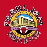
Live on Two Legs reissue looks like a bootleg

Spiritual_Chaos
Posts: 31,951
The reissue arrived and had the chance to watch them side by side, after it had been noted about the difference about the print. The difference in brightness and saturation is very stark. Starker in real life than in images. The reissue is noticable dull.
It must be an error.
Was the original artwork lost and they had to do a reproscan like bootlegmakers do? Or has there been some error along the way by the art director/final art or the printer?


This can not be intentional?
Curious on the reason for this mishap.
It must be an error.
Was the original artwork lost and they had to do a reproscan like bootlegmakers do? Or has there been some error along the way by the art director/final art or the printer?
This can not be intentional?
Curious on the reason for this mishap.
"Mostly I think that people react sensitively because they know you’ve got a point"
Post edited by Spiritual_Chaos on
0
Comments
-
Yeah. The artwork isn’t great.
I think proportionately they missed the mark on the art more than they did on the pressing. I still prefer the sound of the OG, but it’s closer0 -
The European reissue has some more saturation to it than the US one (from tenclub) but no one is close to the original release. But the US print looks like a clear error in its drabiness.


Or is it just my original that has a clear yellow push in the skintones?Post edited by Spiritual_Chaos on"Mostly I think that people react sensitively because they know you’ve got a point"0 -
It’s like that on my US original (same as your European OG)Spiritual_Chaos said:The European reissue has some more saturation to it than the US one (from tenclub) but no one is close to the original release. But the US print looks like a clear error in its drabiness.
Or is it just my original that has a clear yellow push in the skintones?
On the Clear and gold a lot of the image fades into the black background same as yours
Post edited by Cropduster-80 on0 -
Printing methods have likely changed since 1998?www.cluthelee.com0
-
That is not really applicable to the problem at hand though(?).2-feign-reluctance said:Printing methods have likely changed since 1998?
"Mostly I think that people react sensitively because they know you’ve got a point"0 -
I guess the thing is that you are comparing it to something physical that was manufactured years ago. There will even be differences from one end of the print run to the other. I doubt when they were proofing it in the factory they compared it to a 24 year old sleeve to try and match it. It could even be just a digital print rather than CMYK, wouldnt recommend pulling it apart to see. Totally agree that the colours are no where near as good as the original. I can barely read On Two Legs on the front of mine.
This isn't new though. There are other Pearl Jam records where the sleeve hasn't been the best. Some of the reissued singles had blurry text and stuff.
I've also got loads of records from the 90s where the reissue is no where near as sharp as the original with definition lost. Technology has changed a bit in the past 25-30 years. Opening files from that time is going to be a problem so who knows how they recreate these. Spend enough time and they could get it spot on but we know that doesn't happen.0 -
Spiritual_Chaos said:The reissue arrived and had the chance to watch them side by side, after it had been noted about the difference about the print. The difference in brightness and saturation is very stark. Starker in real life than in images. The reissue is noticable dull.
It must be an error.
Was the original artwork lost and they had to do a reproscan like bootlegmakers do? Or has there been some error along the way by the art director/final art or the printer?
This can not be intentional?
Curious on the reason for this mishap.
Complains about there not being enough pressings, complains about show length, complains about the color of vinyl, complains about the cover.
Do you even like Pearl Jam or do you just use them as a vehicle to complain? Mostly about their merch, it seems.0 -
Didn't read this as a compliant, just a question.i am a target said:Spiritual_Chaos said:The reissue arrived and had the chance to watch them side by side, after it had been noted about the difference about the print. The difference in brightness and saturation is very stark. Starker in real life than in images. The reissue is noticable dull.
It must be an error.
Was the original artwork lost and they had to do a reproscan like bootlegmakers do? Or has there been some error along the way by the art director/final art or the printer?
This can not be intentional?
Curious on the reason for this mishap.
Complains about there not being enough pressings, complains about show length, complains about the color of vinyl, complains about the cover.
Do you even like Pearl Jam or do you just use them as a vehicle to complain? Mostly about their merch, it seems.Kearnsy0 -
It comes off more like a collector’s honest critique vs a complaint/bitchNmoan. It’s all good, I’m happy to see how it looks and also kinda wishing the sharpness and color-pop is were really hitting the sweet spot in the rerelease. As a dreamer, I also would like a rerelease to be used as a time to make the 2nd time as close to whatever perfect is as possible. It’s all good tho, I’d rather drop $30 some odd bucks plus whatever shipping on this vs hundreds on an old copy. I want to be able to play this sucker and enjoy the packaging. If that’s there then I’m great
Hey nanana
ain't that somethin
PJ Chi 2--08-24-2009
SG Chi 1--01-23-2013
PJ Wrigley--07-19-2013
CCornell Chi--10-06-2015
PJ Wrigley--08-20 & 22 2016
PJ Wrigley--08-18 & 20 2018
Denver— 09-22-20220 -
Yeah, The art is hard to see, that’s just a fact.GoinHungry94 said:It comes off more like a collector’s honest critique vs a complaint/bitchNmoan. It’s all good, I’m happy to see how it looks and also kinda wishing the sharpness and color-pop is were really hitting the sweet spot in the rerelease. As a dreamer, I also would like a rerelease to be used as a time to make the 2nd time as close to whatever perfect is as possible. It’s all good tho, I’d rather drop $30 some odd bucks plus whatever shipping on this vs hundreds on an old copy. I want to be able to play this sucker and enjoy the packaging. If that’s there then I’m great
how big of a deal it is depends on the individual
the art is just as important as the music on a physical release (especially vinyl) to a lot of people. Most of the audiophile reissue labels (I know this isn’t that) spend a lot of time focusing just on getting the art right. Tip on jackets vs printing directly on the sleeve etcIt’s not a 60 dollar record at retail either so it’s not a huge deal to me as it’s not intended as that. I find complaints about tiny corner dings during shipping as the unreasonable complaintsPost edited by Cropduster-80 on0 -
What did I say about show lenghts?i am a target said:Spiritual_Chaos said:The reissue arrived and had the chance to watch them side by side, after it had been noted about the difference about the print. The difference in brightness and saturation is very stark. Starker in real life than in images. The reissue is noticable dull.
It must be an error.
Was the original artwork lost and they had to do a reproscan like bootlegmakers do? Or has there been some error along the way by the art director/final art or the printer?
This can not be intentional?
Curious on the reason for this mishap.
Complains about there not being enough pressings, complains about show length, complains about the color of vinyl, complains about the cover.
Do you even like Pearl Jam or do you just use them as a vehicle to complain? Mostly about their merch, it seems."Mostly I think that people react sensitively because they know you’ve got a point"0 -
This is what I was getting at, but the OP didn’t think it was relevant.FR181798 said:I guess the thing is that you are comparing it to something physical that was manufactured years ago. There will even be differences from one end of the print run to the other. I doubt when they were proofing it in the factory they compared it to a 24 year old sleeve to try and match it. It could even be just a digital print rather than CMYK, wouldnt recommend pulling it apart to see. Totally agree that the colours are no where near as good as the original. I can barely read On Two Legs on the front of mine.
This isn't new though. There are other Pearl Jam records where the sleeve hasn't been the best. Some of the reissued singles had blurry text and stuff.
I've also got loads of records from the 90s where the reissue is no where near as sharp as the original with definition lost. Technology has changed a bit in the past 25-30 years. Opening files from that time is going to be a problem so who knows how they recreate these. Spend enough time and they could get it spot on but we know that doesn't happen.www.cluthelee.com0 -
You have to figure that these are repressed by different manufactuers than the originals. They probably scanned the old one to create the new graphics
My guess isnthe old art source is long gone0 -
1998, they were probably using Quark Xpress 3 or 4 for layouts back then. Even if they did still have the files I'm not sure they would be able to easily open up 20+ year old files to work from.hrd2imgn said:You have to figure that these are repressed by different manufactuers than the originals. They probably scanned the old one to create the new graphics
My guess isnthe old art source is long gone
Its a bit easier to open slightly older files these days if Hi Res PDFs are saved etc, they usually preserve layers, fonts, colour info.
Printer calibration, inks, digital or 4 color process all come in to play as well.
0 -
The fact that it is the year 2022 and not 1998 is not relevent, in the context of being able to produce and print e.g. the color red and brightness in an image.2-feign-reluctance said:
This is what I was getting at, but the OP didn’t think it was relevant.FR181798 said:I guess the thing is that you are comparing it to something physical that was manufactured years ago. There will even be differences from one end of the print run to the other. I doubt when they were proofing it in the factory they compared it to a 24 year old sleeve to try and match it. It could even be just a digital print rather than CMYK, wouldnt recommend pulling it apart to see. Totally agree that the colours are no where near as good as the original. I can barely read On Two Legs on the front of mine.
This isn't new though. There are other Pearl Jam records where the sleeve hasn't been the best. Some of the reissued singles had blurry text and stuff.
I've also got loads of records from the 90s where the reissue is no where near as sharp as the original with definition lost. Technology has changed a bit in the past 25-30 years. Opening files from that time is going to be a problem so who knows how they recreate these. Spend enough time and they could get it spot on but we know that doesn't happen.
Printers still do that."Mostly I think that people react sensitively because they know you’ve got a point"0 -
FR181798 said:
1998, they were probably using Quark Xpress 3 or 4 for layouts back then. Even if they did still have the files I'm not sure they would be able to easily open up 20+ year old files to work from.hrd2imgn said:You have to figure that these are repressed by different manufactuers than the originals. They probably scanned the old one to create the new graphics
My guess isnthe old art source is long gone
Its a bit easier to open slightly older files these days if Hi Res PDFs are saved etc, they usually preserve layers, fonts, colour info.
Printer calibration, inks, digital or 4 color process all come in to play as well.
I fail to see how this would be a "defense" or reason for the end result, in this case?
Look no further than to KISS, where pretty much all the 2014 re-issues of the catalog were based off scans of commercial copies (older than 1998 too). So?
There were still color and brightness in those releases, that matched the original releases. With the obvious changes in temperature, contrast, brightness or whatever that comes with printing and different printers.
Having or not having the original artwork is a moot point, to why these are so dark and colorless. The text would have been re-set anyways logically. So them being so much darker on the US release, to the degree that it is now hard for people to read the text is one thing on this board that can not be explained away by "it's not the 90s anymore".
"Mostly I think that people react sensitively because they know you’ve got a point"0 -
And this was a big 20.000+ copies relrease by a major rockband.
Not a 100 copies printrun of a local Punkbands 7'' with a cover sent in as a RGB JPEG made in MS Paint."Mostly I think that people react sensitively because they know you’ve got a point"0 -
I guess the only plausible explanation is that it is a poor, bootleg looking reprint and that wherever this was printed didn’t take great care to align to the original art because they didn’t want to.Spiritual_Chaos said:
The fact that it is the year 2022 and not 1998 is not relevent, in the context of being able to produce and print e.g. the color red and brightness in an image.2-feign-reluctance said:
This is what I was getting at, but the OP didn’t think it was relevant.FR181798 said:I guess the thing is that you are comparing it to something physical that was manufactured years ago. There will even be differences from one end of the print run to the other. I doubt when they were proofing it in the factory they compared it to a 24 year old sleeve to try and match it. It could even be just a digital print rather than CMYK, wouldnt recommend pulling it apart to see. Totally agree that the colours are no where near as good as the original. I can barely read On Two Legs on the front of mine.
This isn't new though. There are other Pearl Jam records where the sleeve hasn't been the best. Some of the reissued singles had blurry text and stuff.
I've also got loads of records from the 90s where the reissue is no where near as sharp as the original with definition lost. Technology has changed a bit in the past 25-30 years. Opening files from that time is going to be a problem so who knows how they recreate these. Spend enough time and they could get it spot on but we know that doesn't happen.
Printers still do that.www.cluthelee.com0 -
I had this LO2L on my list for the RSD drop. When I actually saw it in the record store, I decided to pass.✌🏼❤️0
-
Spiritual_Chaos said:FR181798 said:
1998, they were probably using Quark Xpress 3 or 4 for layouts back then. Even if they did still have the files I'm not sure they would be able to easily open up 20+ year old files to work from.hrd2imgn said:You have to figure that these are repressed by different manufactuers than the originals. They probably scanned the old one to create the new graphics
My guess isnthe old art source is long gone
Its a bit easier to open slightly older files these days if Hi Res PDFs are saved etc, they usually preserve layers, fonts, colour info.
Printer calibration, inks, digital or 4 color process all come in to play as well.
I fail to see how this would be a "defense" or reason for the end result, in this case?
Look no further than to KISS, where pretty much all the 2014 re-issues of the catalog were based off scans of commercial copies (older than 1998 too). So?
There were still color and brightness in those releases, that matched the original releases. With the obvious changes in temperature, contrast, brightness or whatever that comes with printing and different printers.
Having or not having the original artwork is a moot point, to why these are so dark and colorless. The text would have been re-set anyways logically. So them being so much darker on the US release, to the degree that it is now hard for people to read the text is one thing on this board that can not be explained away by "it's not the 90s anymore".
Not disagreeing, the quality definitely isn't great for such a big release and not a cheap one either. It was more a comment about whether they could use the original artwork which in theory should have lead to a really decent print close to the original unless the printer wasn't well calibrated etc.Spiritual_Chaos said:And this was a big 20.000+ copies relrease by a major rockband.
Not a 100 copies printrun of a local Punkbands 7'' with a cover sent in as a RGB JPEG made in MS Paint.
Would love to see the process of what goes into doing sleeves for reissues as I've seen some shockers. Sometimes they get it spot on, others they don't.Post edited by FR181798 on0


Categories
- All Categories
- 149.2K Pearl Jam's Music and Activism
- 110.4K The Porch
- 290 Vitalogy
- 35.1K Given To Fly (live)
- 3.5K Words and Music...Communication
- 39.5K Flea Market
- 39.5K Lost Dogs
- 58.7K Not Pearl Jam's Music
- 10.6K Musicians and Gearheads
- 29.1K Other Music
- 17.8K Poetry, Prose, Music & Art
- 1.1K The Art Wall
- 56.8K Non-Pearl Jam Discussion
- 22.2K A Moving Train
- 31.7K All Encompassing Trip
- 2.9K Technical Stuff and Help