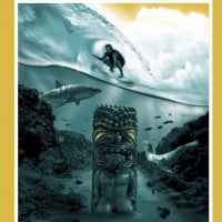
I was able to get an Ames and a Krzysztof and I have every intention of framing and hanging them on my wall.
Excellent. Had I been able to get the Ames, that is what I would have done as well. It just pisses me off to see so many of these on Ebay. It would be great karma if the artists tracked them down and canceled their orders as @demetrios suggested above.
I agree they should cancel those orders but then how do they recoup their money on lost sales or guarantee the next buyer won't be a flipper too?
When emek canceled sales recently he redistributed them through his wishlist. But yeah, there's no guarantee the new buyers won't do the same thing.
I saw that. All of them want over $700. This is just as bad as ticket scalpers. There were some of us fans who genuinely wanted the poster for ourselves - and all of these flippers got the very limited stock
If they stop making these posters “limited editions”, this problem will go away. Just produce as many as there are demand and everyone who wants one can purchase one.
There’s still 115 yet to be sold.....and its not an AMES XL print but not too far off after framing. I like the image but i know a lot of other collector friends who just don't know what they’d do with this other than keep it in a tube (nooooo!)
Not trying to tell you how to spend your cash but anyone paying insane prices for it right now deserve to pay that.
For all we know, the 10C might only have 85 for sale, too. Ames could be keeping 30 for their own purposes.
Thought it was 100 each
It is 100 each. Few artists keep extras on the side if any prints arrive to customers damaged in the mail.
“I had to constantly pinch myself”: Krzysztof Domaradzki on his custom lettering for Pearl Jam’s latest album
The Polish creative talks us through the reasons why he wouldn't change anything about his life right now.
Though
Krzysztof Domaradzki is known for his bold type experiments, it is in
fact drawing that has always been his thing. Based in Poznan, Poland,
the graphic designer is known for his poster art and illustration – a
medium he honed while studying a master’s in drawing and etching. It was
there that he had the chance to expand on his anatomical drawings and
sculpture, then incidentally, technology hit big time and the
illustrator was introduced to the wonders of computer graphics.
Subsequently,
the creative has gone on to make work for the likes of Audi,
Volkswagen, Nike, NBA and Pepsi, creating various logos, identities and
artworks for such giants. Interestingly, he has ventured into the realms
of custom typography, adorning movie poster commissions and gig posters
with bespoke lettering created solely for that artwork. “I have been
able to do a lot of different things, which is what keeps me going,” he
tells It’s Nice That. For Krzysztof, he actively seeks a change in media
to avoid the creative rut which comes with doing the same thing over
and over again. In turn, these new challenges have made life “more
exciting and fulfilling.”
Now with the help of his wife, he runs a
one-man studio under the name of Studio Kxx, applying his
interdisciplinary range of talents to whatever brief that may come his
way. The decision to establish his own studio was not a difficult one
for this designer. Quickly, he discerned what he could offer up to the
industry – that being a unique combination of traditional techniques and
technology. This led him to the realisation: “I did not need anyone to
tell me who to work for and how to run my own show.” It was obviously
the right move, as now, Krzysztof tells us, “I honestly would not change
a thing about my life – I love everything about it, however corny it
may sound.”
Above
Krzysztof Domaradzki
Embracing
the trials and tribulations of running his own business, it is the
excitement of the new creative day that fuels the designer – no matter
what that day may bring. With a meticulous attention to detail, he goes
at his own pace to make the work to the standard he desires. Sometimes
it takes his over six weeks to produce one poster, which is part of the
beauty of the creative process for Krzysztof. It’s a method exemplified
in one of the designer’s most recent projects, a project where he had to
“constantly pinch [him]self” as a reminder that he wasn’t dreaming.
Pearl Jam, a band Krzysztof grew up listening to in the 90s, got in
touch with the designer to promote their latest album, Gigaton.
He
had had the pleasure of creating two previous posters for them a couple
of years back, but this time, they “expected something really special.”
The design would feature on a limited edition set of art prints and,
importantly, they tasked the creative with interpreting the music in his
own way. In this vein, Krzysztof started out by typographically
exploring the band’s name and the album title. From the start, one idea
stood out in particular. “It was quite simple,” explains Krzysztof,
“large letter form a composition with Pearl Jam at the top with a large
‘Giga/Ton’ in capitals taking up the rest of the canvas.”
Later,
he incorporated a silhouette of a female figure into the letters, a hint
to the fading away of Mother Nature. “The part of the design I like
most,” he adds, “is the negative space in-between the letters, creating
an illusion of icebergs melting providing direct link to Pearl Jam’s
11th LP cover.” It’s a subtly placed hidden meaning that can be
uncovered only with further inspection. “I didn’t want to distract
anyone from the artwork itself,” evaluates Krzysztof, “besides, I am not
sure if looking at something as depressing as the idea of environmental
collapse would do anyone any good, which is why it is in the
background.”
As for the future, there is plenty more in store for
this creative brimming with creative motivation. Amidst a bundle of new
commissioned work, at some point, Krzysztof also hopes to work on video
game artwork, book covers, t-shirt designs – the list goes on. “I have
so many ideas I am pretty sure I will always be producing something,” he
finally goes on to say. "My ultimate dream is to do a graphic novel or
even direct a movie, God willing. The thoughts that have haunted me for
all these years are ‘so much to do and so little time’, as well as this
Nietzsche quote: ‘A Yes, a No, a straight line, a goal.’ Both sum up my
attitude pretty well, while the latter has been a guide for most of my
decisions.”
I give the guy credit for coming up with something creative for the lettering but I’m not loving it. Not a big deal since it’s just the font but I’m just not feeling it. Great artist though.
1996: Randall's Island 2 1998: East Rutherford | MSG 1 & 2 2000: Cincinnati | Columbus | Jones Beach 1, 2, & 3 | Boston 1 | Camden 1 & 2 2003: Philadelphia | Uniondale | MSG 1 & 2 | Holmdel 2005: Atlantic City 1 2006: Camden 1 | East Rutherford 1 & 2 2008: Camden 1 & 2 | MSG 1 & 2 | Newark (EV) 2009: Philadelphia 1, 2 & 4 2010: Newark | MSG 1 & 2 2011: Toronto 1 2013: Wrigley Field | Brooklyn 2 | Philadelphia 1 & 2 | Baltimore 2015: Central Park 2016: Philadelphia 1 & 2 | MSG 1 & 2 | Fenway Park 2 | MSG (TOTD) 2017: Brooklyn (RnR HOF) 2020: MSG | Asbury Park2021: Asbury Park 2022: MSG | Camden | Nashville 2024: MSG 1 & 2 (#50) | Philadelphia 1 & 2 | Baltimore 2025: Raleigh
I give the guy credit for coming up with something creative for the lettering but I’m not loving it. Not a big deal since it’s just the font but I’m just not feeling it. Great artist though.
Personal taste is a funny thing. I love the print and were lucky to get one. I on the other hand don’t get the Ames print at all. For me it’s not an interpretation of the album but merely a lesser print version of the original photograph. Did you try for one of the other prints/ get one?
I didn’t try for any of the prints. I have enough trouble finding space for shows I’ve seen. I liked the Ames... as someone else mentioned... It reminded me of something from 1998. They were all good... but nothing grabbed me as something I had to have. I’m hoping there’s a drop of posters from the cancelled tour.
1996: Randall's Island 2 1998: East Rutherford | MSG 1 & 2 2000: Cincinnati | Columbus | Jones Beach 1, 2, & 3 | Boston 1 | Camden 1 & 2 2003: Philadelphia | Uniondale | MSG 1 & 2 | Holmdel 2005: Atlantic City 1 2006: Camden 1 | East Rutherford 1 & 2 2008: Camden 1 & 2 | MSG 1 & 2 | Newark (EV) 2009: Philadelphia 1, 2 & 4 2010: Newark | MSG 1 & 2 2011: Toronto 1 2013: Wrigley Field | Brooklyn 2 | Philadelphia 1 & 2 | Baltimore 2015: Central Park 2016: Philadelphia 1 & 2 | MSG 1 & 2 | Fenway Park 2 | MSG (TOTD) 2017: Brooklyn (RnR HOF) 2020: MSG | Asbury Park2021: Asbury Park 2022: MSG | Camden | Nashville 2024: MSG 1 & 2 (#50) | Philadelphia 1 & 2 | Baltimore 2025: Raleigh
I give the guy credit for coming up with something creative for the lettering but I’m not loving it. Not a big deal since it’s just the font but I’m just not feeling it. Great artist though.
Personal taste is a funny thing. I love the print and were lucky to get one. I on the other hand don’t get the Ames print at all. For me it’s not an interpretation of the album but merely a lesser print version of the original photograph. Did you try for one of the other prints/ get one?
I didn’t try for any of the prints. I have enough trouble finding space for shows I’ve seen. I liked the Ames... as someone else mentioned... It reminded me of something from 1998. They were all good... but nothing grabbed me as something I had to have. I’m hoping there’s a drop of posters from the cancelled tour.
Hehe, I can imagine space is a huge problem for poster fans good luck in case they do drop some show posters!
Pittsburgh, PA September 28, 2005 || Washington, DC June 22, 2008 || Barstow, VA May 13, 2010 || Seattle, WA August 10, 2018 || Dana Point, CA September 29, 2018 (EV) || Dana Point, CA September 28, 2019 (EV) || Dana Point, CA September 25, 2021 (EV) || Dana Point, CA October 1, 2021 || Dana Point, CA October 2, 2021 || Chicago, IL August 29, 2024
Comments
For all we know, the 10C might only have 85 for sale, too. Ames could be keeping 30 for their own purposes.
Wrigley 2016 Night 1
Wrigley 2016 Night 2
MSG 2020
OKC 2020
Hope you get it when they drop on sale @ the 10club store. I'm guessing all 3 will go up May 10th.
“I had to constantly pinch myself”: Krzysztof Domaradzki on his custom lettering for Pearl Jam’s latest album
The Polish creative talks us through the reasons why he wouldn't change anything about his life right now.
Though Krzysztof Domaradzki is known for his bold type experiments, it is in fact drawing that has always been his thing. Based in Poznan, Poland, the graphic designer is known for his poster art and illustration – a medium he honed while studying a master’s in drawing and etching. It was there that he had the chance to expand on his anatomical drawings and sculpture, then incidentally, technology hit big time and the illustrator was introduced to the wonders of computer graphics.
Subsequently, the creative has gone on to make work for the likes of Audi, Volkswagen, Nike, NBA and Pepsi, creating various logos, identities and artworks for such giants. Interestingly, he has ventured into the realms of custom typography, adorning movie poster commissions and gig posters with bespoke lettering created solely for that artwork. “I have been able to do a lot of different things, which is what keeps me going,” he tells It’s Nice That. For Krzysztof, he actively seeks a change in media to avoid the creative rut which comes with doing the same thing over and over again. In turn, these new challenges have made life “more exciting and fulfilling.”
Now with the help of his wife, he runs a one-man studio under the name of Studio Kxx, applying his interdisciplinary range of talents to whatever brief that may come his way. The decision to establish his own studio was not a difficult one for this designer. Quickly, he discerned what he could offer up to the industry – that being a unique combination of traditional techniques and technology. This led him to the realisation: “I did not need anyone to tell me who to work for and how to run my own show.” It was obviously the right move, as now, Krzysztof tells us, “I honestly would not change a thing about my life – I love everything about it, however corny it may sound.”
Krzysztof Domaradzki
Embracing the trials and tribulations of running his own business, it is the excitement of the new creative day that fuels the designer – no matter what that day may bring. With a meticulous attention to detail, he goes at his own pace to make the work to the standard he desires. Sometimes it takes his over six weeks to produce one poster, which is part of the beauty of the creative process for Krzysztof. It’s a method exemplified in one of the designer’s most recent projects, a project where he had to “constantly pinch [him]self” as a reminder that he wasn’t dreaming. Pearl Jam, a band Krzysztof grew up listening to in the 90s, got in touch with the designer to promote their latest album, Gigaton.
He had had the pleasure of creating two previous posters for them a couple of years back, but this time, they “expected something really special.” The design would feature on a limited edition set of art prints and, importantly, they tasked the creative with interpreting the music in his own way. In this vein, Krzysztof started out by typographically exploring the band’s name and the album title. From the start, one idea stood out in particular. “It was quite simple,” explains Krzysztof, “large letter form a composition with Pearl Jam at the top with a large ‘Giga/Ton’ in capitals taking up the rest of the canvas.”
Later, he incorporated a silhouette of a female figure into the letters, a hint to the fading away of Mother Nature. “The part of the design I like most,” he adds, “is the negative space in-between the letters, creating an illusion of icebergs melting providing direct link to Pearl Jam’s 11th LP cover.” It’s a subtly placed hidden meaning that can be uncovered only with further inspection. “I didn’t want to distract anyone from the artwork itself,” evaluates Krzysztof, “besides, I am not sure if looking at something as depressing as the idea of environmental collapse would do anyone any good, which is why it is in the background.”
As for the future, there is plenty more in store for this creative brimming with creative motivation. Amidst a bundle of new commissioned work, at some point, Krzysztof also hopes to work on video game artwork, book covers, t-shirt designs – the list goes on. “I have so many ideas I am pretty sure I will always be producing something,” he finally goes on to say. "My ultimate dream is to do a graphic novel or even direct a movie, God willing. The thoughts that have haunted me for all these years are ‘so much to do and so little time’, as well as this Nietzsche quote: ‘A Yes, a No, a straight line, a goal.’ Both sum up my attitude pretty well, while the latter has been a guide for most of my decisions.”
Did you try for one of the other prints/ get one?
PEARL JAM X KRZYSZTOF DOMARADZKI GIGATON ART PRINT https://shop.pearljam.com/collections/featured/products/pearl-jam-x-krzysztof-domaradzki-gigaton-art-print
They sure are.