How to frame a poster good?

Hi all,
Looking to get some of my posters framed. Are there any general rules to making a poster look good? I heard something about getting the matte the same colour as the most common one in the poster or something. I guess a black frame with 1 inch matte is fine? Frame thickness? I want to spend as little as possible...
First one up is the Owl from MSG 1 2016.
Post edited by Brisk. on
0
Comments
-
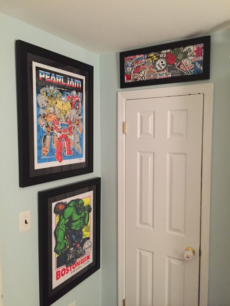
Much of this is personal taste. I went with all thin black metal frames and a consistent matting on the posters. The posters were all double matted with an off white upper matte (same in all), and then an accent colour from the poster as the bottom matte. As a whole the posters look good together. I tend to prefer a thicker matte but that's just personal taste.
Good luck with the framing - MSG1 is a great place to start.0 -
Send it to me and I will frame it up properly for you. I have a thread in the porch offering up my services.0
-
Agreed... most of it is personal taste. I like a 2" matte and a thick wood frame. I stay consistent from Poster to poster by using the same black matte and frame for all my posters. I feel like it lets the poster stand out more.1996: Randall's Island 2 1998: East Rutherford | MSG 1 & 2 2000: Cincinnati | Columbus | Jones Beach 1, 2, & 3 | Boston 1 | Camden 1 & 2 2003: Philadelphia | Uniondale | MSG 1 & 2 | Holmdel 2005: Atlantic City 1 2006: Camden 1 | East Rutherford 1 & 2 2008: Camden 1 & 2 | MSG 1 & 2 (#25) | Newark (EV) 2009: Philadelphia 1, 2 & 4 2010: Newark | MSG 1 & 2 2011: Toronto 1 2013: Wrigley Field | Brooklyn 2 | Philadelphia 1 & 2 | Baltimore 2015: Central Park 2016: Philadelphia 1 & 2 | MSG 1 & 2 | Fenway Park 2 | MSG (TOTD) 2017: Brooklyn (RnR HOF) 2020: MSG | Asbury Park 2021: Asbury Park 2022: MSG | Camden | Nashville 2024: MSG 1 & 2 (#50) | Philadelphia 1 & 2 | Baltimore 2025: Raleigh 20
-
My OCD mostly rules my choice of frames and mattes.

1996: Randall's Island 2 1998: East Rutherford | MSG 1 & 2 2000: Cincinnati | Columbus | Jones Beach 1, 2, & 3 | Boston 1 | Camden 1 & 2 2003: Philadelphia | Uniondale | MSG 1 & 2 | Holmdel 2005: Atlantic City 1 2006: Camden 1 | East Rutherford 1 & 2 2008: Camden 1 & 2 | MSG 1 & 2 (#25) | Newark (EV) 2009: Philadelphia 1, 2 & 4 2010: Newark | MSG 1 & 2 2011: Toronto 1 2013: Wrigley Field | Brooklyn 2 | Philadelphia 1 & 2 | Baltimore 2015: Central Park 2016: Philadelphia 1 & 2 | MSG 1 & 2 | Fenway Park 2 | MSG (TOTD) 2017: Brooklyn (RnR HOF) 2020: MSG | Asbury Park 2021: Asbury Park 2022: MSG | Camden | Nashville 2024: MSG 1 & 2 (#50) | Philadelphia 1 & 2 | Baltimore 2025: Raleigh 20 -
Look through this thread. A lot of different ideas and colors.
http://community.pearljam.com/discussion/3677/framed-poster-thread#latest
As far as a 1" matte is concerned, on a big poster, that may be too small. It's like putting a big girl in a toddler tutu. You have to see how it looks with each individual poster. It may be just right!
There are plenty of examples of framed pieces without mattes. It's what I do and it makes it easier to find stock frames. Cuts cost by a lot. A gig poster frame, an odd size that I couldn't find, was purchased on Amazon from Art to Frames in Brooklyn. Archival materials aren't used in the stock pieces (or the ATF frame I ordered), but it gets the poster out of the tube and onto the wall.
A lot of people swear by Michael's and the almighty coupon. They get a lot of specialized cuts and framing that way. (If you are looking to include tickets, stickers, pictures...) Frame stock and matte color choices are limited with the coupon, but a bunch of people just ran with a $79 deal. A lot of examples are in that poster thread that I included.
A friend has a recipe for his frames which is a nice black block type frame, black matte with color core and an inside color matte to compliment the poster color.
I wish you luck with whatever you choose. Free those posters and enjoy them! 2014: Cincinnati
2016: Lexington and Wrigley 10 -
Thank you all for your help so far. Unfortunately I live in London where it's fucking expensive to frame. I might just leave the matte but feel like all framers would try to sell me if I mention I had an interest in it.0
-
I prefer to use a small framing shop over the big box stores...Brisk. said:Thank you all for your help so far. Unfortunately I live in London where it's fucking expensive to frame. I might just leave the matte but feel like all framers would try to sell me if I mention I had an interest in it.
the prices there AND the quality of work are much better than the places that sell fake flowers and fabric,
even with their "60% off coupons."
The best advice I can give you is to take your print in to the shop of choice,
and tell the framing professional what you have in your budget for the project.
They will help you figure out how to get it done!!Post edited by derbydave on'96: Seattle: Key Arena
'98: Seattle: Memorial Stadium 1 & 2
'00: Columbus: Polaris
'03: Columbus: Germain
'10: Columbus: Nationwide Arena
'11: East Troy: Alpine Valley - PJ20 1 & 2 + EV Detroit
'12: Missoula + EV Jacksonville 1 & 2
'13: Chicago / Pittsburgh / Buffalo / Seattle
'14: Cincinnati / St. Louis / Tulsa / Lincoln / Memphis / Detroit / Moline
'15: New York City - Global Citizen Festival
'16: Greenville / Hampton / Raleigh / Columbia / Lexington / Ottawa / Toronto 1 & 2 / Wrigley 1 & 2
'17: Brooklyn - Rock & Roll Hall of Fame Induction Ceremony
'18: London 1 & 2 / Seattle 1 & 2 / Missoula / Wrigley 1
'22: Nashville / St. Louis0 -
mat colors- well sometimes they can really help bring out the colors in the print, sometimes they can really overpower the print. You have to consider a few things:
color: red/yellow/orange are warm colors and will visually advance- large mats with these color could very well overpower the print.
blue-green-violet are cool colors, they tend to recede visually, they won;t be as likely to overpower a print
white-gray are sometime considered neutral, however, many hues in this range tend to have red or blues in it making them in essence warmer or cooler (same with Brown).
pure black and white are different animals large black mats could make the color "pop" in the print, but they could also make a frame look empty or even darker. White on the other hand will make the colors "pop" as well, but will significantly brighten the frame job, so if you have a lot of bright colors in the print they may be harder to see. One trick many framers use is a multi color mat job where there is a small inner mat showing of a color prevalent in the print, with a second mat over that mat, that is more neutral.
The effects of colors changing our perception of the colors around them is very real, and you really would want to bring the print in to the framer and see the mat color literally next to the print to get some sort of idea but until it is fully framed you just won;t know. You can digitally mat a print with say a photoshop or something to see what Munk Pitt would look like with a orange mat, red mat, etc as sort of preview tool, but as one of my instructors always said, the monitor is a lying stinking whore, don't ever trust it top represent your physical stuff..
So red will look redder when around colors such as green/yellow green/blue green, and if the same red is next to oranges or yellows it will look totally different, even though it is the same color. Kandinsky, Miro, Albers all have extensively studied color and their effect on the viewer and the colors within a work.
SOOOOO, bring the print in, see what it looks like with the physical mats next to them, and pick what color or combo you like, as there is no one way to do it. Get what you think looks good, and don't always listen to the framer. They have preferences just like you may, and they may try to convince you to get a job done contrary to what your brain is screaming to you saying I love it!
Some frames can serve almost like a mat as well, where the print is strait in the frame, and the bordering frame acts like a mat.
good luck, matting if done properly is expensive, but it helps preserve the print.
Cheap mats usually have acids in them that will yellow your print over time, but even if you pony up for acid free mats, you need a good UV glass, or the light will literally burn the print over a long period of time, and the stuff exposed to the light will fade and discolor, while anything covered by a mat or frame would stay closer to the original color and you would have a print that is ruined(this happens when you hang them in direct sun or florescent light very often).
So get what looks good, what you could afford, and unless you plan on reselling the print, do what is in your budget, or long term goals.0 -
Make sure they frame it archival. That means they won't dry mount the poster and they will use acid free materials. Also pay for UV plexiglass. Normal glass will stick to the poster over time, and UV protection prevents fading0
-


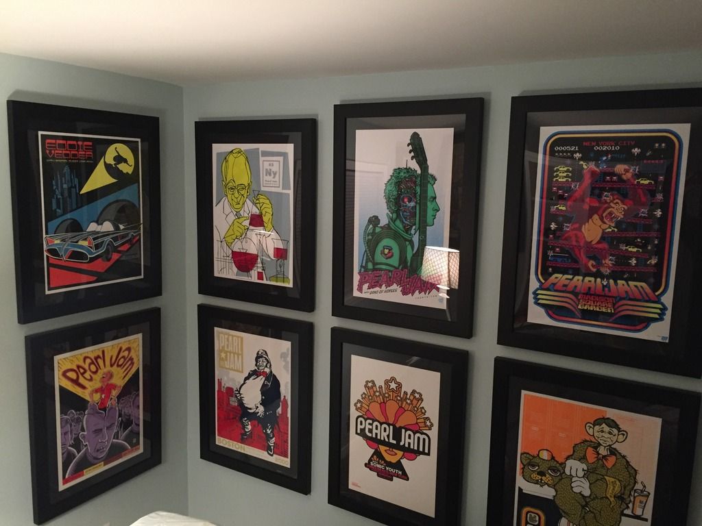
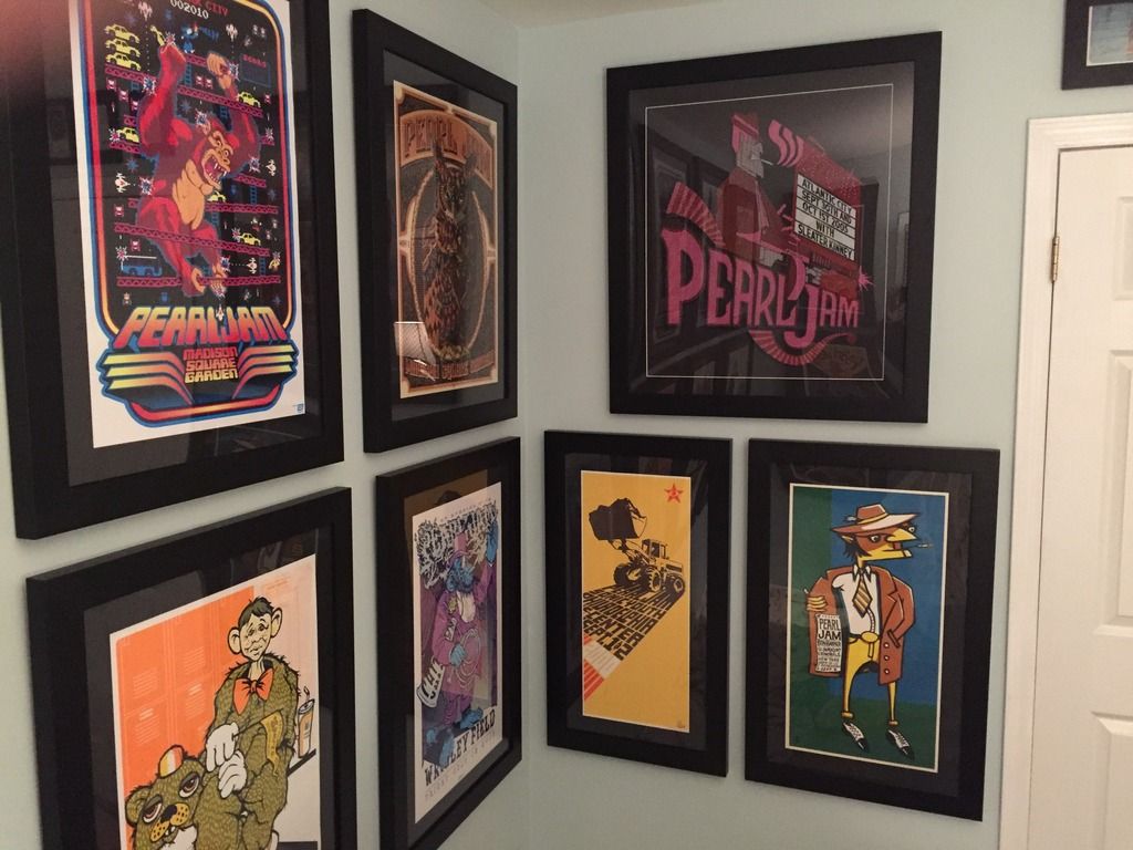
Two examples I had done. The first has the glass under the inner/lower frame and the bottom has it between frames. Get whatever color of frame you want. I like to take the main colors in the art and use them in the frame. The ship in the first one sort of "pops out" at you. The second one has sort of an "underwater" theme, especially with the darker inner frame. The guy at the store had an idea about going with pink for the inner frame, but I shot that idea down. I'm glad I did, as the pink would have been distracting.
In the top photo, you can also notice some examples I did when I was a rookie at the game and I wanted minimal frames. There, I was basically looking just to get them framed. The huge one is a four-piece from Eddie's ukulele show at Benaroyal Hall. There was really no way to get that as one huge piece, like what some people have done with the TOTD Tryptiks.Post edited by Lost In Ohio onPresidential Advice from President-Elect Mike McCready: "Are you getting something out of this all encompassing trip?"0 -
Here are all pics of one's I have done. Personally, I am not a fan of a single mat for most. Double or triple has the ability to pull so much more color out of the posters.


0


Categories
- All Categories
- 149.3K Pearl Jam's Music and Activism
- 110.5K The Porch
- 294 Vitalogy
- 35.1K Given To Fly (live)
- 3.5K Words and Music...Communication
- 39.6K Flea Market
- 39.6K Lost Dogs
- 58.8K Not Pearl Jam's Music
- 10.6K Musicians and Gearheads
- 29.1K Other Music
- 17.8K Poetry, Prose, Music & Art
- 1.1K The Art Wall
- 56.9K Non-Pearl Jam Discussion
- 22.2K A Moving Train
- 31.7K All Encompassing Trip
- 2.9K Technical Stuff and Help