Shirt idea!
 chiquimonkey
Posts: 9,337
chiquimonkey
Posts: 9,337
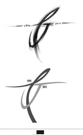
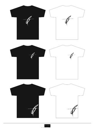
Been sketching out ideas for a new shirt in my shop, in honor of the 20th anniversary! Done two versions, one in a rougher state and a cleaner version. I'm leaning towards the rougher one, and played around with placement, but thought I'd share to get some feedback ")
Post edited by Unknown User on
0
This discussion has been closed.
Comments
at first i was going to say definitely the rough sketch
but then, i dunno...i like the other one too
but i like the center large logo or the pocket area for the logo the best
not a lotta help huh?
you know, i never put your screen-name with your etsy page..and your fb (until i asked mickey where he got the stuff for his secret santa).
well, no sense in being stupid 'lest you show it right?
jo
http://www.Etsy.com/Shop/SimpleEarthCreations
"How I choose to feel is how I am." ~ EV/MMc
"Some people hear their own inner voices with great clearness and they live by what they hear. Such people become crazy, or they become legends." ~ One Stab ~
great
As far as placement, I don't care for the bottom two where it is placed lower...but all the other ones look great.
Nice work!
Awesome as always
Hartford - 2010
Ed Solo - Hartford - 2011
Toronto X 2, Ottawa & Hamilton - 2011
Ed Solo - Jacksonville - 2012
London, Pittsburgh & Buffalo - 2013
No shows in 2014 :-(
Possible to work the number 20 into the PJ somehow? What do I know, I work in finance
I like all, but prefer the rough either centered or hip/side. Hip/side would look good on a hoodie too. Also like BD's suggestion of incorporating 20. Nice work!
Don't fuck sheep. -EV 7/11/11
You can never have enough Neil in the mix. -EV 10/24/10
There's only one commandment: Don't be an asshole. -EV 5/6/10
the P can be slightly more defined but it's a hella great design :thumbup:
and i like it clean and rough (cue the barry white) :wave:
beautiful chiqui!
- Christopher McCandless
i like the rougher one the most probably but they both look good
THEY ARE SWEEEEEEEEET.
Nice work, Chiqui.
Please Support My Writing Habit By Purchasing A Book:
https://www.createspace.com/3437020
http://www.facebook.com/profile.php?id=100000663025696
http://earthtremors.blogspot.com/
That's my favorite too.
Great design!
6/12/08 - Tampa, FL
8/23/09 - Chicago, IL
9/28/09 - Salt Lake City, UT (11 years too long!!!)
9/03/11 - East Troy, WI - PJ20 - Night 1
9/04/11 - East Troy, WI - PJ20 - Night 2
Looks great on white too !
Nice Job !
"To question your government is not unpatriotic --
to not question your government is unpatriotic."
-- Sen. Chuck Hagel
I agree with you Chiqui, the dates on either side look good and would be much better than working in the number 20. Plus, PJ already did that with the PJ20 shirt and hoodie so it would make yours more original having the dates.
OOOOWWWWWWWWWWWWWWWCCCCCCCCHHHH!!!!
Nice work,chiqui!
Where I'm not ugly and you're lookin' at me
And thanks!
+1 but the pocket area is cool too