framed poster thread
Comments
-
I like that one as well. Did you try the same upper matter you used for the London AP and if so I take it you did not like the look? Also I have never done this before and it is hard to tell with your pic but I am guessing you lose the artist's signature and number with the yellow matte?cp3iverson said:Thanks man. Really happy with London. I’ll post B&B below. I go back and forth sometimes with that one wondering if i went too bold with the upper matting. I like using yellow underneath on both of them though. I’ll keep it going with #3 if i ever get that one
 .
.
Post edited by PJNB on0 -
No there’s definitely a lot of space for the signature. He signs in pencil so its hard to see in that pic. I didn’t try the same dark navy on B&B. I wonder if i should have. Excited to see yours, manPost edited by cp3iverson on0
-
Iam definitely copying your London if that is ok unless the framer comes up with something different that I like and unsure about the other 2. Hope to get the Sao Paulo soon and get them out together.cp3iverson said:No there’s definitely a lot of space for the signature. He signs in pencil so its hard to see in that pic. I didn’t try the same dark navy on B&B. I wonder if i should have. Excited to see yours, man0 -
Copy away brother! Thanks again for the compliment. This thread has provided me with tons of great ideas0
-
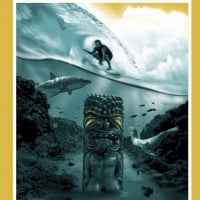
Psyched to finally have this one home!
 0
0 -
Very nice!0
-
Thanks dude!cp3iverson said:Very nice!0 -
-
Looks awesome I've very recently acquired this one and will look to do something very similar unless the framer comes up with something that tops yours.Windermere11 said:Windermere11 said:

 Windermere11 said:Windermere11 said:0
 -
White matting is great on it.0
-
Framed this one yesterday. Went with a weathered wood frame with navy and white matting. One of my favorite PJ posters ever.

Post edited by cp3iverson on0 -
Beautiful dudecp3iverson said:Framed this one yesterday. Went with a weathered wood frame with navy and white matting. One of my favorite PJ posters ever.Pittsburgh 2013. Cincinnati 2014. Greenville 2016. Columbia 2016. Ft Worth x2 2023. Austin x2 2023. Atlanta x2 2025.0 -
Thanks brother! Looking forward to seeing yours!drakeheuer14 said:
Beautiful dudecp3iverson said:Framed this one yesterday. Went with a weathered wood frame with navy and white matting. One of my favorite PJ posters ever.0 -
Nice! Congrats on the AP.. I love how he signed in gold ink.cp3iverson said:Framed this one yesterday. Went with a weathered wood frame with navy and white matting. One of my favorite PJ posters ever.0 -
Thanks man. How’d you land that Florida print? AmazingSJD3232 said:
Nice! Congrats on the AP.. I love how he signed in gold ink.cp3iverson said:Framed this one yesterday. Went with a weathered wood frame with navy and white matting. One of my favorite PJ posters ever.0 -
I got lucky and found it on Collectionzz. It was given a gift for Joey Ramones friend, Ed’s ex guitar tech. He’s had it rolled up in a tube since 98.. I sent it to poster mountain to be flattened out and made mint again. They do an amazing job; I can’t recommend them enough.cp3iverson said:
Thanks man. How’d you land that Florida print? AmazingSJD3232 said:
Nice! Congrats on the AP.. I love how he signed in gold ink.cp3iverson said:Framed this one yesterday. Went with a weathered wood frame with navy and white matting. One of my favorite PJ posters ever.0 -
I was looking for a darker shade of blue but could not find one with American Frame custom settings. Any thoughts on these 4? I think I am sold with all 3 Mumfords having the bottom mat being yellow. Just unsure the colour of the top mat and if they should all be the same or 3 unique colours.


 0
0 -
The dark blue, top left looks best IMO. Also, what about a shade of green matching the cityscape instead?
"Populated with every reject and cutthroat from Bombay to Calcutta. It's worse than Detroit."0 -
I like the dark blue also. Though I think the 2nd mat is way too thick.0
-
Thanks for the advice! I am only going with a 2" mat for the 2nd mat and do not think those pics are very proportional to that.0


Categories
- All Categories
- 149.2K Pearl Jam's Music and Activism
- 110.4K The Porch
- 290 Vitalogy
- 35.1K Given To Fly (live)
- 3.5K Words and Music...Communication
- 39.5K Flea Market
- 39.5K Lost Dogs
- 58.7K Not Pearl Jam's Music
- 10.6K Musicians and Gearheads
- 29.1K Other Music
- 17.8K Poetry, Prose, Music & Art
- 1.1K The Art Wall
- 56.8K Non-Pearl Jam Discussion
- 22.2K A Moving Train
- 31.7K All Encompassing Trip
- 2.9K Technical Stuff and Help