The Pearl Jam 2016 Poster Experience!
Comments
-
The Klausen will be the one to sell out if any do. The others are great, but that one will appeal to the masses.
I like Taylor's but why is he killing an Eagle with a bat handle?Sorry. The world doesn't work the way you tell it to.0 -
Yep, I agree.BCBA said:Actually thinking the feldman is going to be really sharp in person
2000-Chicago
2003-Chicago, East Troy
2006-Chicago, Cleveland
2009-Chicago
2011-PJ20 1, PJ20 2
2013-Wrigley
2014-Moline, Milwaukee
2016-Lexington, Wrigley 1, Wrigley 2
2018-Wrigley 1, Wrigley 20 -
Not a huge poster person, but those really aren't all that great. The skeleton is neat, but the rest? Glad I'm not a collector!www.cluthelee.com0
-
Have to agree with this. Love me some posters, Kens is cool but the colors dont do it for me and the variant for BK far surpasses the regular so that will be the only one I go after from the bunch. The Feldman is just beyond ugly, i would hang the vancouver pig thing before this one hit my wall.2-feign-reluctance said:Not a huge poster person, but those really aren't all that great. The skeleton is neat, but the rest? Glad I'm not a collector!
Pittsburgh 2013
Cincinnati 2014
Greenville 2016
(Raleigh 2016)
Columbia 20160 -
1) Feldman
2) Taylor
3) Faile
3) Klausen (variant)0 -
I agree too. This one is the best of the lot... I threw it out of consideration based on the teaser, but seeing the entire thing changed my mind a bit. I dont think an electronic representation does the art justice. Interesting colors, perspective, interpretation, and a bit of abstract.PJM3333 said:
Yep, I agree.BCBA said:Actually thinking the feldman is going to be really sharp in person
In person in screen print form its going to be really good. A variant could have potential as well0 -
As someone that didnt go to either stadium shows..i like Chicago posters much better.www.twitter.com/robert_harbin0
-
Faile for the uninspiring win.
Disappointed no one encorporated the ivy at Wrigley as a theme to the poster. Klausen used it but as a gimmick in a poster busier than a 20 car pile up. Baseball is an asthetically classic sport which screams old school in its presentation. I love his art but that poster is the equivalent to the Diamondbacks new "space age" unis....if it ain't broken don't fix it. I'd honestly say detailed elaborate ivy with the simple Cubs lettering for the info would have beaten all these. The Feldman is cool but looks way too much like an 80's album cover for the Mad Magazine Spy v Spy band. Reaper is a Klausen DC 2006 cop-job. Taylor is ok but could have used much better colors. Faile did copy an old El Jefe Design (their stuff is sick!!) Bouncing Souls DC poster with the local subway passenger theme but incorporates the Chicago asthetic well enough that it works. Would have rather a plain L train subway car encorperating the info wherever text was necessary for accuracy but I'm boring.
Fenway folks were lucky with that Thomas. After seeing both weekends posters I'm coming around on Ted Williams too.Post edited by rvapete on0 -
I think it's a good thing that there is such a mixed review of the posters. This will give those going to the shows a chance to get what they want. It doesn't sound like it's going to be as much of a shit show as Fenway was with 1 dominant poster and the rest being so-so(at best).0
-
I do agree with this. The Cracker Jack theme and "The Catch" are so popular because they captured the synergy between a gig poster, baseball, and a classic aethetic look.rvapete said:
Disappointed no one encorporated the ivy at Wrigley as a theme to the poster. Klausen used it but as a gimmick in a poster busier than a 20 car pile up. Baseball is an asthetically classic sport which screams old school in its presentation. I love his art but that poster is the equivalent to the Diamondbacks new "space age" unis....if it ain't broken don't fix it. I'd honestly say detailed elaborate ivy with the simple Cubs lettering for the info would have beaten all these. The Feldman is cool but looks way too much like an 80's album cover for the Mad Magazine Spy v Spy band. Reaper is a Klausen DC 2006 cop-job. Taylor is ok but could have used much better colors. Faile did copy an old El Jefe Design (their stuff is sick!!) Bouncing Souls DC poster with the local subway passenger theme but incorporates the Chicago asthetic well enough that it works. Would have rather a plain L train subway car encorperating the info wherever text was necessary for accuracy but I'm boring.
Wrigley folks were lucky with that Thomas. After seeing both weekends posters I'm coming around on Ted Williams too.0 -
Liking the Feldman and Klausen. The Feldman is something different and I think BKs stuff is always prety solid.
Now to see how much of a shit show merchmania becomes!0 -
Looking to score all but the Cliver, just doesn't do it for me.0
-
Ummm the Cliver isn't political is it? Looks like a 75 topps card.tschav said:All posters are wall worthy, I'd be curious to see if any really sell out like Thomas at Fenway. Tough choice to make here.
Mr Klausen quoting the great Willie Keller with that "hit em where they ain't" quote. I love prewar era baseball.EM194007 said:Pearl Jam is set to rock Wrigley Field once again for two big shows on August 20 and 22. Brad Klausen has done one of the posters for the concerts, with it he has combined the world of rock and baseball perfectly.
The poster is a 6 color screenprint measuring 13.7 x 25 inches and on the back features a heart touching tribute to his father who played baseball and some of Harry Caray's famous quotes.
The variant edition will only available from Brad and features the colors of the Seattle Mariners.
Regular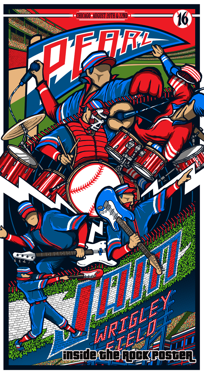
Variant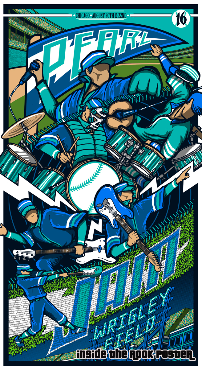
Back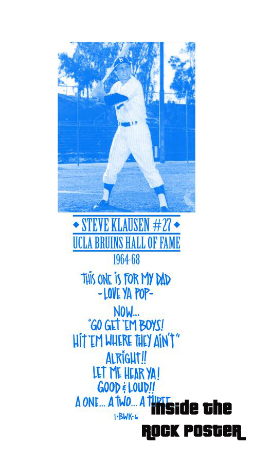 0
0 -
My criteria for undesirable posters is met on 3 of these!
Skulls: Cliver
Birds of Prey: Taylor
Humanoids: Faile
so that leaves Klausen and Feldman0 -
So an Eagle is no good, but a Plague mask is?MayDay10 said:My criteria for undesirable posters is met on 3 of these!
Skulls: Cliver
Birds of Prey: Taylor
Humanoids: Faile
so that leaves Klausen and FeldmanSorry. The world doesn't work the way you tell it to.0 -
hey, I didnt make the rules....
oh wait, I did0 -
I think a Humanoid criteria would eliminate Feldman as well....
And yes, the Cliver print is very political.And so you see, I have come to doubt
All that I once held as true
I stand alone without beliefs
The only truth I know is you.0 -
Just as long as we're clear on that.MayDay10 said:hey, I didnt make the rules....
oh wait, I did
Too funny.
BTW, I guess I could have asked about baseball/music orgies. I think that's what BK was really after... His dad on the back is just a cover.Sorry. The world doesn't work the way you tell it to.0 -
How? I'm not seeing it.Dr. Delight said:I think a Humanoid criteria would eliminate Feldman as well....
And yes, the Cliver print is very political.0 -
EdsonNascimento said:
Just as long as we're clear on that.MayDay10 said:hey, I didnt make the rules....
oh wait, I did
Too funny.
BTW, I guess I could have asked about baseball/music orgies. I think that's what BK was really after... His dad on the back is just a cover.
Ha.... yeah, the rules are loose though. Instituted after the Hartford 06 and Camden 08 posters.
The other rule I forgot is Clowns are a deal breaker.0


Categories
- All Categories
- 149.2K Pearl Jam's Music and Activism
- 110.3K The Porch
- 287 Vitalogy
- 35.1K Given To Fly (live)
- 3.5K Words and Music...Communication
- 39.4K Flea Market
- 39.4K Lost Dogs
- 58.7K Not Pearl Jam's Music
- 10.6K Musicians and Gearheads
- 29.1K Other Music
- 17.8K Poetry, Prose, Music & Art
- 1.1K The Art Wall
- 56.8K Non-Pearl Jam Discussion
- 22.2K A Moving Train
- 31.7K All Encompassing Trip
- 2.9K Technical Stuff and Help